



The NCERT Class 12 Informatics Practices Chapter 4 Plotting Data using Matplotlib Book PDF gives students the official 2026-27 chapter for Python charting. Keep the PDF open while practising line charts, bar charts, histograms, scatter plots and plot formatting commands.
- PDF size: 32 official NCERT pages for classroom and offline revision.
- Core focus: Matplotlib basics, plot types, labels, legends, colours and chart interpretation.
- Best use: type each plotting command and compare the chart with the NCERT output.
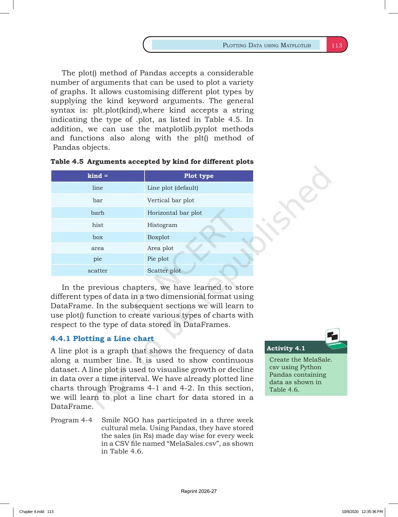
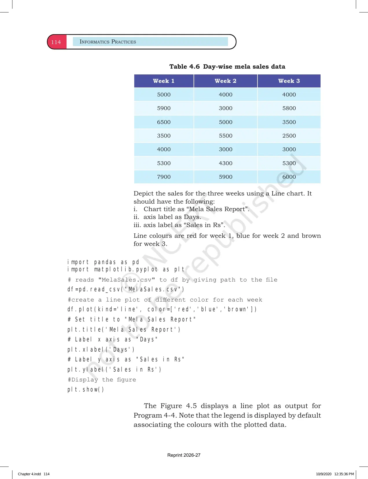
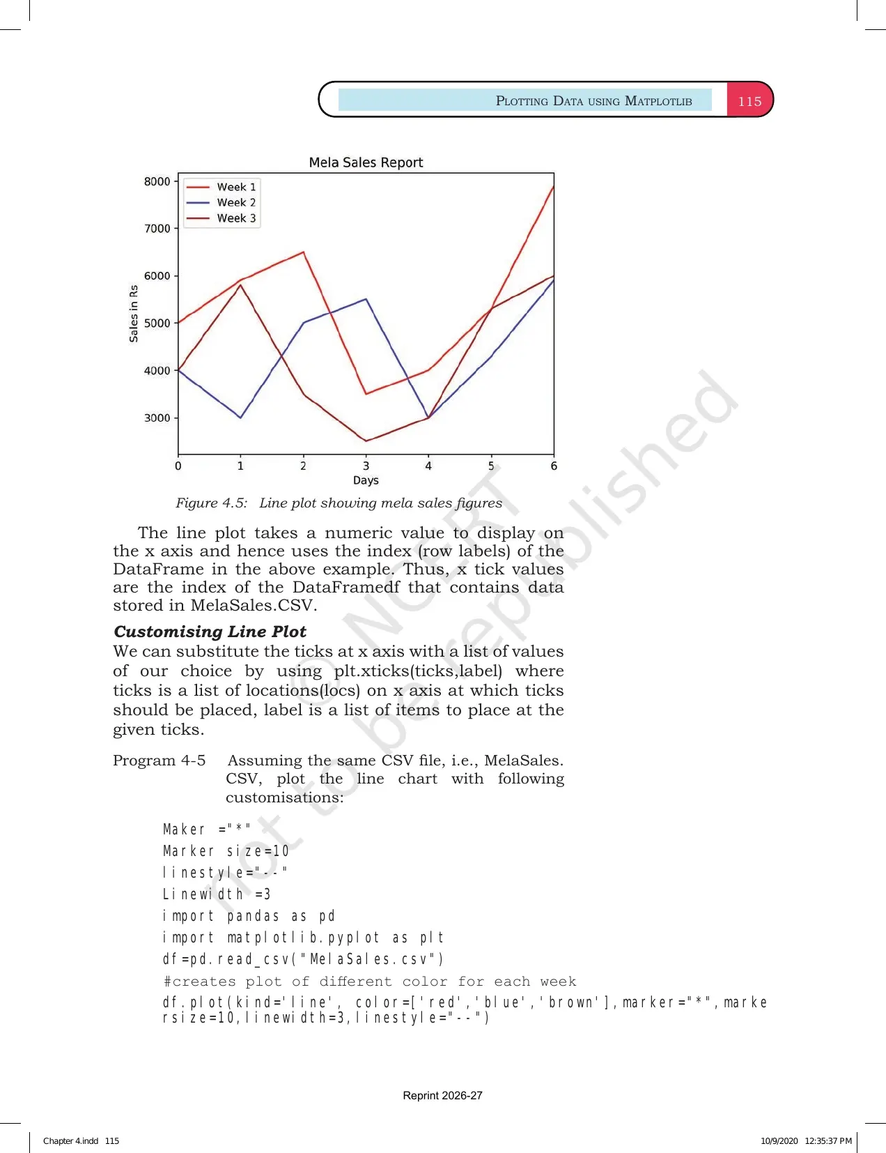
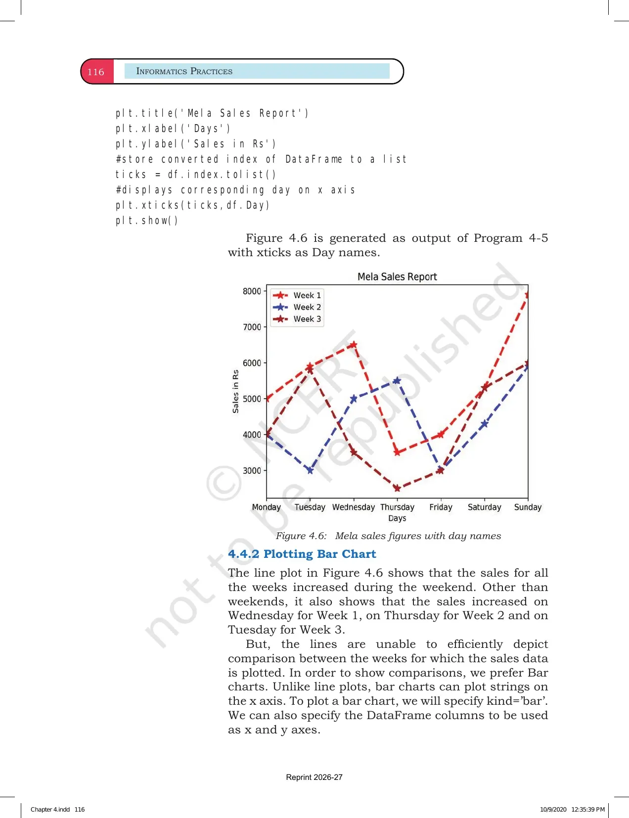
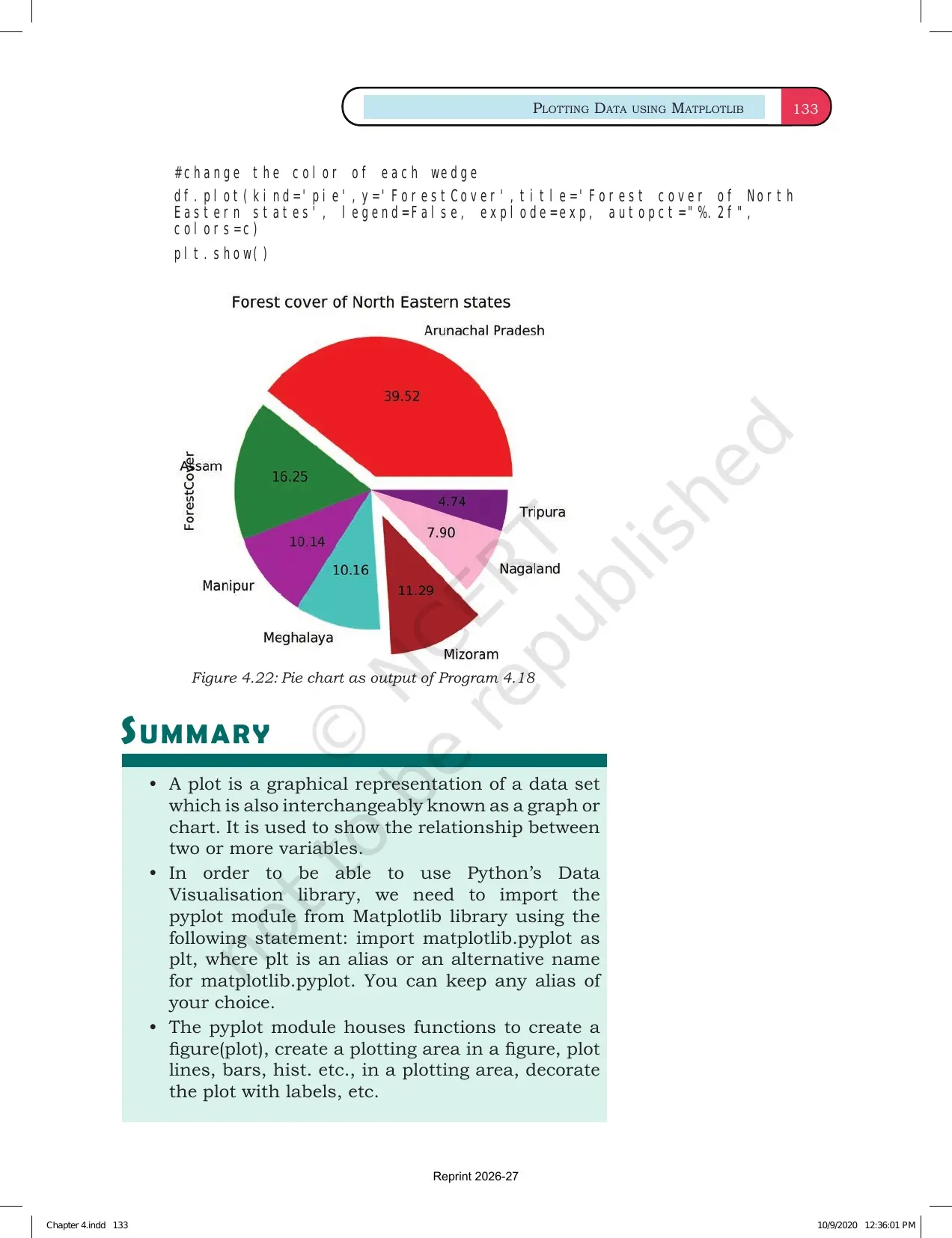
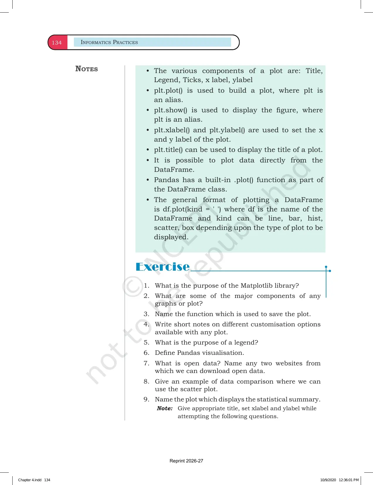
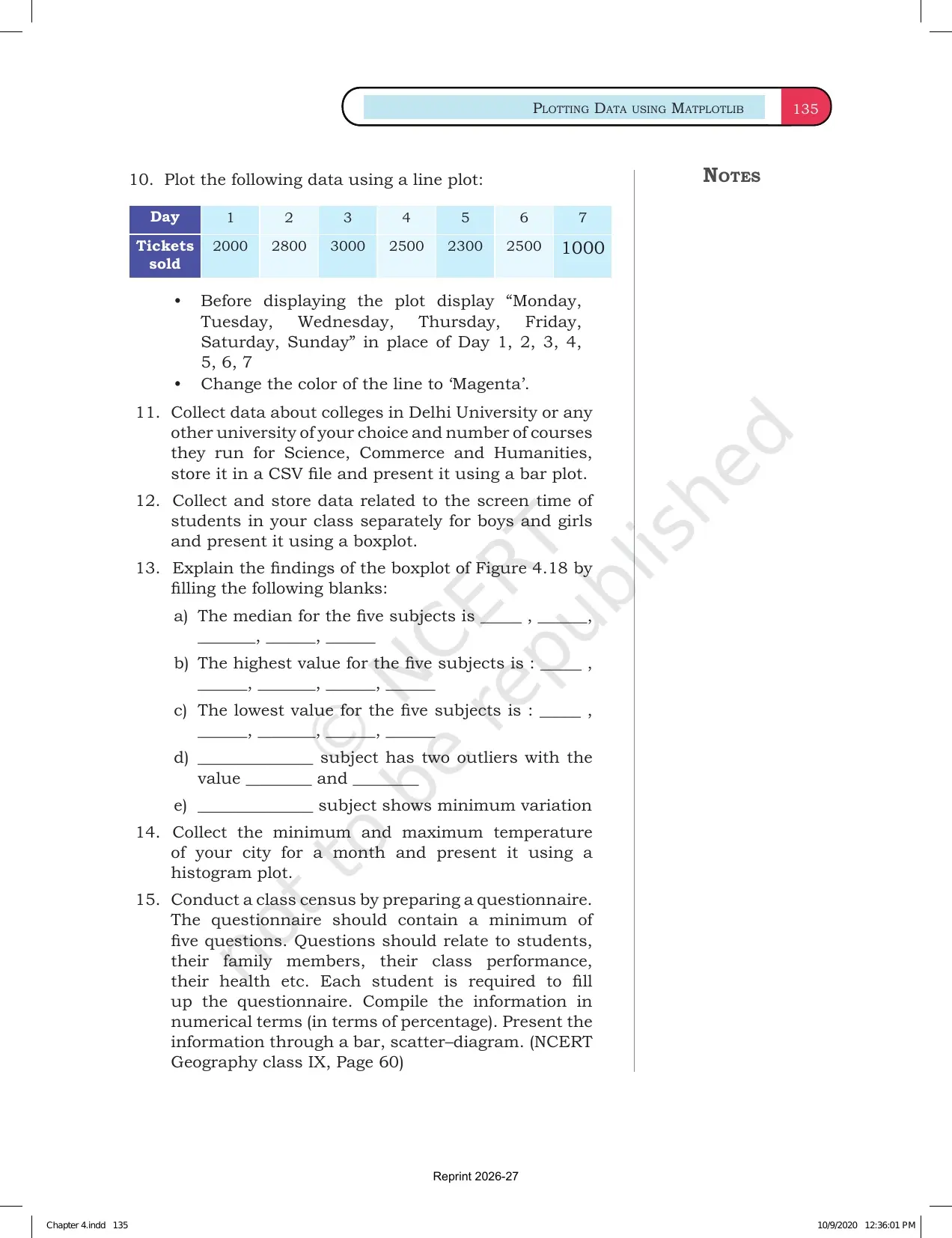
This Collegedunia page follows the 2026-27 NCERT Informatics Practices textbook and keeps the official chapter PDF, Matplotlib chart cues and related study links in one place.
Student Feedback: In a Collegedunia poll of 9,860 Class 12 Informatics Practices students from the 2026-27 board cycle, most students said Matplotlib became easier when every chart was revised as data, command and output together.
- 78% wanted a quick chart for choosing line, bar, histogram or scatter plots.
- 73% needed a reminder for labels, legends and titles before output questions.
- 69% revised faster when chart-formatting commands were kept beside examples.
|
Table of Contents |
Plotting Data using Matplotlib Chapter 4 Highlights
Chapter 4 explains how data can be converted into visual charts using the Matplotlib library. It is important for board questions because a small change in command can change the chart title, axis label, colour, marker or legend.
| Chapter area | What NCERT asks students to learn | Revision cue |
|---|---|---|
| Matplotlib basics | Import pyplot and understand the plotting workflow | Use import matplotlib.pyplot as plt |
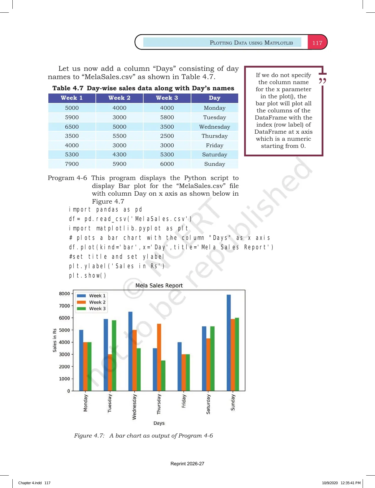
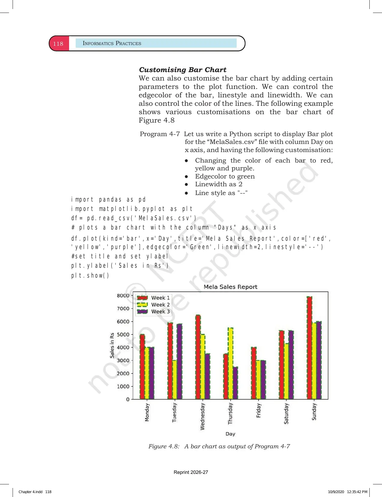
| Line and bar charts | Plot ordered values and category comparisons | Choose chart type from the data |
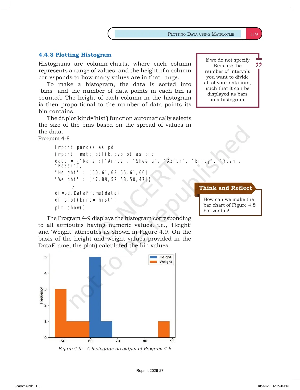
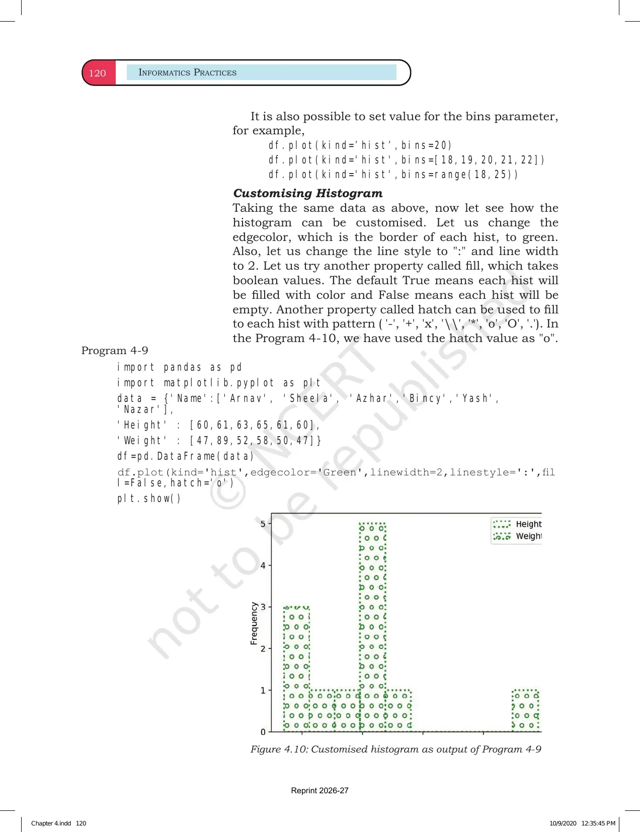
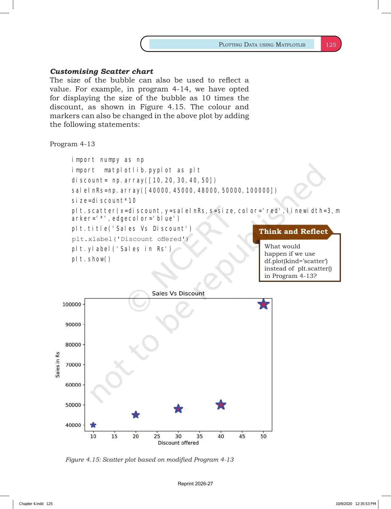
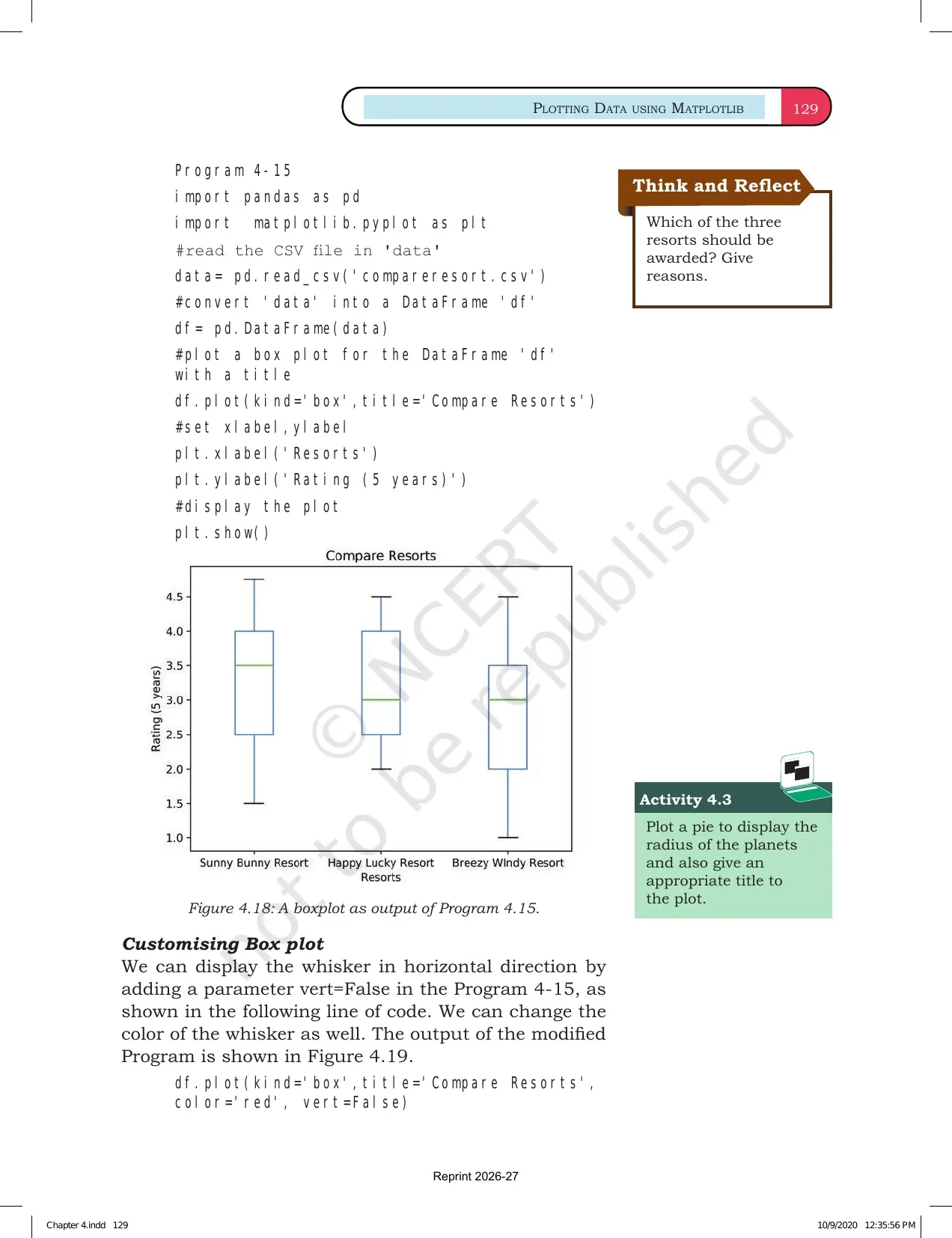
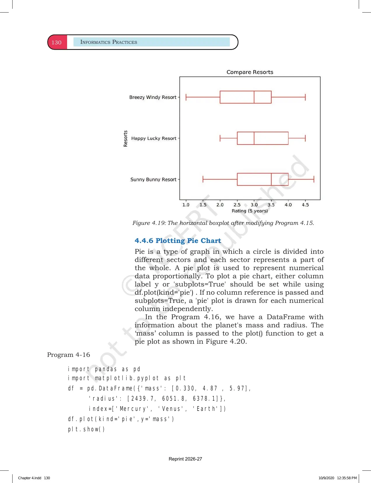
| Histogram and scatter plot | Show frequency distribution and relation between variables | Read axes before reading points |
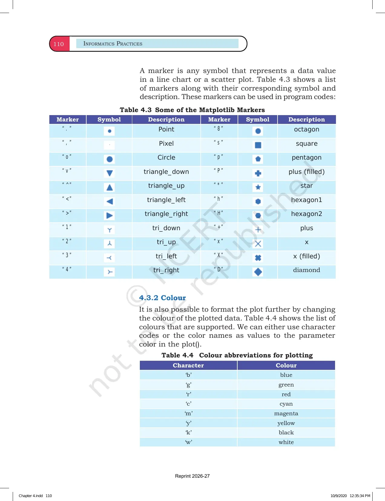
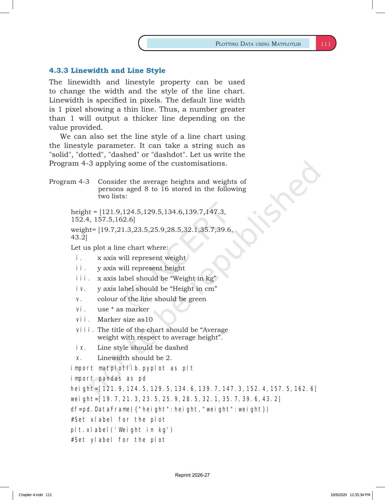
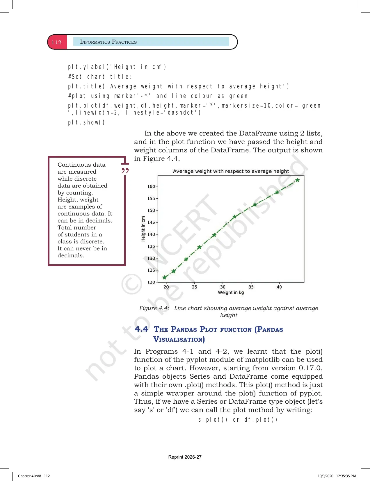
| Formatting | Add title, labels, legend, grid, colours and markers | Formatting makes the answer readable |
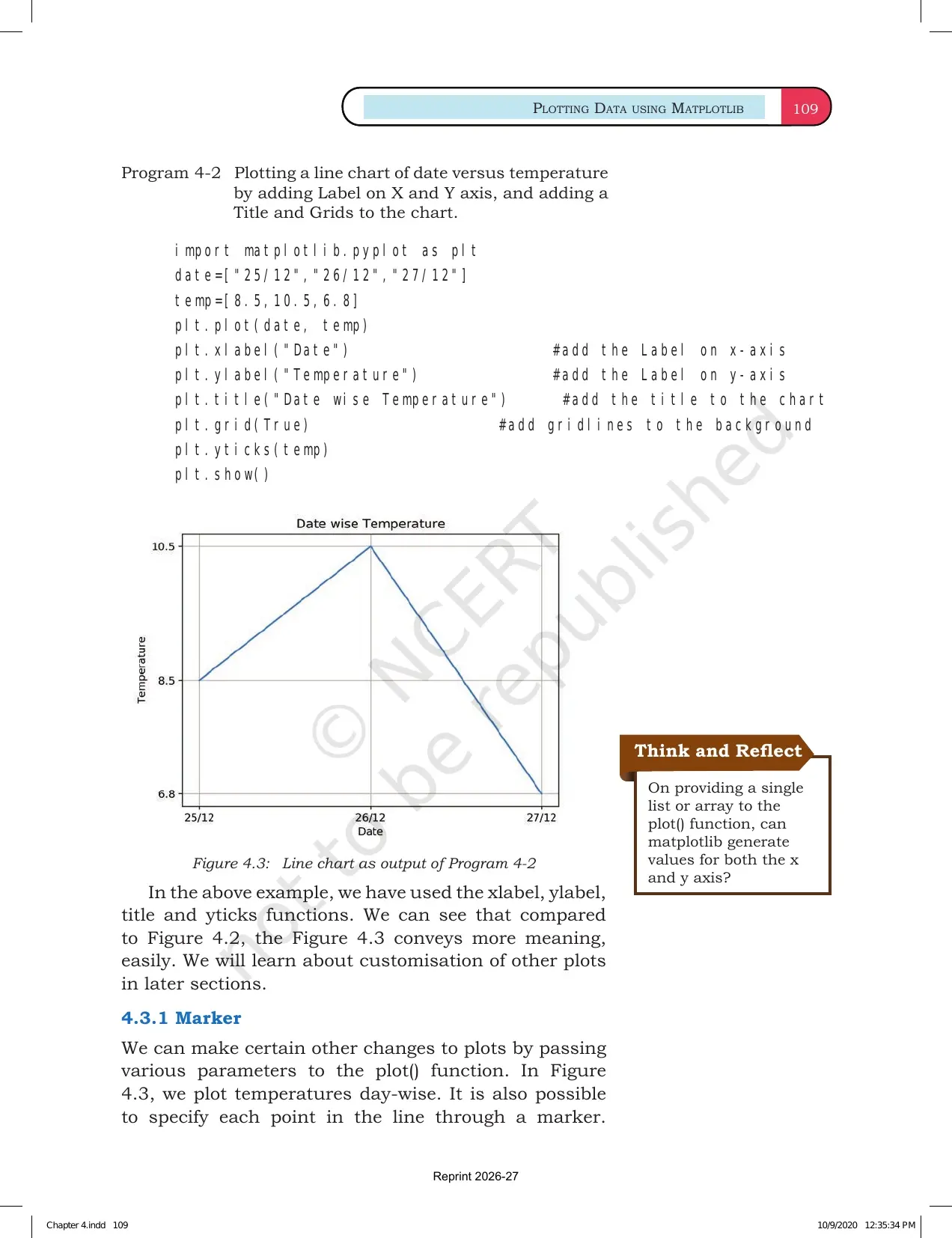
A plot is useful only when the data, axes and title are clear. Students should revise every chart as a pair of Python commands and visual output.
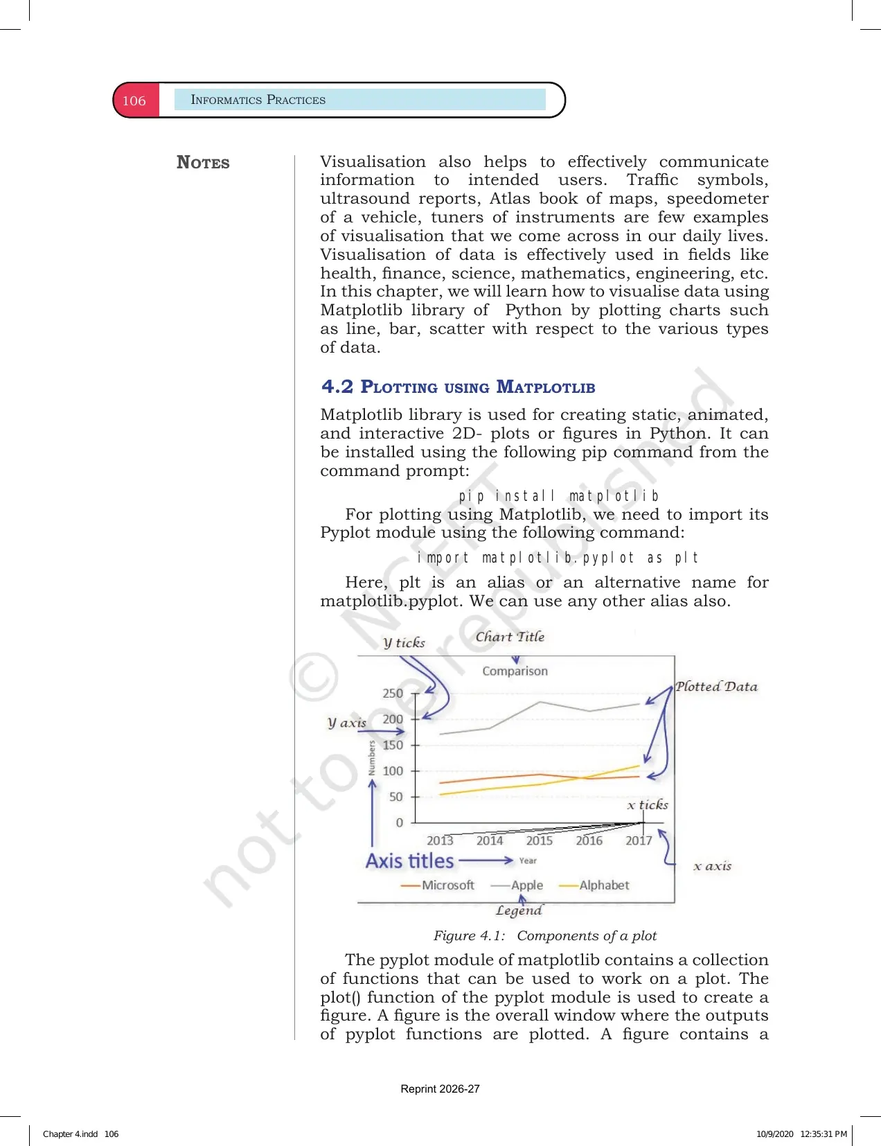
Matplotlib Plot Anatomy
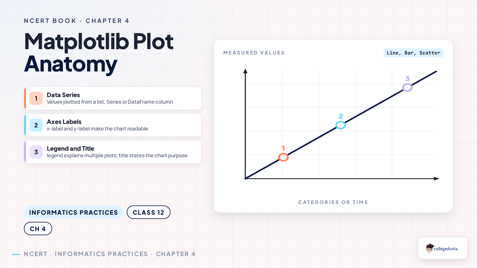
The NCERT examples show a common pattern: prepare the data, call a plotting function, format the plot and display it. Students should not memorise commands without knowing which part of the chart each command changes.
- Data series: list, tuple, Series or DataFrame column values that are plotted.
- Axes: the x-axis and y-axis show what the chart is measuring.
- Labels:
xlabel()andylabel()explain the axes. - Title and legend:
title()andlegend()help students read multi-line or grouped charts.
Line Charts Bar Charts and Scatter Plots
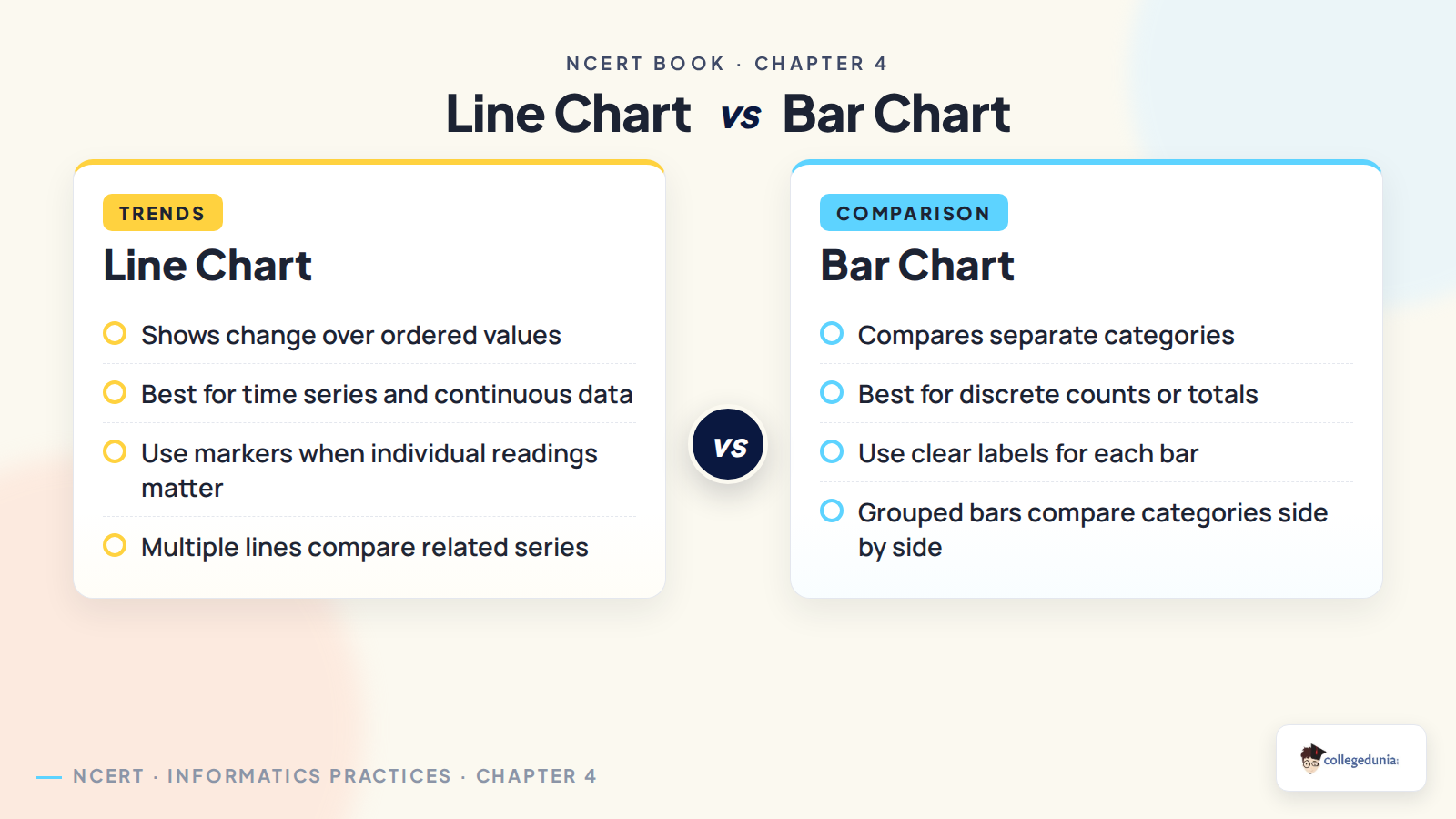
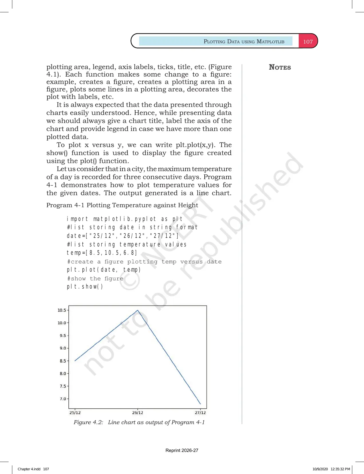
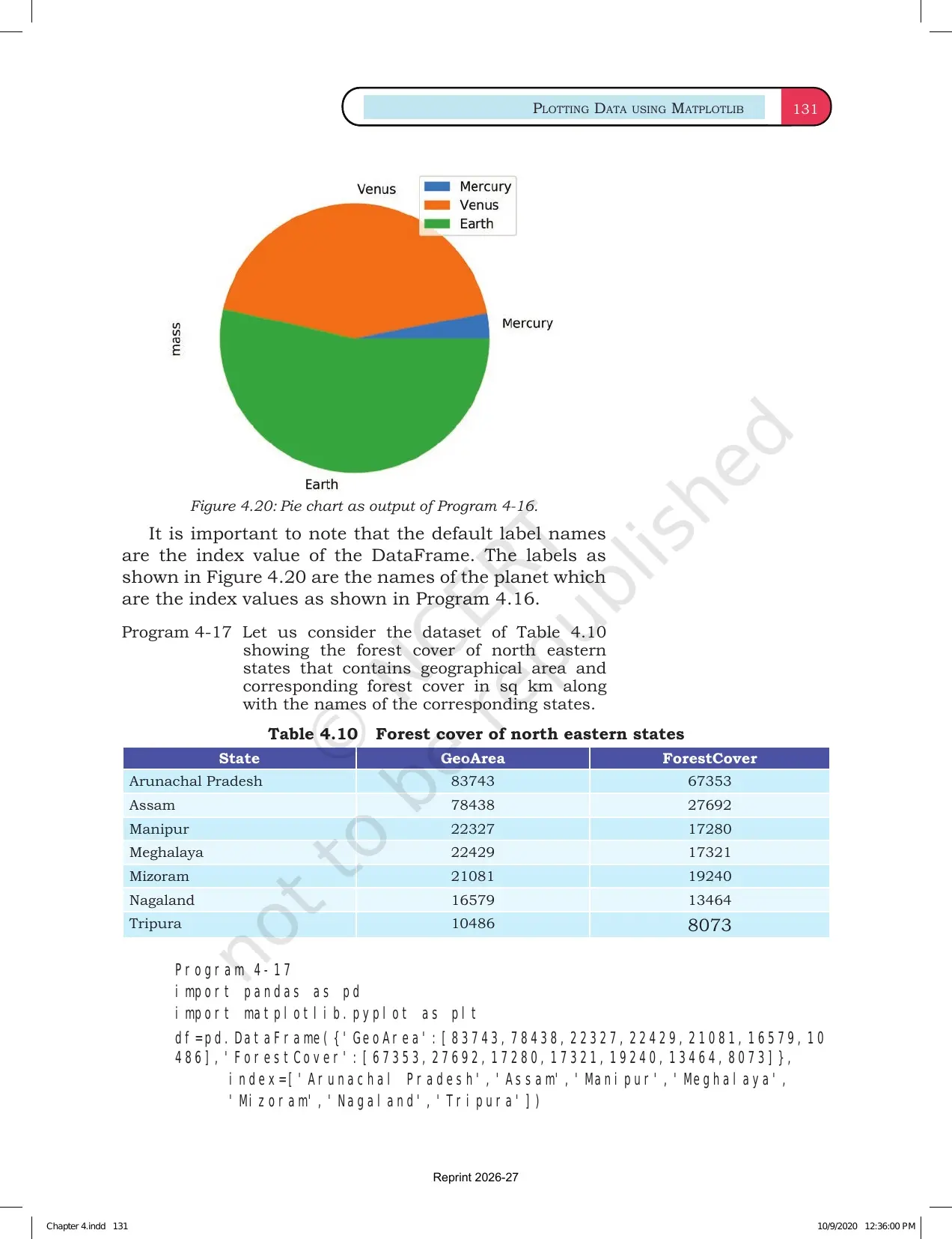
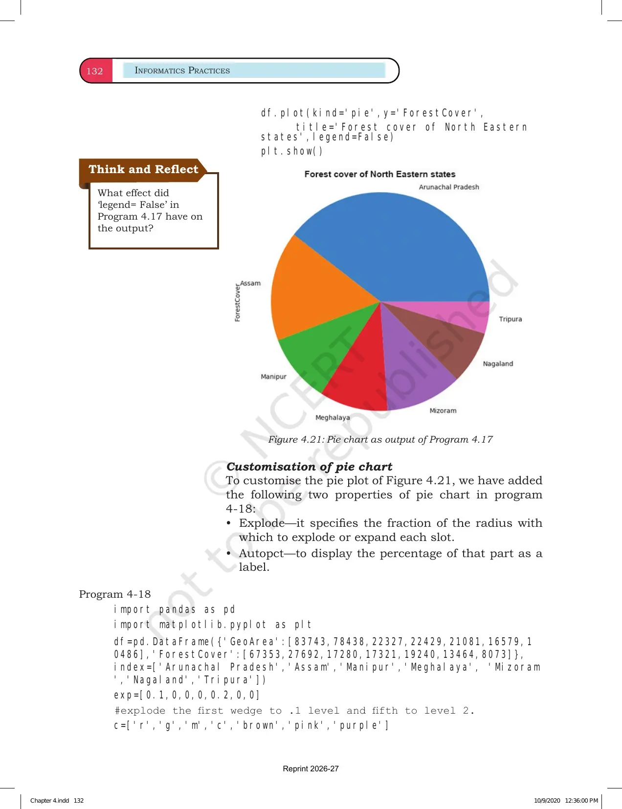
Most Matplotlib questions become simpler after students identify the required chart type. Line charts are used when ordered values show a trend. Bar charts compare separate categories. Scatter plots show relation between two numeric variables.
- Use
plot()when values move across time, class intervals or ordered observations. - Use
bar()when the x-axis has categories such as subjects, products or cities. - Use
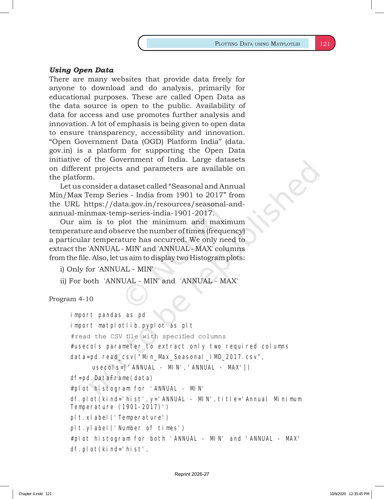
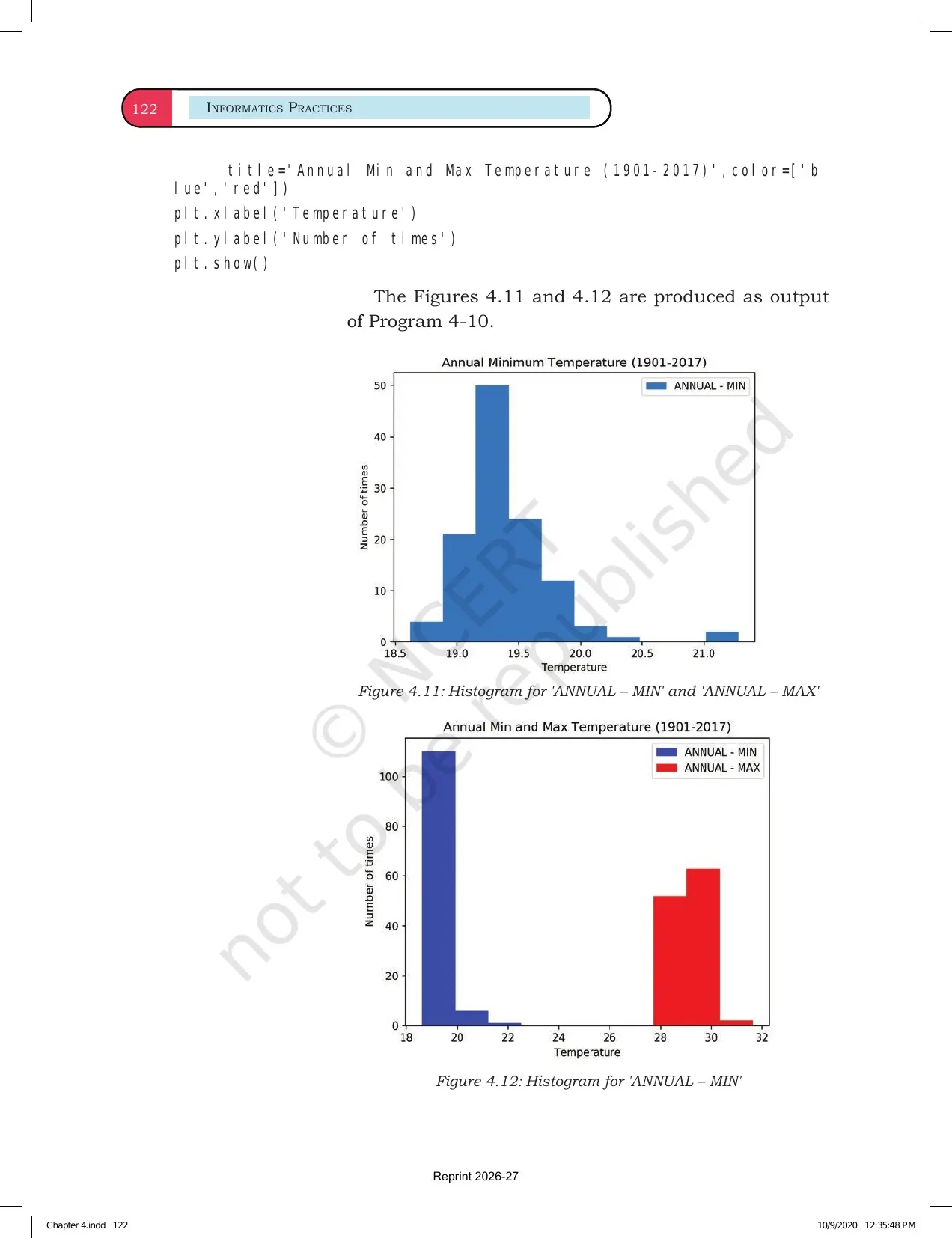
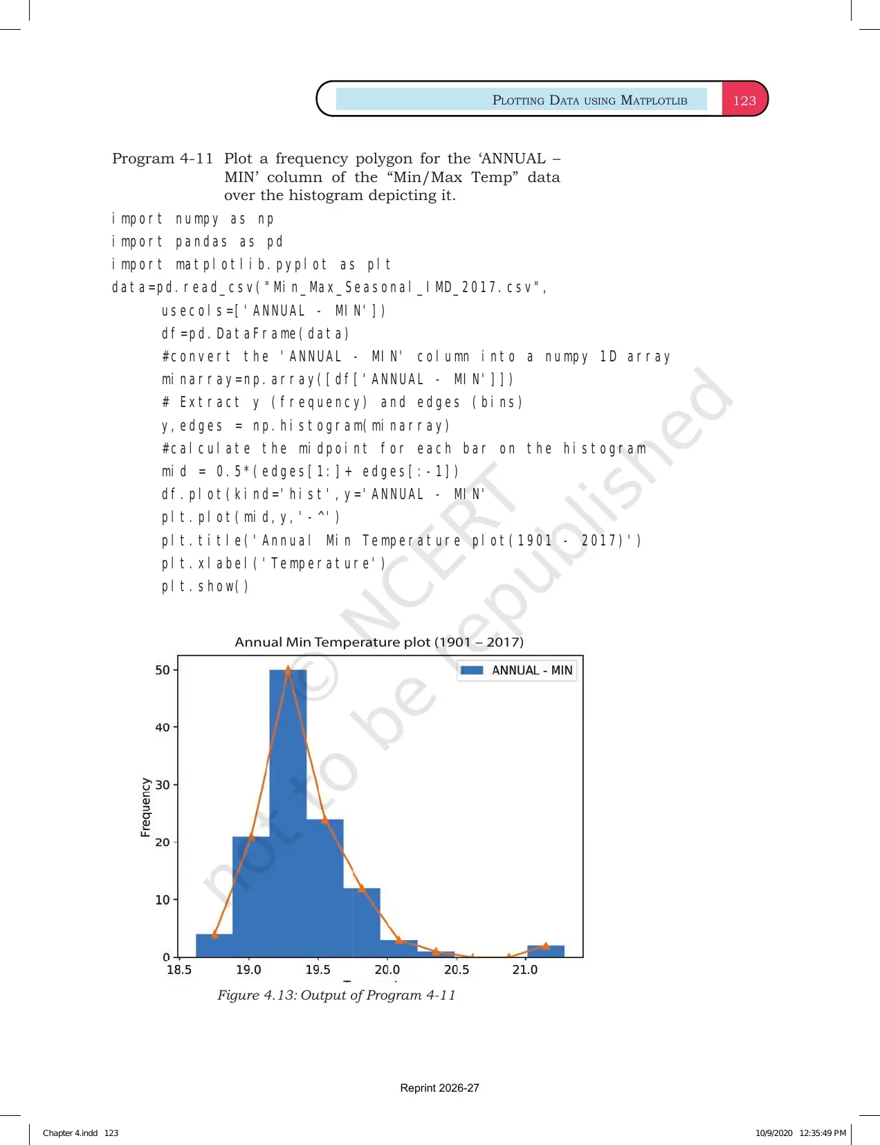
hist()when the question asks for frequency distribution. - Use
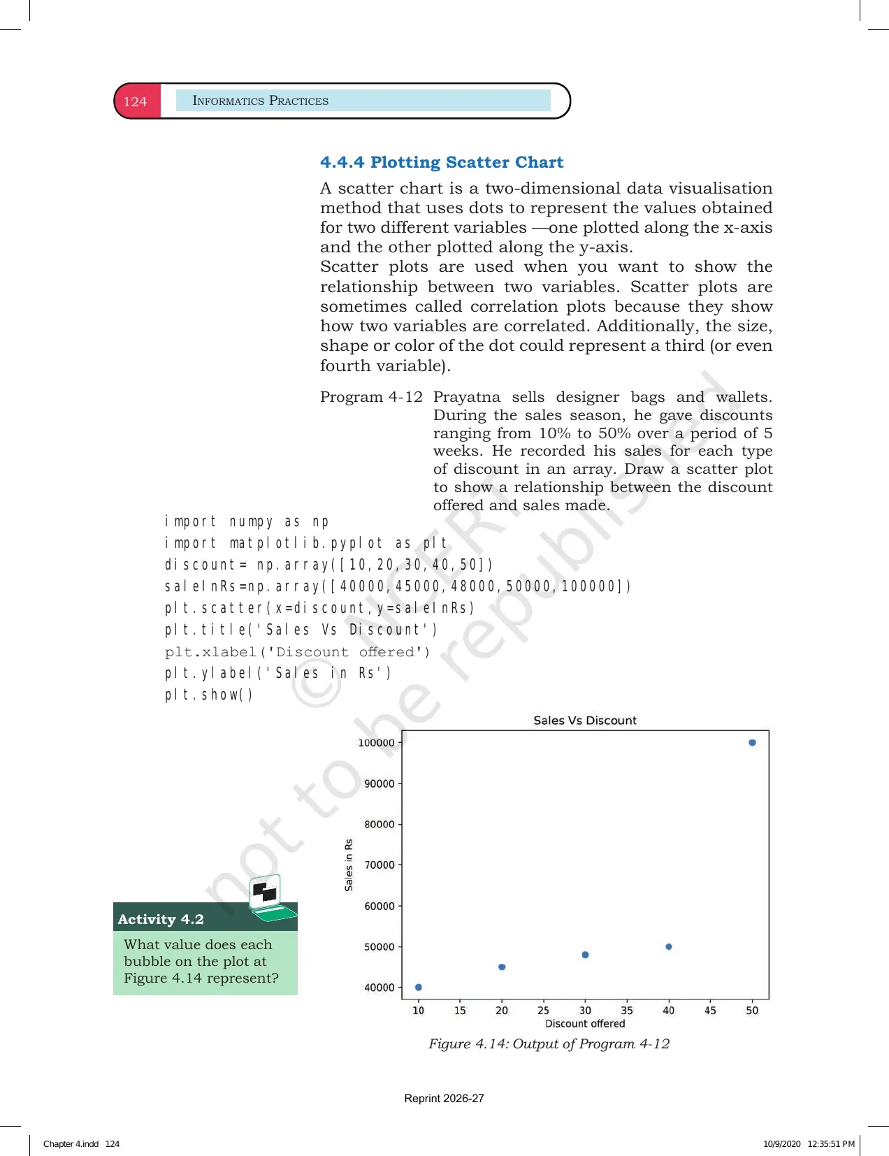
scatter()when two variables must be compared point by point.
Plotting Data using Matplotlib Video
The video below supports the NCERT Chapter 4 reading flow. Watch it after reading the PDF once, then return to the examples and type the plotting commands yourself.
Source: Magnet Brains on YouTube
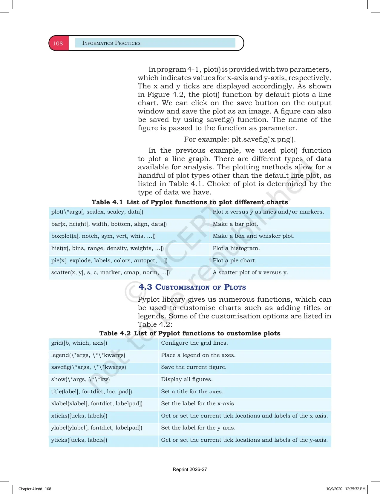
Chart Formatting Commands
Formatting commands are not decoration in a board answer. They show whether students understand the chart. A correct plot without labels can still be hard to read, so the chapter gives repeated practice with titles, labels, legends, colours and grids.
| Command | Use | Exam-ready meaning |
|---|---|---|
plt.title() | Adds the chart heading | States what the graph shows |
plt.xlabel() | Adds x-axis label | Names the input or category axis |
plt.ylabel() | Adds y-axis label | Names the measured values |
plt.legend() | Explains multiple data series | Needed when more than one plot appears |
plt.grid() | Adds grid lines | Makes value reading easier |
Revision tip: always check whether the question asks for chart display only, or for chart formatting with title and labels.
How to Use the NCERT Book PDF
Use the PDF as a coding practice file, not only a reading file. Matplotlib syntax becomes easier when students write commands, predict the chart and then compare the output with the NCERT example.
- Write one line chart and one bar chart from your own sample data.
- Change colour, marker and line style one at a time.
- Add x-axis label, y-axis label, title and legend to every practice chart.
- Practise histogram and scatter plot only after line and bar charts are clear.
- Read every chart from title to axes before checking data points.
Related Class 12 Informatics Practices Resources
| Resource | Use It For | Link |
|---|---|---|
| NCERT Solutions | Check solved Matplotlib exercise answers. | Chapter 4 NCERT Solutions |
| Revision Notes | Revise chart commands, syntax and output patterns quickly. | Chapter 4 Notes |
| Handwritten Notes | Use a compact notebook-style recap before tests. | Chapter 4 Handwritten Notes |
All Informatics Practices NCERT Book PDFs
| Chapter | NCERT Book PDF |
|---|---|
| Chapter 1 Querying and SQL Functions | Chapter 1 NCERT Book PDF |
| Chapter 2 Data Handling using Pandas Series | Chapter 2 NCERT Book PDF |
| Chapter 3 Data Handling using Pandas DataFrame | Chapter 3 NCERT Book PDF |
| Chapter 4 Plotting Data using Matplotlib | Chapter 4 NCERT Book PDF |
| Chapter 5 Introduction to Computer Networks | Chapter 5 NCERT Book PDF |
| Chapter 6 Societal Impacts | Chapter 6 NCERT Book PDF |
Class 12 Informatics Practices Chapter 4 NCERT Book FAQs
Ques. What is the main topic of Class 12 Informatics Practices Chapter 4?
Ans. Chapter 4 explains Plotting Data using Matplotlib. It covers line charts, bar charts, histograms, scatter plots, labels, titles, legends and chart formatting.
Ques. Why should students read the NCERT PDF before notes?
Ans. The NCERT PDF gives the official examples, syntax and chart outputs. Reading it first helps students match each Matplotlib command with its visual result.
Ques. Which Python library is used in Chapter 4?
Ans. Chapter 4 uses Matplotlib, mainly the pyplot module. Students usually import it as matplotlib.pyplot as plt.
Ques. What is the best way to revise Matplotlib for exams?
Ans. Practise one chart at a time. Write the data, choose the plot function, add labels and title, then check whether the output matches the NCERT example.



Comments