



Content Curator
Statistics is a branch of mathematics that deals with methods for gathering, organising, and evaluating data such that useful conclusions can be drawn.
- Accidents, pricing of commodities, business, earnings, epidemics, sports data, and demographic statistics are examples of events that are dealt with.
- Differential and integral calculus, linear algebra, and probability theory are all used substantially in statistics' mathematical theories.
- By creating specialised experimental designs and survey samples, statistics can be utilised to improve data quality.
- Statistics also includes tools for forecasting and prediction.
- Statistics are useful in a wide range of academic fields, including natural and social sciences, government, and business.
Read Also: Equally Likely Events
| Table of Content |
Key Takeaways: Calculus, Integrals, Linear Algebra, Probability, Differentiation, Mean, Median, Mode, Statistics
Introduction to Statistics
[Click Here for Sample Questions]
Statistics is a field of study that deals with data gathering, presentation, interpretation, and analysis.
- Primary and Secondary Data: The data obtained is referred to as primary data when it was collected by the investigator herself or himself with a specific goal in mind. The data obtained is referred to as secondary data when it was gathered from a source that already had the information stored.
- Frequency: In statistics, frequency refers to the number of times a specific event occurs.
- Grouped data & Ungrouped data: Observations are sorted into groups in grouped data. Ungrouped data is data in its most basic or unprocessed form. There are no categories for the observations.
- Class Interval: The number of classes into which a set of data is divided. E.g., divisions on a histogram or bar graph. Class width = upper-class limit – lower class limit
- Regular and Irregular class interval: When the class intervals are identical or of the same size, it is called a regular class interval. For example, 0-10, 10-20, 20-30, 90-100. When the class intervals are of variable sizes, it is called an irregular class interval. For example, 0-35, 35-45, 45-55, 55-80, 80-90, 90-95, and 95-100.
- Frequency table: A frequency table, also known as frequency distribution, is a table that displays the frequency of a specific variable in a tabular format.
- Grouped frequency table & Ungrouped frequency table: The relevant class intervals' frequencies are organized or structured in a specific order, either ascending or descending. When each class interval's frequency is not ordered or organised in any way.
Also Read:
Principles of Graphical Representation of Data
[Click Here for Sample Questions]
Algebraic principles govern graphical representation. Two lines in a graph are known as the Axis or Coordinate axis. The X-axis and Y-axis are the two axes. The X-axis is the horizontal axis, while the Y-axis is the vertical axis. They are perpendicular to each other and cross at O, the origin point. The X-axis has a positive value on the right side of the Origin and a negative value on the left side. Similarly, the positive side of the Origin Y-axis has a positive value, whereas the negative side has a negative value. When the x- and y-axis connect at the origin, the plane is divided into four quadrants: Quadrant I, Quadrant II, Quadrant III, and Quadrant IV. The Histogram, Smoothed frequency graph, Pie diagram or Pie chart, Cumulative or ogive frequency graph, and Frequency Polygon are examples of this type of representation. The following are the main graphical representations:
Bar Graph
A bar graph is a visual representation of data in which bars of uniform width are drawn on one axis (say, the x-axis) with equal spacing between them, displaying the variable. The variable's values are displayed on the other axis (say, the y-axis), and the heights of the bars are determined by the variable's values.
| Savings (in percentage) | Number of Employees (Frequency) |
|---|---|
| 20 | 105 |
| 30 | 199 |
| 40 | 29 |
| 50 | 73 |
| Total | 400 |
Check Important Difference Between Average and Mean
The data can be represented as:

Histogram
A histogram is a graphical depiction of a continuous-classed grouped frequency distribution. The construction steps are as follows:
- On a suitable scale, we represent the class limits along the x-axis and the frequencies along the y-axis.
- We now create rectangles (or rectangular bars) of equal width and length based on the frequencies of the corresponding class intervals.
The generated graph resembles a solid figure since there are no gaps between consecutive rectangles. This is referred to as a histogram.
Note:
- If the first-class interval does not begin at zero, we mark a kink or a break on the axis to represent it on the graph.
- The area of the rectangles erected in a histogram is proportional to the associated frequencies.
- If the widths of the rectangles vary, we must make changes to the lengths of the rectangles so that the areas are proportionate to the frequencies once again. The following are the measures to take to do this.
- Choose a class interval with the smallest possible class size.
- The rectangles' lengths are then adjusted to be proportional to the minimal class size. 'Lengths proportional to the minimal class size' is how these lengths are referred to.
Presentation of Histogram is as follows:

Frequency polygon
The frequency polygon is created for an ungrouped distribution by plotting points with the abscissa as the variate values and the ordinate as the associated frequencies, and then connecting the plotted points with straight lines. The abscissa of points in a grouped frequency distribution is the mid-values of the class intervals. The frequency polygon can be made for equal class intervals by connecting the middle points of the upper sides of the neighbouring rectangles of the histogram with straight lines.
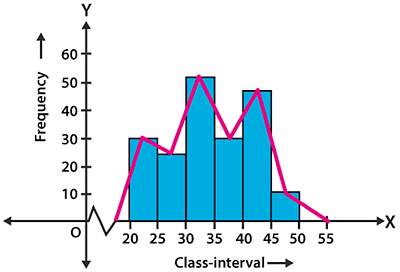
Note: If a histogram and a frequency polygon are to be drawn, the histogram should be drawn first, followed by the frequency polygon.
Also Check:
Rules of Graphical Representation of Data
[Click Here for Sample Questions]
There are some rules that must be followed when presenting data graphically. They are as follows:
- Suitable Title: The graph's title should be appropriate and identify the presentation's topic.
- Measurement Unit: The graph's measurement unit should be specified.
- Proper Scale: To accurately depict the data, a proper scale must be chosen.
- Index the relevant hues, tones, lines, and designs in the graphs for better understanding.
- Data Sources: At the bottom of the graph, data should be placed wherever it is needed.
- Simple: A graph's construction should be simple to comprehend.
- To interpret the data effectively, the graph should be visually clean in terms of size and typeface.
Measures of Central Tendency
[Click Here for Sample Questions]
There are three main averages:
Mean
The sum of all the values of all the observations divided by the total number of observations is the mean (or average) of a set of observations. Thus,

In general, for n observations,

For an ungrouped frequency distribution,

Where, fi is the frequency corresponding to the observation xi.

Median
The median is the value that splits a given number of observations into exactly two halves. When the observations are sorted in ascending or descending order of magnitudes, the median is the middle or centre value of the variate in a set of observations.
Median is calculated as: ½ (n+1), where n is the number of values in the data.
The median is the average of the two middle values if the number of items in the data collection is even.
Mode
The mode is the value of an observation that happens the most frequently, i.e., the observation with the highest frequency. The data's extreme values have an impact on the mean. Extreme numbers in the data do not affect the median or mode.
Also Read More:
Points to Remember
[Click Here for Sample Questions]
Following are the important points:
- The most common observation is referred to as the mode.
- The modal class is the class interval with the highest frequency.
- Raw data needs to be sorted to carry out operations. This process is known as sorting.
- The class mark of a class is the mid-value of the two limits of that class.
- An Inclusive or Discontinuous Frequency Distribution is a frequency distribution in which the upper limit of one class differs from the lower limit of the next class.
Sample Questions
Ques: The heights of 60 students, measured to the nearest centimetres. The values are shown below: (3 Marks)
161 150 154 165 168 161 154 162 150 151
162 164 171 165 158 154 156 172 160 170
153 159 161 170 162 165 166 168 165 164
154 152 153 156 158 162 160 161 173 166
161 159 162 167 168 159 158 153 154 159
162 158 161 167 169 154 156 151 154 159
- Represent the data given above by a grouped frequency distribution table, taking the class intervals as 160 - 165, 165 - 170, etc.
- What can you conclude about their heights from the table?
Click here for the answer
Ans: Grouped frequency distribution table for total students (60):
| Height (cm) | No of students |
|---|---|
| 150-155 | 15 |
| 155-160 | 12 |
| 160-165 | 16 |
| 165-170 | 12 |
| 170-175 | 5 |
We can see that 70% of the students are having a height of less than 165.
Ques: The following number of goals were scored by an Indian hockey team in a series of 10 matches: 2, 3, 4, 5, 0, 1, 3, 3, 4, 3. Find the mean, median, and mode of these scores. (5 Marks)
Click here for the answer
Ans: 1. Arrange then in ascending order: 0,1,2,3,3,3,3,4,4,5
- Frequency distribution:
| 0 | 1 |
| 1 | 1 |
| 2 | 1 |
| 3 | 4 |
| 4 | 2 |
| 5 | 1 |
Mean= 0+1+2+3+3+3+3+4+4+5/10
= 28/10
= 2.8
Median=3
Mode=3
Ques: Three coins were tossed 30 times simultaneously. Each time the number of heads occurring was noted down as follows:
0 1 2 2 1 2 3 1 3 0
1 3 1 1 2 2 0 1 2 1
3 0 0 1 1 2 3 2 2 0
Prepare a frequency distribution table for the data given above. (3 Marks)
Click here for the answer
Ans: By observing the data given above, the required frequency distribution table can be constructed as follows:
| Number of heads | Number of times (frequency) |
|---|---|
| 0 | 6 |
| 1 | 10 |
| 2 | 9 |
| 3 | 5 |
| Total | 30 |
Ques: There are 50 numbers. Each number is subtracted from 53 and the mean of the numbers so obtained is found to be – 3.5. Find the mean of the given numbers. (3 Marks)
Click here for the answer
Ans: Let x be the mean of 50 numbers.
Sum of 50 numbers = 50x
Since each number is subtracted from 53.
According to question, we have
(53*50-50x)/50 = -3.5
2650 – 50x = -175
50x = 2825
x = 2825/50
x = 56.5
Ques: If the median of data (arranged in ascending order) 31, 33, 35, x, x+10, 48, 48, 50 is 40, then find the value of x. (3 Marks)
Click here for the answer
Ans: Given data is 31, 33, 35, x, x+10, 48, 48, 50
Number of observations = 8 (even)
Median = [Value of (8/2)th observation + Value of (8/2 + 1)th observation]/2
= [Value of 4th observation + Value of 5th observation]/2
= (x+x+10) / 2
= x+5
Therefore, x+5 = 40
x = 35
Ques: For a particular year, the following is the distribution of ages (in years) of primary school teachers in a district: (5 Marks)
- Write the lower limit of the first-class interval.
- Determine the class limits of the fourth-class interval.
- Find the class mark of class 45 – 50.
- Determine the class size.
Click here for the answer
Ans: First-class interval is 15 – 20 and its lower limit is 15.
Fourth class interval is 30 – 35 Lower limit is 30 and upper limit is 35.
Class mark of the class 45 – 50 = (45+50) / 2 = 95 / 2 = 47.5
Class size = Upper limit of each class interval – Lower limit of each class interval. Here, class size = 20 – 15 = 5
Ques: Ten observations 6, 14, 15, 17, x + 1, 2x – 13, 30, 32, 34, 43 are written in ascending order. The median of the data is 24. Find the value of x.
Click here for the answer
Ans. Here, the arranged data is 6, 14, 15, 17, x + 1, 2x – 13, 30, 32, 34, 43
Total number of observations = 10
Here, 10 is an even number, therefore, the median will be the mean of (10/2)th and (10/2 + 1)th observation.
Therefore, Median = [5th observation + 6th observation] / 2
= [x+1+2x-13] / 2
= [3x-12] / 2
But median of data is 24 (given)
= (3x-12) / 2 =24
= x = 20
Therefore, the value of x is 20.
Ques: In the figure, there is a histogram depicting the daily wages of workers in the d factory. Construct the frequency distribution table. (3 Marks)

Click here for the answer
Ans: 
Ques: Thirty children were asked about the number of hours they watched TV programs in the previous week. The results were found as follows: (3 Marks)
1 6 2 3 5 12 5 8 4 8 10 3 4 12 2
8 15 1 17 6 3 2 5 9 6 8 7 14 12
- Make a frequency distribution table for this data, taking class width 5 and one of the classes as 5-10.
- How many children watched television for 15 or more than 15 hours a week?
Click here for the answer
Ans: (i) Frequency distribution table:

(ii) From the above frequency distribution table, we observe that the number of children in the class- interval 15 – 20 is 2.
So, 2 children view television for 15 hours or more than 15 hours a week.
Physics Related Links:



Comments