



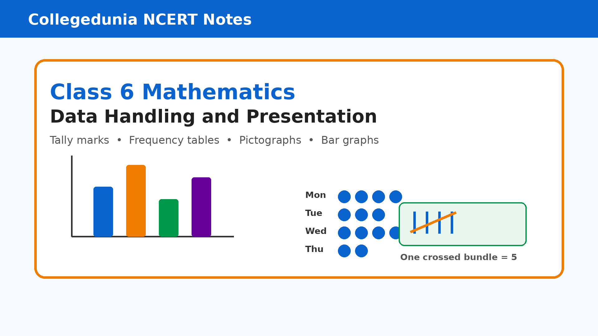
Data Handling and Presentation Class 6 notes help students revise data collection, tally marks, frequency tables, pictographs, bar graphs, and interpretation from the 2026-27 NCERT Ganita Prakash book. These notes keep every display method short and connect it with a clear classroom example.
- Core focus: collecting, organising, presenting, and reading data with evidence.
- Best use: revise one display type, then solve the matching NCERT activity.
- Revision habit: read the key or scale before answering a graph question.
Chapter4DataHandlingandPresentationNotes.pdf?page=1&dpi=150)
Chapter4DataHandlingandPresentationNotes.pdf?page=2&dpi=150)
Chapter4DataHandlingandPresentationNotes.pdf?page=3&dpi=150)
Chapter4DataHandlingandPresentationNotes.pdf?page=4&dpi=150)
Chapter4DataHandlingandPresentationNotes.pdf?page=5&dpi=150)
Chapter4DataHandlingandPresentationNotes.pdf?page=6&dpi=150)
Chapter4DataHandlingandPresentationNotes.pdf?page=7&dpi=150)
Chapter4DataHandlingandPresentationNotes.pdf?page=8&dpi=150)
Chapter4DataHandlingandPresentationNotes.pdf?page=9&dpi=150)
Chapter4DataHandlingandPresentationNotes.pdf?page=10&dpi=150)
Chapter4DataHandlingandPresentationNotes.pdf?page=11&dpi=150)
Chapter4DataHandlingandPresentationNotes.pdf?page=12&dpi=150)
Chapter4DataHandlingandPresentationNotes.pdf?page=13&dpi=150)
Chapter4DataHandlingandPresentationNotes.pdf?page=14&dpi=150)
Chapter4DataHandlingandPresentationNotes.pdf?page=15&dpi=150)
Chapter4DataHandlingandPresentationNotes.pdf?page=16&dpi=150)
Chapter4DataHandlingandPresentationNotes.pdf?page=17&dpi=150)
Chapter4DataHandlingandPresentationNotes.pdf?page=18&dpi=150)
Chapter4DataHandlingandPresentationNotes.pdf?page=19&dpi=150)
Chapter4DataHandlingandPresentationNotes.pdf?page=20&dpi=150)
Chapter4DataHandlingandPresentationNotes.pdf?page=21&dpi=150)
Chapter4DataHandlingandPresentationNotes.pdf?page=22&dpi=150)
Chapter4DataHandlingandPresentationNotes_flat_MobileCard.pdf?page=1&dpi=150)
Chapter4DataHandlingandPresentationNotes_flat_MobileCard.pdf?page=2&dpi=150)
Chapter4DataHandlingandPresentationNotes_flat_MobileCard.pdf?page=3&dpi=150)
Chapter4DataHandlingandPresentationNotes_flat_MobileCard.pdf?page=4&dpi=150)
Chapter4DataHandlingandPresentationNotes_flat_MobileCard.pdf?page=5&dpi=150)
Chapter4DataHandlingandPresentationNotes_flat_MobileCard.pdf?page=6&dpi=150)
Chapter4DataHandlingandPresentationNotes_flat_MobileCard.pdf?page=7&dpi=150)
Chapter4DataHandlingandPresentationNotes_flat_MobileCard.pdf?page=8&dpi=150)
Chapter4DataHandlingandPresentationNotes_flat_MobileCard.pdf?page=9&dpi=150)
Chapter4DataHandlingandPresentationNotes_flat_MobileCard.pdf?page=10&dpi=150)
Chapter4DataHandlingandPresentationNotes_flat_MobileCard.pdf?page=11&dpi=150)
Chapter4DataHandlingandPresentationNotes_flat_MobileCard.pdf?page=12&dpi=150)
Chapter4DataHandlingandPresentationNotes_flat_MobileCard.pdf?page=13&dpi=150)
Chapter4DataHandlingandPresentationNotes_flat_MobileCard.pdf?page=14&dpi=150)
Chapter4DataHandlingandPresentationNotes_flat_MobileCard.pdf?page=15&dpi=150)
Chapter4DataHandlingandPresentationNotes_flat_MobileCard.pdf?page=16&dpi=150)
Chapter4DataHandlingandPresentationNotes_flat_MobileCard.pdf?page=17&dpi=150)
Chapter4DataHandlingandPresentationNotes_flat_MobileCard.pdf?page=18&dpi=150)
Chapter4DataHandlingandPresentationNotes_flat_MobileCard.pdf?page=19&dpi=150)
Chapter4DataHandlingandPresentationNotes_flat_MobileCard.pdf?page=20&dpi=150)
Chapter4DataHandlingandPresentationNotes_flat_MobileCard.pdf?page=21&dpi=150)
Chapter4DataHandlingandPresentationNotes_flat_MobileCard.pdf?page=22&dpi=150)
Chapter4DataHandlingandPresentationNotes_flat_MobileCard.pdf?page=23&dpi=150)
Chapter4DataHandlingandPresentationNotes_flat_MobileCard.pdf?page=24&dpi=150)
Chapter4DataHandlingandPresentationNotes_flat_MobileCard.pdf?page=25&dpi=150)
Chapter4DataHandlingandPresentationNotes_flat_MobileCard.pdf?page=26&dpi=150)
Chapter4DataHandlingandPresentationNotes_flat_MobileCard.pdf?page=27&dpi=150)
Chapter4DataHandlingandPresentationNotes_flat_MobileCard.pdf?page=28&dpi=150)
Student Feedback: In a Collegedunia poll of 10,640 Class 6 students before the 2026 school exams, many students said Chapter 4 became easier after they separated a table question into collect, count, display, and interpret steps.
Source: 2026-27 Class 6 Mathematics student poll.
Data Handling and Presentation Ideas Every Class 6 Student Should Know
Data handling starts with a question. Students collect answers, arrange them, present them in a table or graph, and then write a conclusion. In this chapter, frequency means how many times an item appears in the data.
| Step | What it means | Class 6 example |
|---|---|---|
| Collect | Record answers or measurements. | Ask each student their favourite game. |
| Organise | Put similar answers together. | Use tally marks for each game. |
| Present | Show the data clearly. | Make a pictograph or bar graph. |
| Interpret | Answer the question from the display. | Find the most popular game. |
Every graph answer should quote evidence from the data. For example, write “Hockey is most popular because it has the highest frequency.”
Data Handling and Presentation Class 6 Quick Video Recap
Source: Magnet Brains on YouTube
Collecting and Organising Data in Class 6
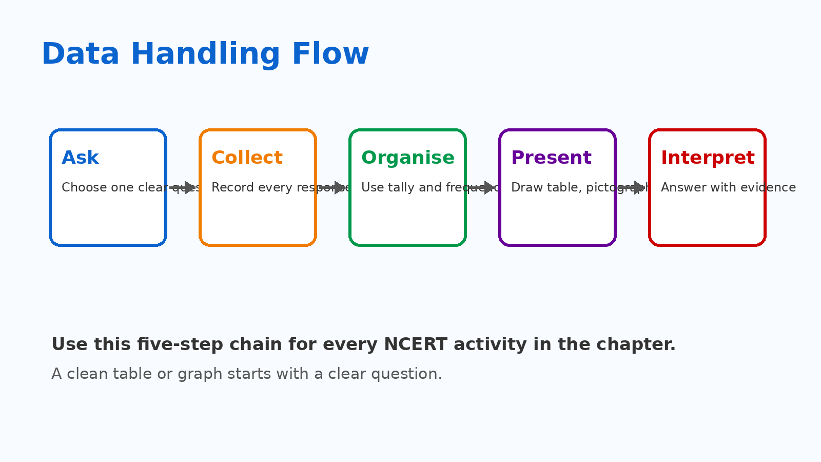
Raw data is the first list of answers. It may look untidy because responses appear in the order in which they were collected. Organising data means grouping similar answers so counting becomes faster and safer.
- Raw list: answers written one by one.
- Grouped list: same answers placed together.
- Frequency table: category and count written in columns.
A table is useful only when the total frequency matches the number of responses. This total check helps students catch missed or double-counted answers.
Tally Marks and Frequency Tables in Data Handling
Tally marks help students count repeated answers. Four straight strokes and one crossing stroke make a bundle of five. After counting bundles of five, add the extra strokes.
| Category | Tally habit | Frequency habit |
|---|---|---|
| Favourite sweets | Mark one stroke for each student. | Add bundles and leftovers. |
| Shoe sizes | Arrange sizes first. | Count each size separately. |
| Library books | Record each day or group. | Check the final total. |
A frequency table gives totals, but it may not name the exact student behind each choice. Keep the raw list if names are needed later.
Pictographs and Bar Graphs in Data Handling and Presentation Notes
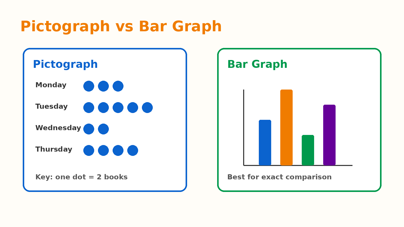
A pictograph uses symbols or pictures. A bar graph uses equal-width bars. Both show the same data visually, but they use different reading habits.
| Display | Read first | Common use |
|---|---|---|
| Pictograph | Key | Simple visual count |
| Bar graph | Scale and axis labels | Exact comparison |
| Frequency table | Column headings | Clean record of data |
In a pictograph, one symbol may stand for 2, 5, 10, or another number. In a bar graph, the bar height shows the frequency. The bar width should stay equal.
How to Interpret Data in Class 6 Chapter 4
Interpreting data means writing what the table or graph shows. The safest answers use words such as most, least, equal, total, and difference.
- Find the largest frequency for “most”.
- Find the smallest frequency for “least”.
- Add all frequencies for “total”.
- Subtract smaller from larger for “how many more”.
Do not overclaim from a small survey. A class survey describes that class only. It cannot prove what every student in the country likes.
Common Mistakes in Data Handling and Presentation Notes
Most errors happen when students skip the key, scale, or table heading. Read the display completely before starting the answer.
- Do not count pictograph symbols before reading the key.
- Do not draw unequal-width bars in a bar graph.
- Do not forget the title and axis labels.
- Do not add when the question asks “how many more”.
- Do not treat a frequency count as a name list.
Write one evidence line with every interpretation. This makes the answer stronger and easier to check.
Related Resources for Data Handling and Presentation Class 6
| Resource | How it helps |
|---|---|
| Data Handling and Presentation NCERT Solutions | Step-by-step answers to NCERT activities and questions. |
| Data Handling and Presentation NCERT Book PDF | Official chapter text and classroom examples. |
| Data Handling and Presentation Handwritten Notes | Notebook-style quick revision for this chapter. |
NCERT Notes for Class 6 Mathematics Ganita Prakash: All Chapters
| Chapter | NCERT Notes |
|---|---|
| Chapter 1 | Patterns in Mathematics Notes |
| Chapter 2 | Lines and Angles Notes |
| Chapter 3 | Number Play Notes |
| Chapter 4 | Data Handling and Presentation Notes |
| Chapter 5 | Prime Time Notes |
| Chapter 6 | Perimeter and Area Notes |
| Chapter 7 | Fractions Notes |
| Chapter 8 | Playing with Constructions Notes |
| Chapter 9 | Symmetry Notes |
| Chapter 10 | The Other Side of Zero Notes |
Data Handling and Presentation Class 6 Notes FAQs
Ques. What do Data Handling and Presentation Class 6 notes cover?
Ans. These notes cover data collection, tally marks, frequency tables, pictographs, bar graphs, graph scales, and interpretation questions from NCERT Ganita Prakash Chapter 4.
Ques. What is frequency in Class 6 data handling?
Ans. Frequency is the number of times a category or value appears in the data. For example, if 8 students choose Hockey, the frequency of Hockey is 8.
Ques. How is a pictograph different from a bar graph?
Ans. A pictograph uses symbols and a key. A bar graph uses equal-width bars and an axis scale to show frequencies.
Ques. What is the best way to revise this chapter?
Ans. Revise one display type at a time. First read the rule, then solve one NCERT example, and finally write the interpretation with evidence.
Ques. Are these notes based on the 2026-27 NCERT book?
Ans. Yes. The notes follow Class 6 Mathematics Ganita Prakash Chapter 4 for the 2026-27 session.



Comments