



Education Journalist | Study Abroad Lead
Pictographs are used in Statistics where the data is represented by icons and pictures relevant to the data. Being one of the simplest ways to represent statistical data, pictographs represent the frequency of data while using symbols or images that are relevant to the data. To be more precise, pictographs are charts where the data and the frequency of data are represented. Pictographs are a great way of representing data as it is visually understandable and is mostly used in data handling. This is the foundation for the interpretation of data using pictorial representation.
| Table of Content |
Key Takeaways: Pictographs, Data Handling, Visual Representation, Statistics, Frequency, Icons, Key, Whole Numbers, Fractions
What are Pictographs?
[Click Here for Sample Questions]
As the name suggests Pictograph is a method of representing data using pictures and icons. Each icon in the pictograph represents something. Pictographs are easy to understand because of their visual representation. In a pictograph, there is a key that denotes the value of a symbol. It is required that all the symbols and icons in a pictograph should be of the same size.
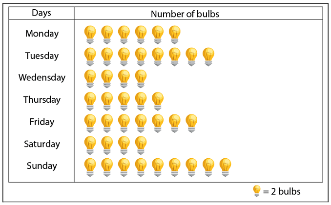
Pictograph
How to Make a Pictograph?
[Click Here for Sample Questions]
There are some pre-defined ways in which one can make a pictograph. The first step is
- Collecting Data: The first step is to collect the data from various sources available. Then make a table from the data representing all the information in a systematic manner. And finally, review the data for any errors.
- Picking Up Symbol: Pick a symbol or icon to represent the data in your table. The picked symbol should be relatable to the data or else it will create confusion. If the data is of the no of TV sold in a shop then an icon of football will be really confusing to understand. Therefore the symbol should be picked carefully or else it will create misinterpretation.
- Assign a Key: There are cases when the frequency of the data is too high and one object cannot be assigned one icon. Every icon should be assigned a number so that one icon will represent that many numbers of actual data. Assign a key to the data. This value should be mentioned with the pictograph. For example, one TV icon will represent 100TV actually. This is called the key value of a pictograph.
- Draw the Pictograph: Now is the right time to draw the pictograph. Draw the two columns for the data and make as many rows as many values are present in the data. Then draw the chosen symbol that represents the frequency. Point to be noted that the symbol can be fractions if the frequency is not a whole number.
- Review the Data: Finally, review the pictograph so that it is in sync with the table that was made in the first place. Now the data from the pictograph can be analyzed for various purposes.
Read More: Frequency Distribution Table
Example of A Pictograph
[Click Here for Sample Questions]
Pictographs can be easily understood by an example. Consider a shopkeeper William, who sold the red boxes in the week given by the table
| Days | No of Red Boxes |
|---|---|
| Monday | 4 |
| Tuesday | 2 |
| Wednesday | 3 |
| Thursday | 5 |
| Friday | 8 |
| Saturday | 1 |
The pictographic representation of this data is
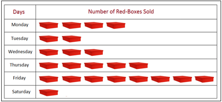
Here one represents  one box.
From the given pictograph it can be easily seen that
Total sales of week = 23
Lowest sales were on Saturday = 1
Maximum sale was on Friday = 8
It is easy to understand the data from pictograph.
Read More: Graphical Representation of Data and Central Tendency
Guidelines to Make a Pictograph
[Click Here for Sample Questions]
- All the symbols and icons should be of the same size.
- A fraction of an icon can also be used if the frequency is not representable by the whole icon.
- The amount of data in the table which is represented by an icon can be calculated as follows:
Amount = Number of times the icon appears in the table * the weight of one icon(the key value)
Let the value of each symbol be ‘N’ and the number of times the icon appears in pictograph be ‘S’
Then the actual amount = N * S.
Read More: Frequency Polygons
Things to Remember
- Pictographs are used in statistics where the data is represented by icons and pictures relevant to the data.
- Pictographs are easy to understand because of their visual representation.
- It is required that all the symbols and icons in a pictograph should be of the same size.
- Key is assigned because there are cases when the frequency of the data is too high
- A fraction of an icon can also be used if the frequency is not representable by the whole icon.
- If no key has been mentioned, it can be assumed that the key value is 1.
- Pictographs are used because there are chances that the graphical or any other representation is difficult and is prone to errors.
Sample Questions
Ques. What is meant by a pictograph? (3 Marks)
Ans. Pictograph is a method where data is represented by symbols and icons. It is mostly used in statistical mathematics to analyse data. Pictographs represent the occurrence of data by using appropriate images. A key is assigned to every icon so that one icon represents a particular frequency of data. It is used when the frequency of data is too high that one icon cannot represent one element, or it will not fit in the table.
Ques. What are the advantages of pictographs? (3 Marks)
Ans. A pictograph helps in representing a huge amount of data in an easy manner.
It is known that pictures help people understand better than written data. Further, the symbols attract the attention of the viewer and provide a smart way of representing data.
All the required information can be processed by just looking at the pictograph. It is one of the main disciplines of data handling.
Ques. What is the use of pictographs? (3 Marks)
Ans. A pictograph uses symbols and icons to represent the data. This way of representation gives meaning to the statistical data. Pictographs are used because there are chances that the graphical or any other representation is difficult and is prone to errors. Mistakes in representing data can lead to misinterpretation, different outcomes, wrong values. Therefore pictographs became an important way of representing data that is visually understandable and makes the data accurate.
Ques. Write the answers to the following questions based on the given pictograph. (3 Marks)
i) What is the total number of students going by different modes of transportation?
ii) What is the total number of students?
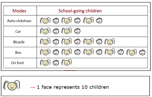
Ans. i) Given that one face symbol represents 10 children.
So we get N = 10
For autorickshaw, S = 6.
No of students going by autorickshaw: 10 * 6 = 60
No of students going by car = 4 * 10 =40
No of students going by bicycle = 7 * 10 =70
No of students going by bus = 10 * 10 =100
No of students going on foot = 3 * 10 = 30
ii) Total number of students = 60+40+100+30+70 = 300
Ques. The following pictograph shows the number of illiterate children of 5 small towns. (3 Marks)
i) Find out the number of illiterate children in the five towns.
ii) Find out the total number of children.

Ans. i) Here no key value is given,
Therefore one icon represents one child.
In Melrose there are 5*1 = 5 children
In Marengo there are 4*1 =4 children
In Midway there are 5*1 = 7 children
In parral there are 3*1 = 3 children
In Rushville there are 2*1 =2 children
ii) Total number of children in five cities = 4+ 5 + 7 + 3 + 2 =21
Ques. The following pictograph shows the votes of the students for their favourite subject. (3 marks)
i) Write the favourite subjects of students in increasing order.
ii) What is the total number of votes.
iii) Which subject is least liked?

Ans. Since there is no given key-value, it can be assumed that
Every symbol represents one vote.
For maths, the total number of votes = 8
For reading, the total number of votes = 6
For social studies, the total number of votes =3
The list of subjects in increasing order is -> social studies < reading < maths
ii) Total number of votes is 8+ 6 + 3 =17
iii) Social studies is least liked subject with minimum votes.
Ques. What do you understand by the term ‘Key to Pictograph’? (3 Marks)
Ans. The key to a pictograph is used to let us know many items each picture stands for. When the frequency of the data is too large and one item cannot be assigned one icon, we use keys in the pictograph. Every icon is assigned a number, which means that one icon will represent that many numbers of actual data. For instance, 1 apple in a pictograph can be used to represent 100 apples in the case when the number of apples to present on the pictograph is too high.
Read More:



Comments