



Content Curator
Pictograph is a term for a visual or pictorial representation of data. For example, a bar graph allows data stakeholders to visually show a wide range of data, which not only improves understanding but also makes things easier for the merchant. The difference between realistic and logical visuals is a common one in graphical representations. Paintings, Photographs and drawings that are realistic have solid qualities & structures in common with the items they describe. A bar graph, often known as a bar chart, is the most basic visual data representation.
Read Also: Class 8 Introduction to Graph
| Table of Content |
Key terms: Bar Graph, Pictorial, Group, Rectangular, Expenditure, Representation,data
Pictorial Representation Using Bar Graph
[Click Here for Sample Questions]
A bar graph, also referred to as a bar chart, is a graph that displays data in the form of rectangular bars. The length of the bar is proportionate to the values it represents in this case. The bar graph can be formed both ways: vertical and horizontal orientation. The term “column bar graph” refers to a vertical bar graph.
Bar graphs are used as comparative tools because they can display multiple groups of data on the same graph. The length of the rectangular bar refers to the value of each category. As these rectangular bars are proportional, the disparities between them may be seen much more easily than with words. Let’s look at bar graphs in more detail.
Bar Graph
Assume your monthly salary is 15k, and You are free to spend this money in any way you see fit. You spend this money on Groceries, entertainment, electricity bill and all. What you observe is that the money appears to vanish very soon. So, you reluctantly create a bar chart to know about where you are actually spending your money so that you can balance your expenditure accordingly. However, you'll need data to make a bar chart. You should keep track of what you spend money on and how much you spend it on. After a month, you have the details of this months’ expenditure, and they look something like this.
| Expenditure | 1 Month |
|---|---|
| Groceries | 4000 |
| Electricity Bill | 2000 |
| Entertainment | 1500 |
| Outdoors | 4000 |
| Savings | 2500 |
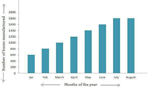
The first thing to notice is how the information is organized. It is the first step in the process of making a bar graph. All the expenditures are all classed together. The same can be said for other things as well. When talking about a bar graph, it was noted that the values are represented by a rectangular bar, the length of which is proportional to the data value. Another feature of a bar graph comes into play at this point. Let’s look at an example,
Bar Graph
A uniform scale is required for a bar graph. The scale determines how the numerical data is converted into a rectangular representation. A bar graph is a visual depiction of numbers made up of bars of varying widths and lengths that are proportional to the number.
For example, if you use a 25 cm long rectangular bar to symbolize the money you spent on chocolate, the scale is 1 rupee equals one unit on the graph, i.e. one rupee equals one centimeter. However, it is evident that a large graph is required for this form of representation. The problem with scale is that we have complete control over it. So, instead of 25 cm, a rectangular bar of length 25 millimeters can be used to indicate the same number, and here the scale is 10 rupees equals one unit, i.e. 10 rupees equals one centimeter.
As clear information about the scale is critical for data interpretation, it is critical to state the scale of your graph on both the x-axis and the y-axis. Using the latter scale, one centimeter equals ten rupees. It’s vital to remember that all of the data groups in the bar graph have the same scale.
Properties of Bar Graph
[Click Here for Sample Questions]
Here are some important properties of Bar Graph:
- Each bar or column in a bar graph must have the same width.
- All rectangular bars must have equal space between them.
- The base of the bars is common in a bar graph.
- The height of the bars proportionally represents the data in the bar graph.
- Depending on the data, the bars can be drawn horizontally or vertically.
Check More: Graphical Representation of Data
Types of Bar Graphs
[Click Here for Sample Questions]
A bar graph is used to show data in a graphical representation. Here are some different types of Bar graphs:
- Vertical bar graph
Vertical bar graphs are graphs or charts in which the given data is shown vertically in a graph or chart with the use of rectangular bars that display the data measure. The y-axis indicates the value of the height of the rectangular bars, which reflects the quantity of the variables stated on the x-axis, and the x-axis shows the vertically drawn rectangular bars.
- Horizontal bar graph
Horizontal bar graphs are graphs in which the provided data is displayed horizontally by rectangular bars that display the data measure. The variables or classifications of the data must be written, and then rectangular bars must be constructed horizontally on the y-axis, with the length of the bars equivalent to the values of the various variables present in the data on the x-axis.
- Stacked Bar Graph
The composite bar graph is another name for the stacked bar graph. It separates the entire bar into sections. Each segment of a bar is represented by a different colour to make it easier to distinguish between the many categories. It necessitates appropriate labelling to distinguish the various portions of the bar. In a stacked bar graph, each rectangular bar represents the entire graph, and each segment in the rectangular bar represents the various components of the entire graph. It can be displayed horizontally or vertically.
- Grouped Bar Graph
The clustered bar graph is another name for the grouped bar graph. It's used to represent the discrete value of two or more categorical data sets. Rectangular bars are clustered by position for levels of one categorical variable, with the secondary category level in each group shown in the same colour. It can be displayed in both vertical and horizontal orientations.
Pictorial Representation of Data using Vertical Bar Graph
Vertical bar graphs are frequent visual representations that employ vertical bars to communicate data. The categories are represented by the horizontal axis, while the data for each category is represented by the vertical bars. The x-axis is the horizontal axis, while the y-axis is the vertical axis.
Vertical bar graphs can also be used to depict a sequence of data and how it changes over time. All of the vertical bars run from the x-bottom axis to its top.
Pictorial Representation of Data Using Horizontal Bar graph
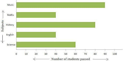
The data is represented in the horizontal bar graph by bars that are parallel to the x-axis. The types are defined on the y-axis, and the data is represented by horizontal bars. The horizontal graph's bars run from left to right along the x-axis.
For example, A class teacher of Grade 5 made a note of the students who passed in every subject in the class. She represented the data in the form of a horizontal bar graph to know the passing students in every subject.
Pictorial Representation of Data Using Horizontal Bar graph
You've seen how the bar graph of your first week's expenses looks. Assume you keep track of where you spent your money for a while longer. You discover that your expenses for week two differ slightly from those for week one. The second-week expenses are as follows:
| Expenditure | 1st Month | 2nd Month |
|---|---|---|
| Groceries | 4000 | 4000 |
| Electricity Bill | 2000 | 1500 |
| Entertainment | 1500 | 1500 |
| Outdoors | 4000 | 6000 |
| Savings | 2500 | 2000 |
They can all be plotted on the same bar graph because they are all part of the same group. Remember that the scale is the same for all the data in the graph. Rather than charting them independently, you can compare the changes over a longer time span or across a wider range of data by grouping them together. Now that we've plotted everything together, we'll be able to see the differences in weekly spending.
This process also allows you to control your spending because you now know where your money is going. This allows you to determine whether your expenses are necessary.
Read More: Class 8 Introduction to Graph MCQ’s
Things to remember
[Click Here for Sample Questions]
- A bar graph, often referred as a bar chart, is a graph that displays data in the form of rectangular bars.
- A bar graph is used to show data in a graphical representation.
- For pictorial representation, there are 3 kinds of bar graphs to choose from: Vertical bar graph, horizontal bar graph and Double bar graph.
- The bar graph can be formed both ways: vertical and horizontal orientation. The term “column bar graph” refers to a vertical bar graph.
- Bar graphs are used as comparative tools because they can display multiple groups of data on the same graph.
Sample Questions
Ques. Consider the bar graph below, which represents the number of cakes baked from Monday to Saturday.
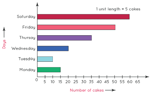
With the help of the above graph, now determine on which day were the minimum number of cakes baked and also state that how many cakes were baked on that day? (3 Marks)
Ans. We can plainly see from the graph above that the fewest number of cakes were prepared on Tuesday because Tuesday is the smallest bar. Following this bar, we can see that 10 cakes were produced on this particular day.
Ques. The number of cars produced by a factory for five consecutive weeks is given in the table below:
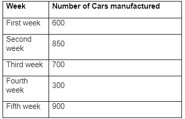
i) Draw a bar graph to represent the tabular data.
ii) Calculate the total number of cars manufactured in the fourth week. (5 Marks)
Ans.
- The data represented by the bar graph is as follows:
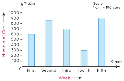
- The total number of cars made in the fourth week = 300, as can be seen in the graph above.
As a result, the total number of cars produced during the fourth week was 300.
Ques. From Monday to Saturday, the following bar graph depicts the sale of shirts in a readymade shop. On Thursday, how many shirts were sold? (1 Mark)
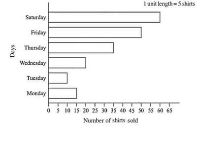
Ans. The quantity of shirts sold on Thursday is 3535 units, as seen in the bar graph.
Ques. The bar graph below depicts Ajay's performance on a half-yearly examination in various courses.
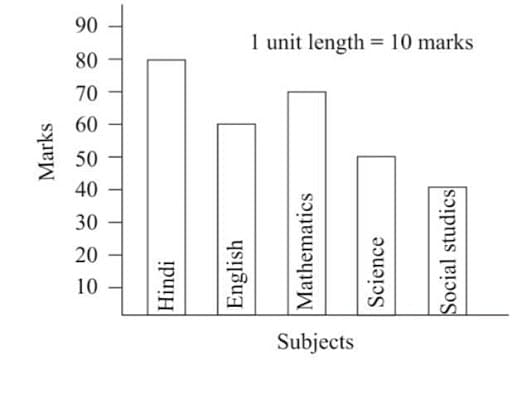
In which subject has he scored minimum marks? (2 Marks)
Ans. The minimum mark for Social Studies is 4040, as shown in the bar graph.
As a result, Ajay received the lowest possible grade in Social Studies.
Ques. A poll of 120 students was conducted in a school to determine which activity they preferred to pursue in their spare time.
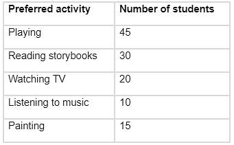
Make a bar graph using the data above using a scale of 1 unit length = 5 pupils. Apart from playing, what is the most popular pastime among students? (3 Marks)
Ans. A bar graph is a visual representation of data that uses vertical or horizontal bars of consistent width to represent data. They can be drawn on the horizontal axis (say, the X-axis) with equal spacing between them to represent the variable. The variable’s values are displayed on the vertical axis (say, the Y-axis), and the heights of the bars are determined by the variable’s values.
As a result, rather than playing, most students prefer to read storybooks.
Ques. The following bar graph depicts the amount of wheat purchased by the state government from 1998 to 2002. Which year saw the lowest wheat production? (2 Marks)
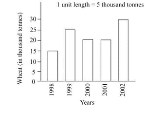
Ans. It is obvious that wheat output in 1998 was at a minimum, which was 15.
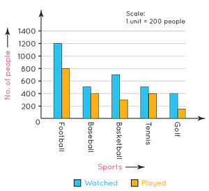
Ques. The information gathered from a city survey is presented below. Make a double bar graph with a scale that is acceptable. (4 Marks)
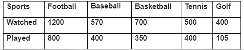
Ans. The data can be represented by the following double bar graph:
Ques. Differentiate between a bar graph and a histogram. (3 Marks)
Ans. A bar graph and a histogram are differentiated as follows:
| Bar Graph | Histogram |
|---|---|
| Bar graphs help in the pictorial representation of categorical data in the form of rectangular bars (as heights or lengths) and compare it. | Histograms help in the frequency distribution of the quantitative data with continuous class intervals. |
| The data provided is represented pictorially. | The data provided is represented graphically |
| Discrete variables are distributed | Non-discrete variables are distributed. |
| Equal spacing between each solid bar and they do not touch each other. | No equal spacing between each solid bar and they touch each other. |
| The data used is categorical | The data used is quantitative |
Ques. In a particular section of Class IX, 40 students were asked about their birth month and the following graph was prepared for the data obtained.
In a particular section of Class IX, 40 students were asked about their birth month and the following graph was prepared for the data obtained.
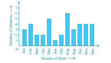
Answer the following questions after observing the graph given above.
a) How many students were born in the month of November?
b) In which month was the maximum number of students born. (3 Marks)
Ans. The variable shown on the X-axis in the given bar graph is 'Months of Birth,' while the value of the variable plotted on the Y-axis is 'Number of Students.'
By looking at the graph, one can see that there are four individuals born in November.
By looking at the graph, it can be seen that the most individuals were born in August.
Ques. The following table shows the favourite sports of 250 students of a school. (3 Marks)
Represent the data by a bar graph.

Ans.



Comments