



Class 11 Economics Chapter 4 Presentation of Data notes help students revise textual presentation, tables, bar diagrams, pie charts, histograms, ogives and line graphs for the 2026-27 syllabus. The page follows NCERT Statistics for Economics and keeps each diagram choice easy to compare.
- Download the Presentation of Data notes PDF for offline revision.
- Revise tables, captions, stubs, units, sources and notes.
- Use the diagram tables to pick bar, pie, histogram, ogive or line graph.








Student Feedback: In a Collegedunia poll of 12,420 Class 11 Economics students conducted before the 2026 boards, 74% of students said histogram, frequency polygon and ogive were the easiest diagrams to mix up. These notes place the diagram rules side by side.
Presentation of Data Notes: Text, Tables and Diagrams
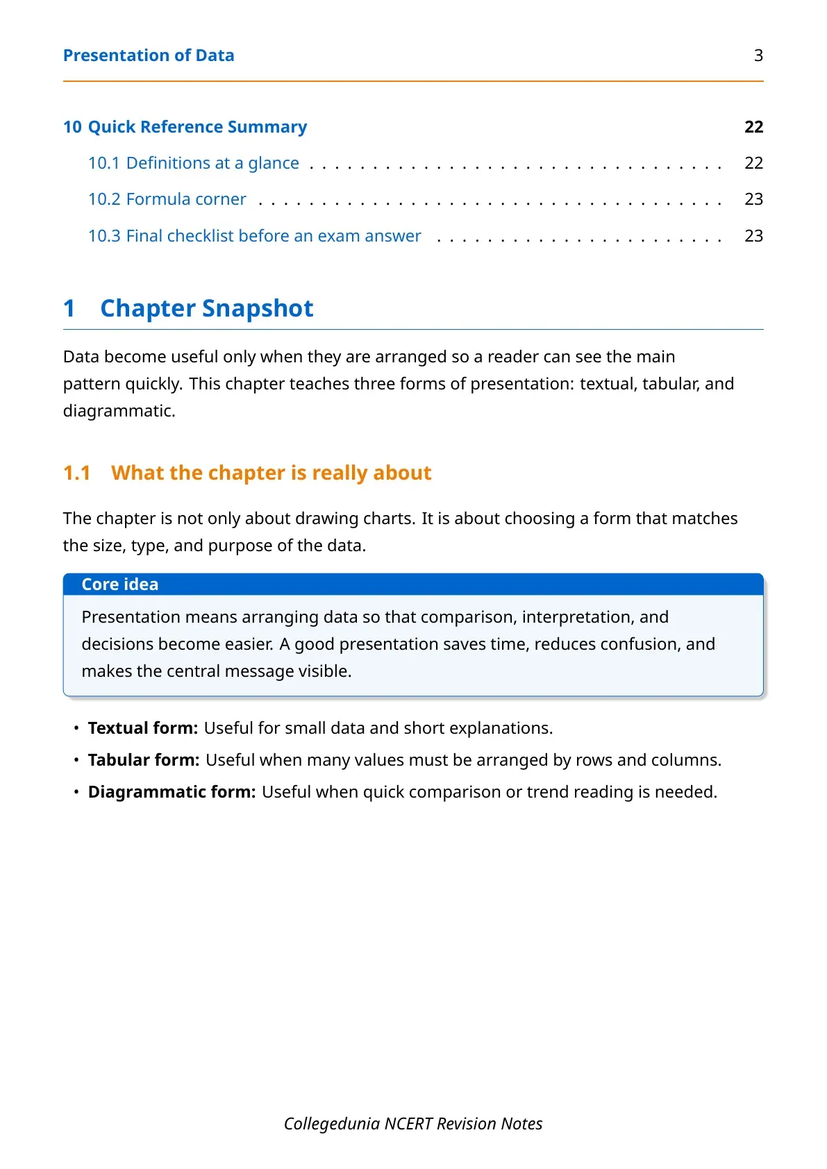
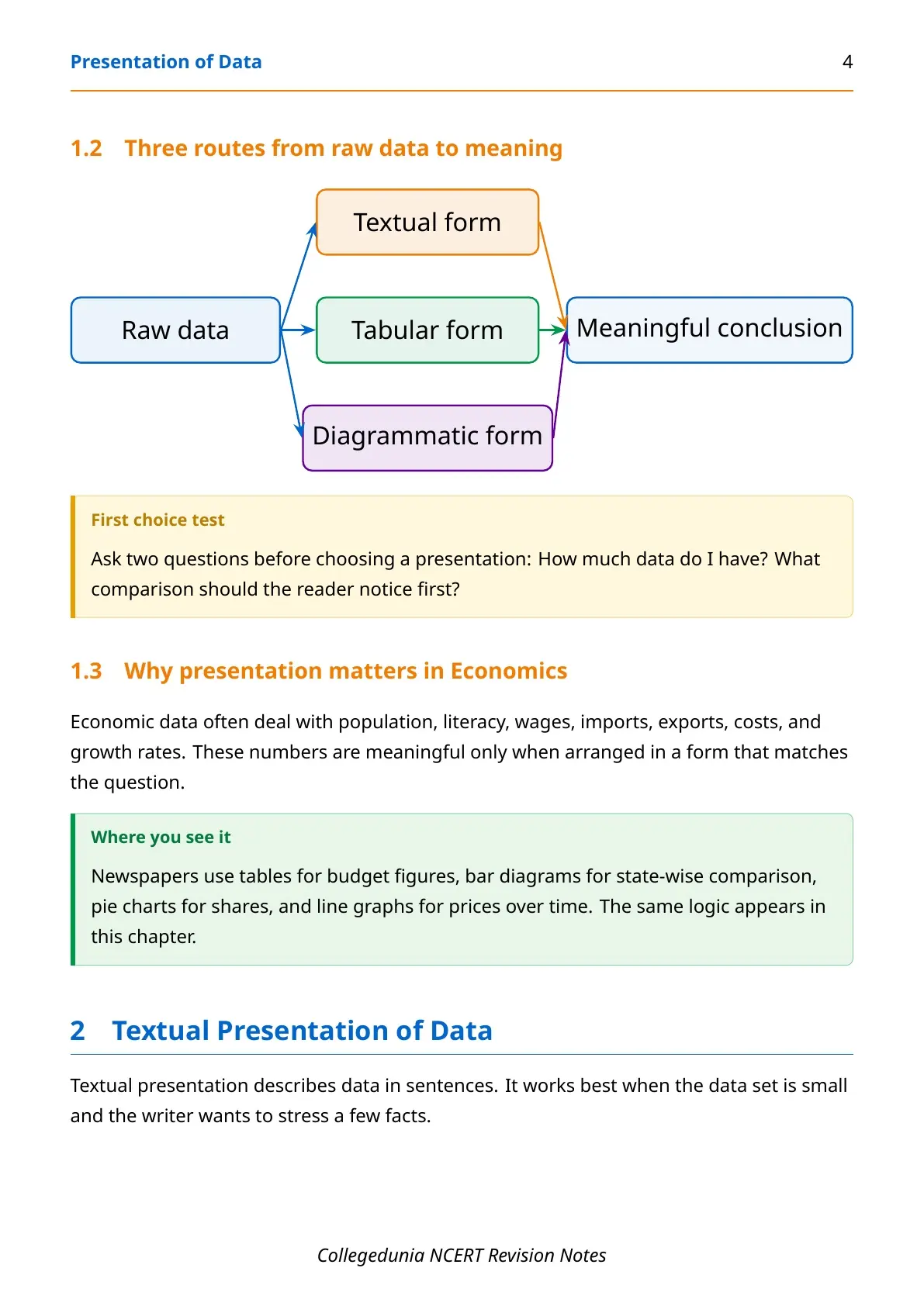
Presentation of data means arranging facts so the main pattern becomes clear. NCERT gives three forms: textual, tabular and diagrammatic presentation. Text explains small data, tables organise exact values, and diagrams show comparison quickly.

| Form | Best used when | NCERT example |
|---|---|---|
| Textual | Data are small and need explanation | Bandh survey paragraph |
| Tabular | Many values need exact comparison | Literacy by sex and location |
| Diagrammatic | Students need a quick visual pattern | Bar diagram, pie diagram, ogive |
Textual Presentation of Data for Class 11 Economics
Textual presentation describes data inside sentences. It is useful when only a few values must be reported with context.
- Strength: it explains the story behind the number.
- Limit: students must read the whole paragraph to compare values.
- Exam clue: convert crowded text into a table when many figures appear.
Textual form is simple, but it is not the fastest way to compare many values.
Tabular Presentation of Data and Parts of a Table
A statistical table arranges data in rows and columns. A good table needs a clear number, title, captions, stubs, body, unit, source and note.
| Table part | Meaning | Why it matters |
|---|---|---|
| Table number | Identity of the table | Helps students refer to it |
| Title | Short description of content | Removes confusion |
| Captions | Column headings | Show what each column means |
| Stubs | Row headings | Show what each row means |
| Body | Actual data values | Contains the main information |
| Unit | Measurement such as per cent, crore or rupees | Prevents wrong reading of values |
| Source | Origin of the data | Builds trust in the table |
| Note | Special explanation such as rounding | Clarifies unusual table details |
Classification Types in Presentation of Data Notes
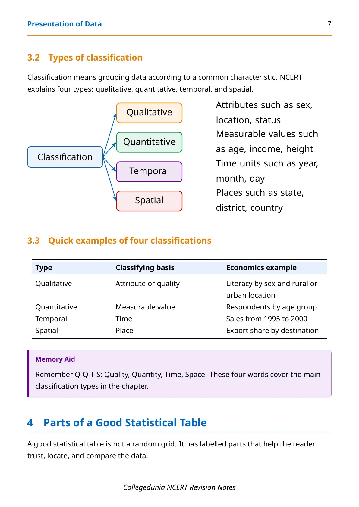
Tables become useful only after data are classified. NCERT explains four types of classification for this chapter.
- Qualitative: grouping by attributes like sex, status or location.
- Quantitative: grouping by measurable values like age or income.
- Temporal: grouping by time, such as years or months.
- Spatial: grouping by place, such as states or countries.
Presentation of Data Diagram Practice for Class 11
Source: Magnet Brains on YouTube
Bar, Pie and Histogram Rules in Presentation of Data
Different data need different diagrams. A neat diagram can still be wrong if the data type does not match the method.
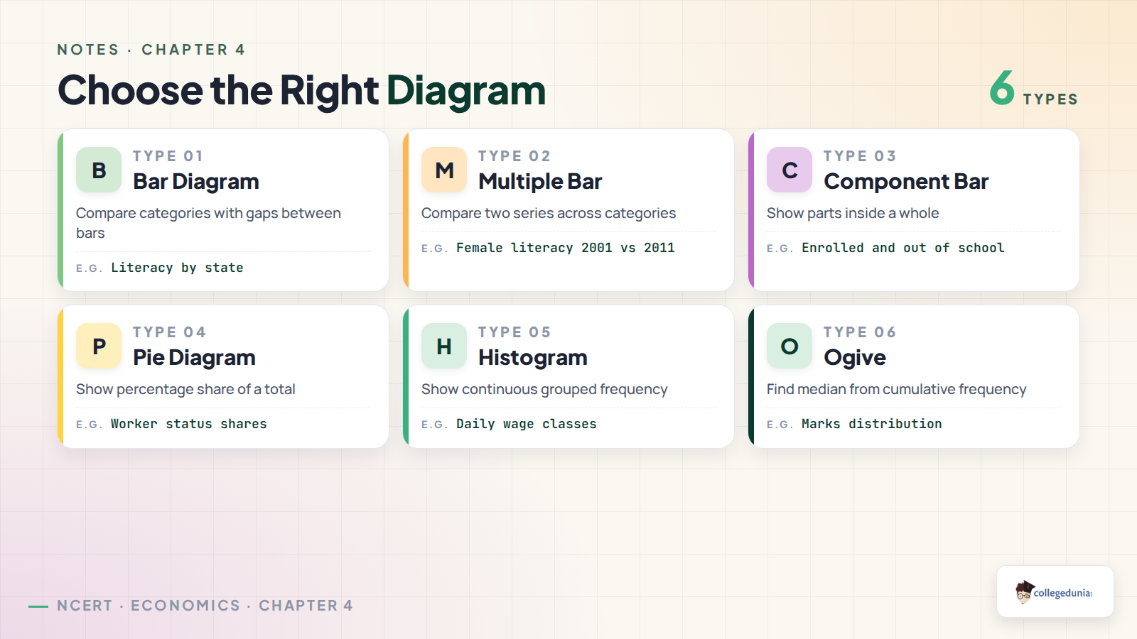
| Diagram | Used for | One rule to remember |
|---|---|---|
| Simple bar diagram | One series across categories | Bars have equal width and equal gaps |
| Multiple bar diagram | Two or more related series | Bars in each group must stay close |
| Component bar diagram | Parts of a whole | Each bar shows the total and its parts |
| Pie diagram | Percentage share of a total | Convert each percentage into angle |
| Histogram | Continuous grouped frequency | Rectangles touch each other |
Frequency Polygon, Frequency Curve and Ogive
Frequency diagrams are used for grouped frequency distributions. They help students read the shape, spread and median of a distribution.
- Frequency polygon: join class-mark frequency points with straight lines.
- Frequency curve: draw a smooth curve close to the polygon points.
- Less than ogive: plot cumulative frequency against upper limits.
- More than ogive: plot cumulative frequency against lower limits.
The intersection of the less than and more than ogives gives the median graphically.
Arithmetic Line Graph in Presentation of Data
An arithmetic line graph is also called a time series graph. Time stays on the x-axis, while the variable value stays on the y-axis.
| Line graph use | What students read | NCERT-style example |
|---|---|---|
| Trend | Rising, falling or stable movement | Exports over years |
| Gap | Distance between two series | Imports above exports |
| Change speed | Sharp or slow movement | Faster rise after 2001-02 |
Download Presentation of Data Class 11 Economics Notes PDF
The PDF above gives a full revision set for Presentation of Data. It covers textual presentation, table parts, classification, bar diagrams, pie diagrams, histograms, polygons, curves, ogives and line graphs.
| Study pass | What to revise | Target |
|---|---|---|
| Pass 1 | Textual and tabular presentation | Definition-based answers |
| Pass 2 | Bar diagram, pie diagram and histogram | Diagram choice questions |
| Pass 3 | Ogive and line graph | Median and trend questions |
Related Class 11 Economics Resources for Presentation of Data
Also Check: use these links when you need the same chapter in another format.
| Resource | Best used for | Link |
|---|---|---|
| NCERT Book PDF | Official chapter wording and examples | Presentation of Data NCERT Book PDF |
| NCERT Solutions | Answers to textbook exercises | Presentation of Data NCERT Solutions |
| Handwritten Notes | Fast visual revision before tests | Presentation of Data Handwritten Notes |
Class 11 Economics Notes for All Chapters
Use the table below to move through the Statistics for Economics notes in chapter order.
| Chapter | Notes Link |
|---|---|
| Chapter 1 | Introduction Notes |
| Chapter 2 | Collection of Data Notes |
| Chapter 3 | Organisation of Data Notes |
| Chapter 4 | Presentation of Data Notes |
| Chapter 5 | Measures of Central Tendency Notes |
| Chapter 6 | Correlation Notes |
| Chapter 7 | Index Numbers Notes |
| Chapter 8 | Use of Statistical Tools Notes |
Presentation of Data Class 11 Economics Notes FAQs
Ques. What is covered in Class 11 Economics Chapter 4 Presentation of Data notes?
Ans. The notes cover textual presentation, tabular presentation, parts of a table, classification, bar diagrams, pie diagrams, histograms, ogives and line graphs.
Ques. What are the three forms of presentation of data?
Ans. The three forms are textual presentation, tabular presentation and diagrammatic presentation.
Ques. Which diagram is used to show parts of a whole?
Ans. A component bar diagram or a pie diagram can show parts of a whole. Pie diagrams need percentage values converted into angles.
Ques. What is the difference between a bar diagram and a histogram?
Ans. Bar diagrams compare categories and leave gaps between bars. Histograms show continuous grouped frequency, so rectangles touch each other.
Ques. How do ogives help in Presentation of Data?
Ans. Ogives show cumulative frequency. The point where less than and more than ogives meet gives the median graphically.



Comments