




The 2026-27 NCERT keeps Class 11 Economics Chapter 4 Presentation of Data in full for the CBSE course. These class 11 economics handwritten notes chapter 4 Presentation of Data follow the 2026-27 NCERT and cover textual presentation of data, tabular presentation and parts of a table, simple, multiple and component bar diagrams. This page hosts the notes PDF,.
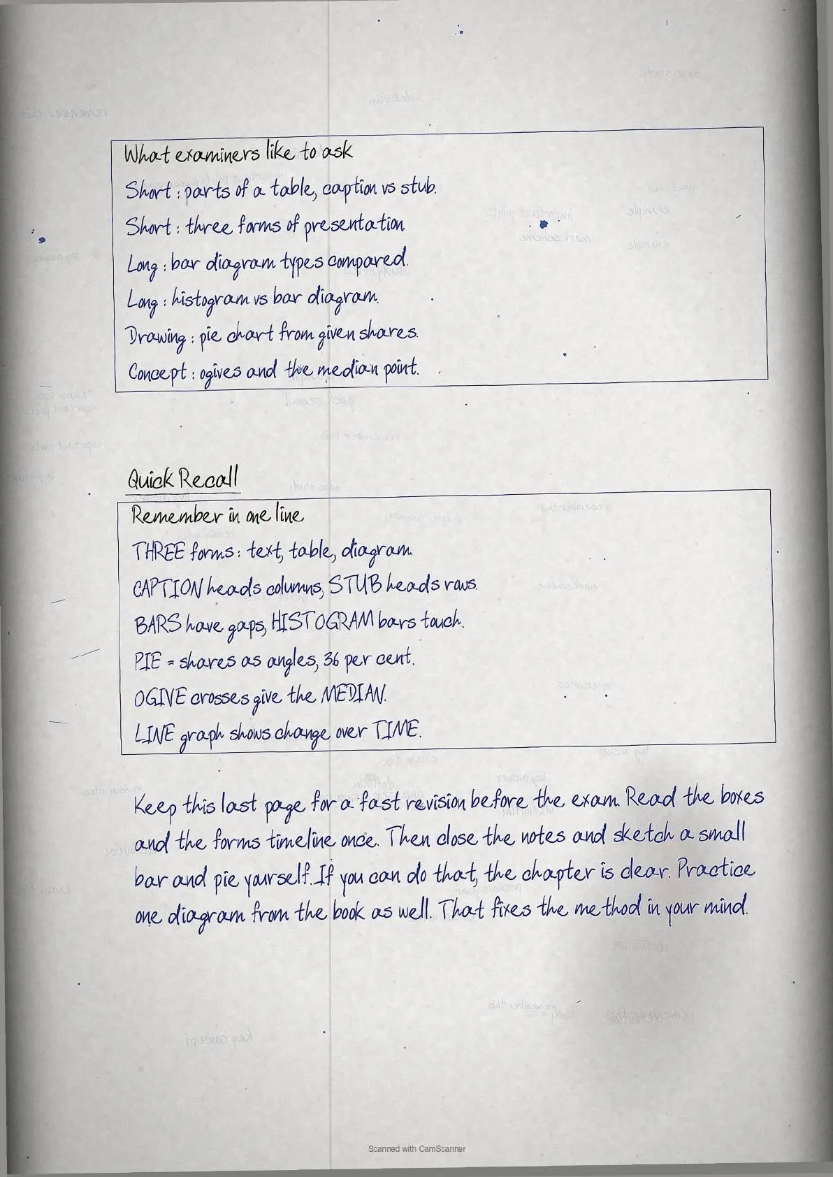
- CBSE Class 11 Weightage: a scoring chapter in the Economics paper, asked in short and long answers.
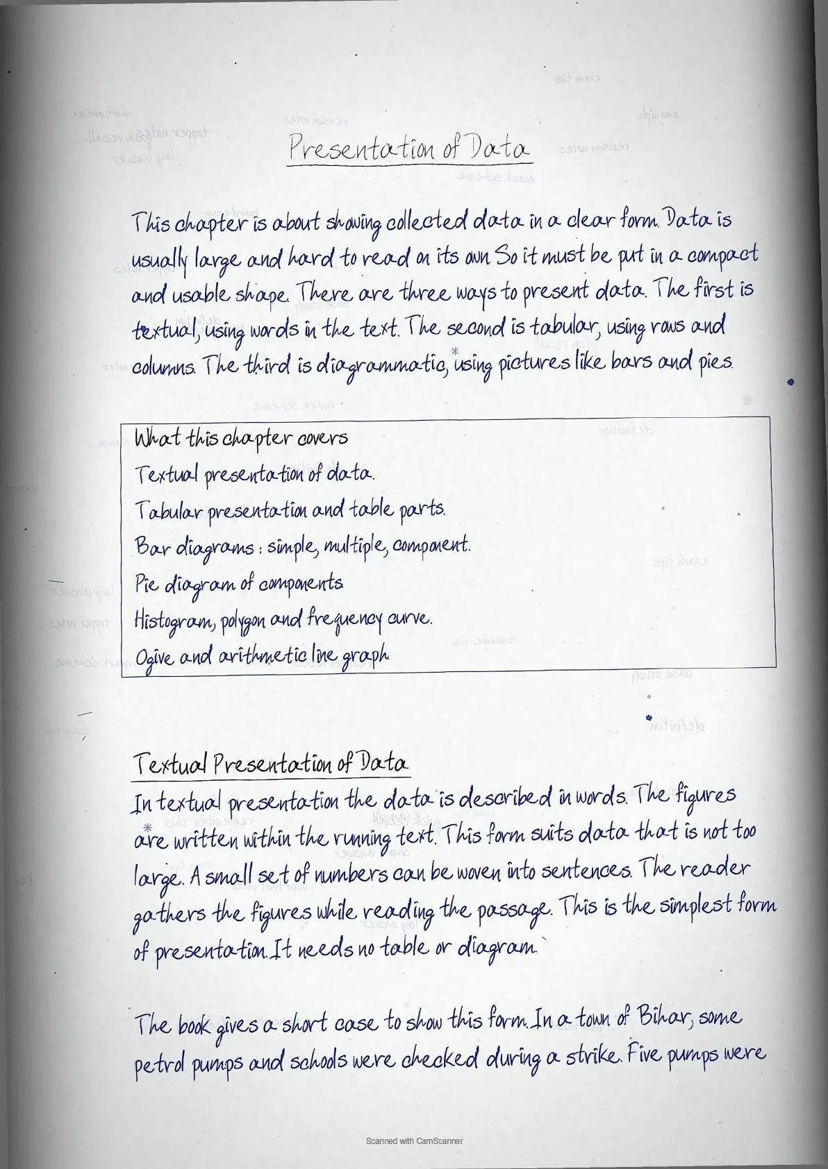
- What the notes cover: textual presentation of data, tabular presentation and parts of a table, simple, multiple and component bar diagrams, pie diagram of a whole.
- Best for: quick revision before Class 11 exams and a base for CUET later.
You can read the complete class 11 economics handwritten notes for Presentation of Data, with key terms, boxed definitions, and quick revision points, in the PDF below.
These handwritten notes are written by subject teachers, mapped to the 2026-27 NCERT, and checked against the last five years of CBSE Class 11 Economics papers.
Presentation of Data Topic-wise Weightage for CBSE Class 11 Economics
Some parts of this chapter are asked more often than others. The table below shows which sub-topics to revise first, based on recent CBSE Class 11 question trends.
| Sub-topic | Weightage | CBSE Frequency |
|---|---|---|
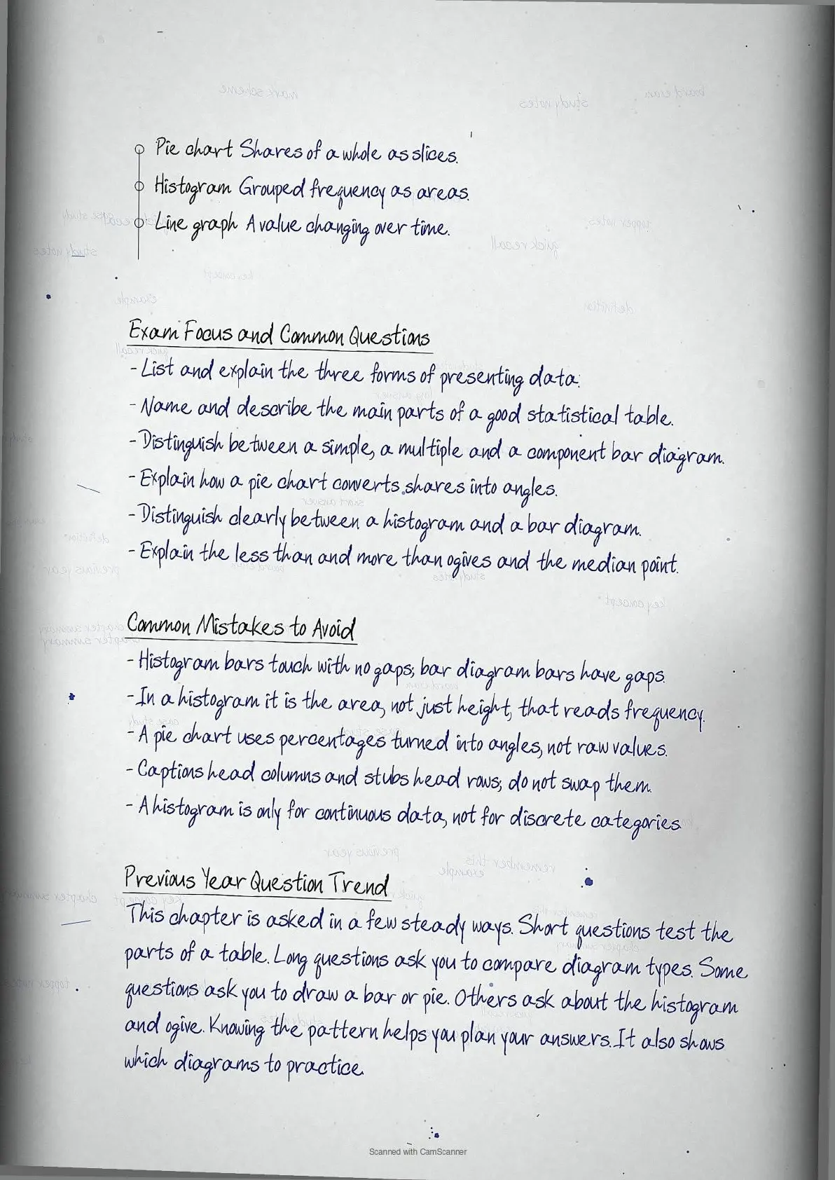
| Bar diagrams: simple, multiple, component | High | asked most years |
| Histogram vs bar diagram | High | frequent comparison question |
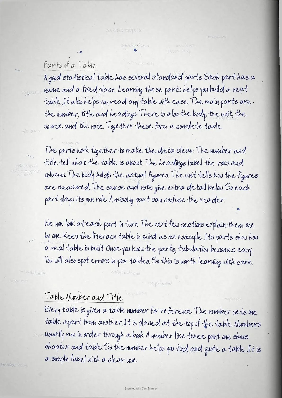
| Parts of a statistical table | Medium | asked often |
| Pie diagram and angle calculation | Medium | drawing question |
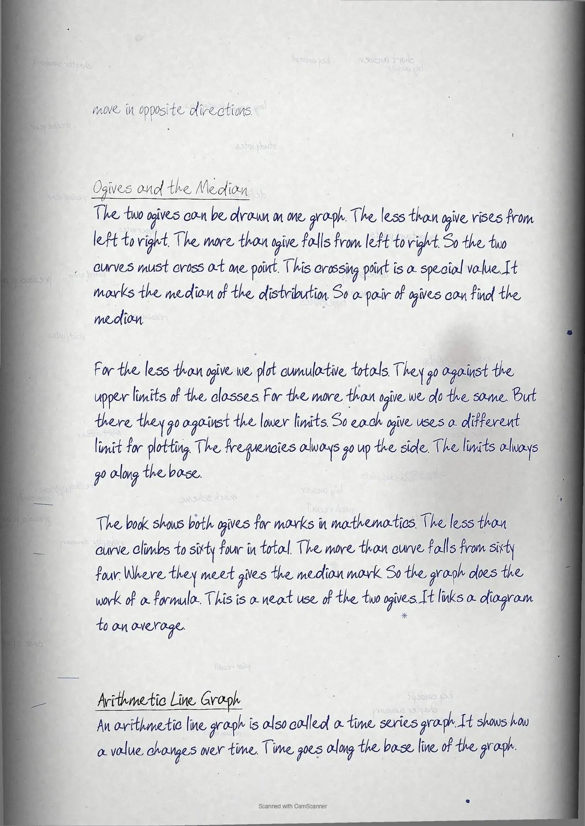
| Ogives and the median point | Low | occasional |
What the Presentation of Data Handwritten Notes Cover
Collected data is large and hard to read in raw form. Presentation puts it in a compact, clear shape. This chapter covers the three forms of presentation: textual, tabular and diagrammatic.
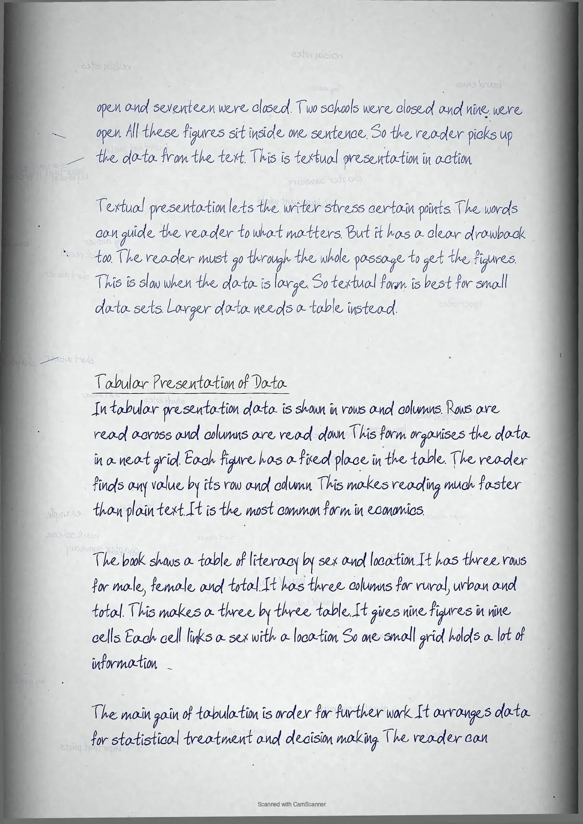
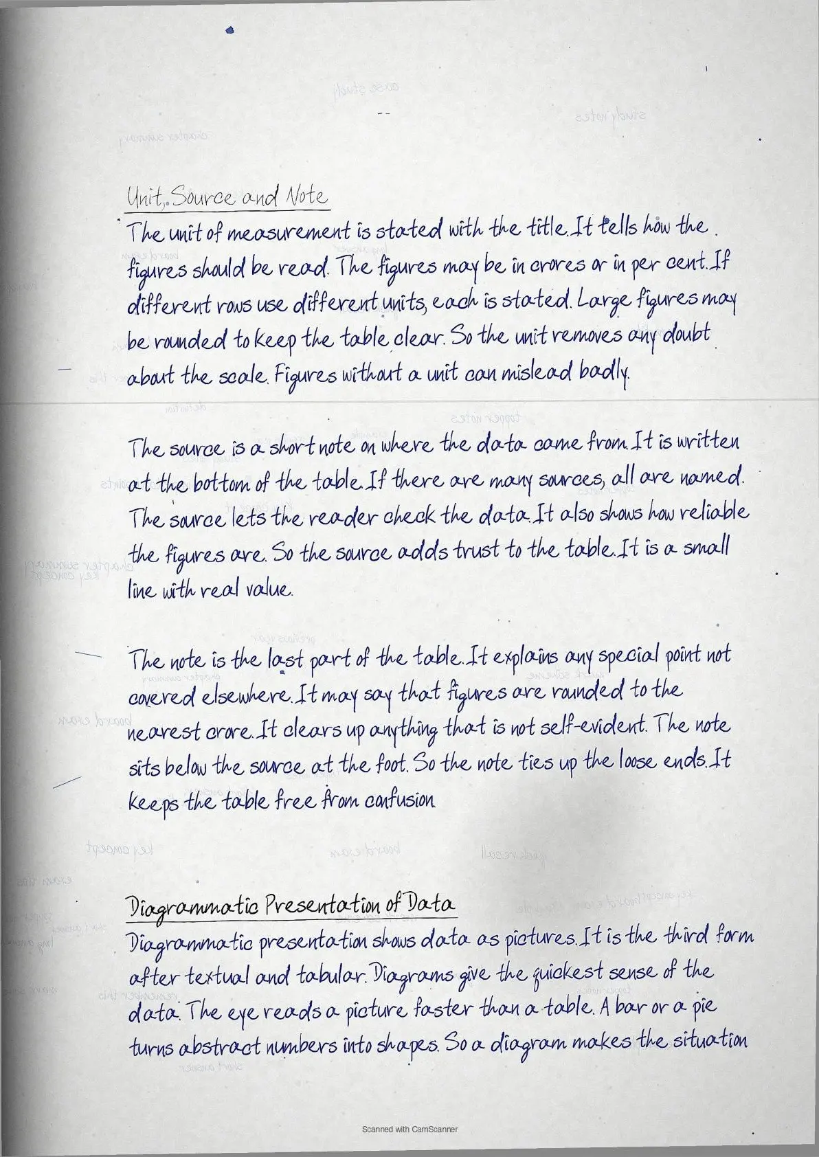
- Textual presentation of data
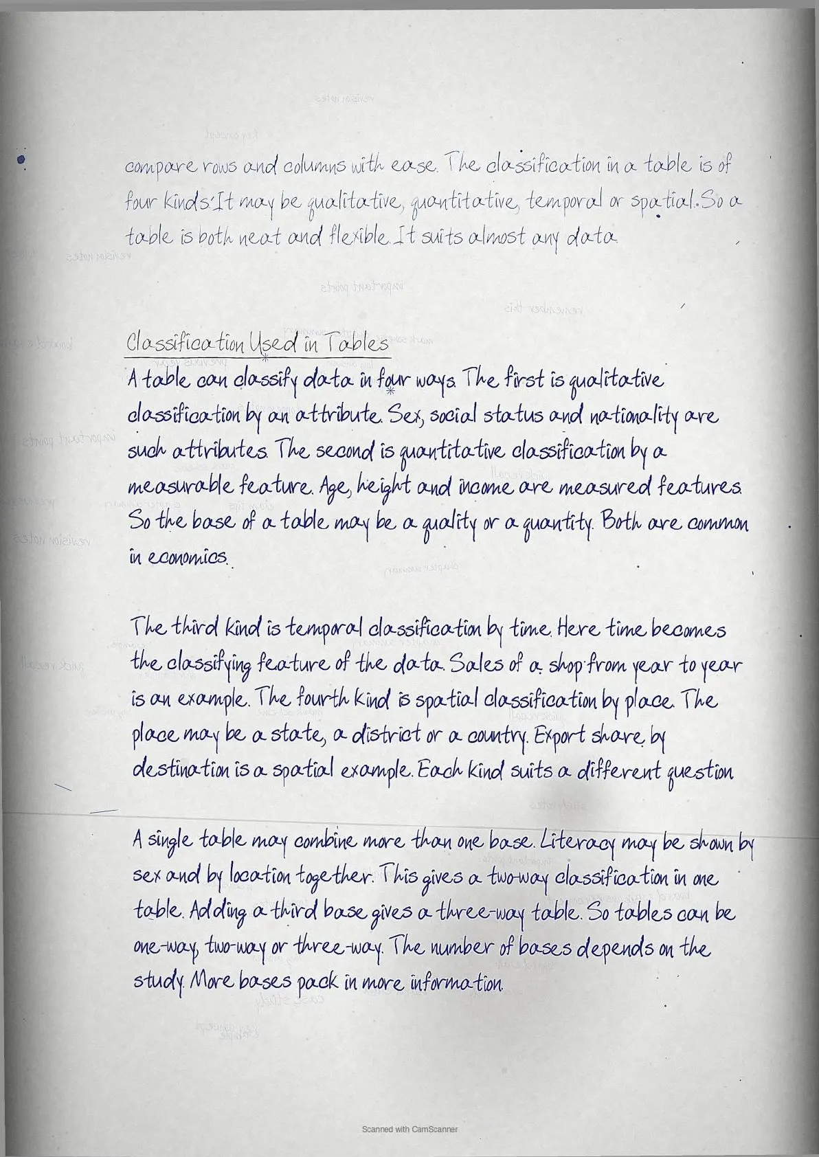
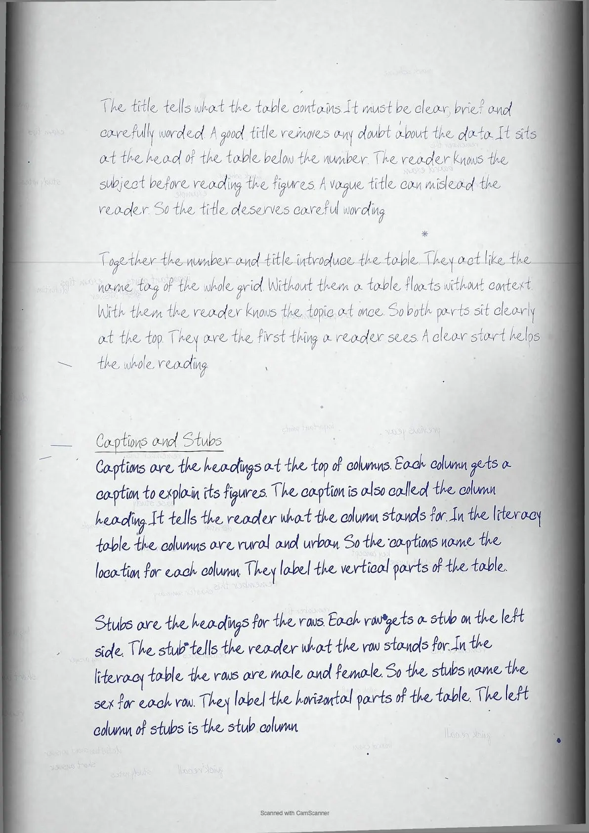
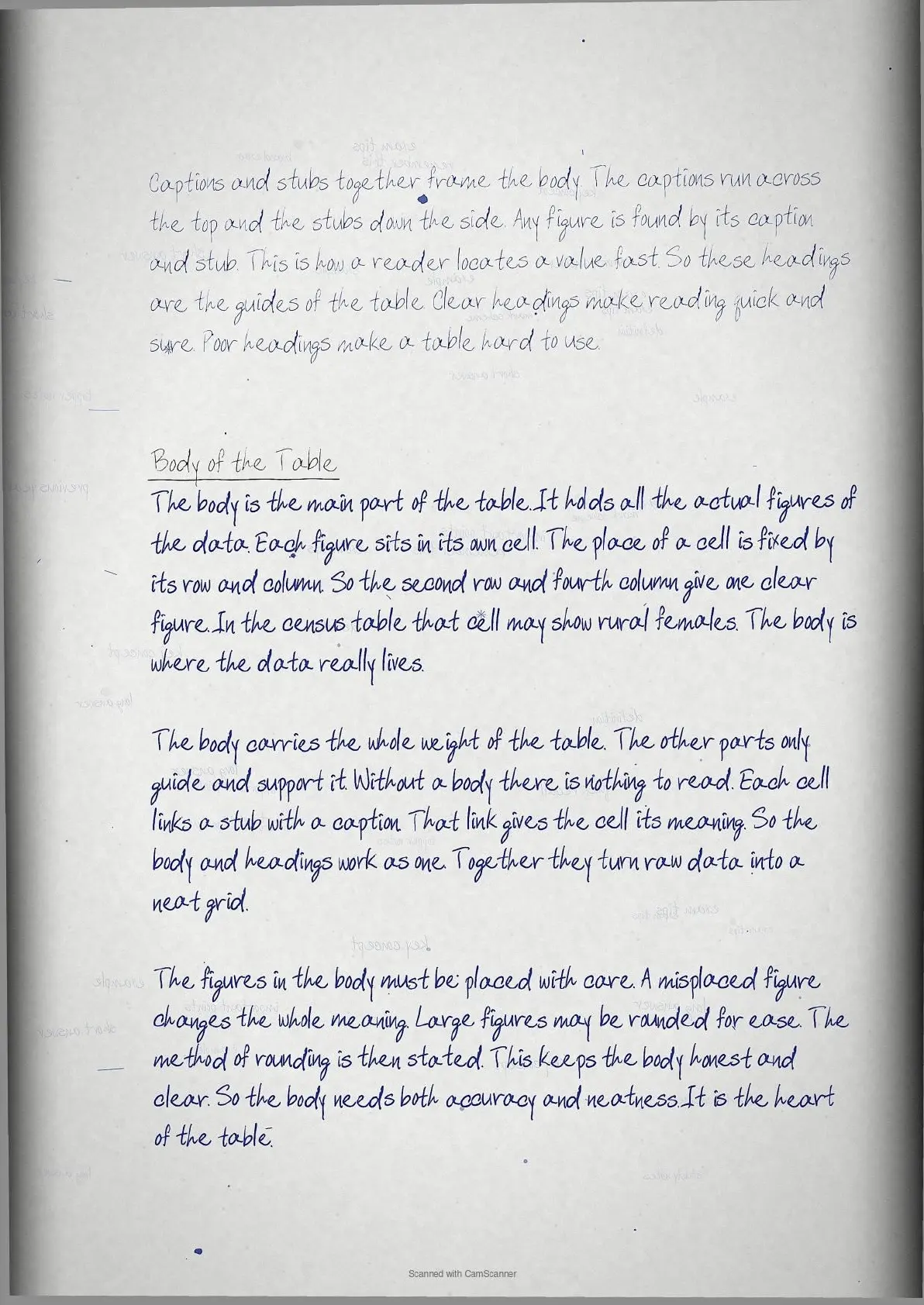
- Tabular presentation and parts of a table
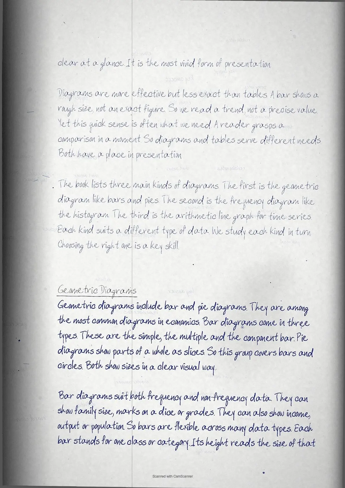
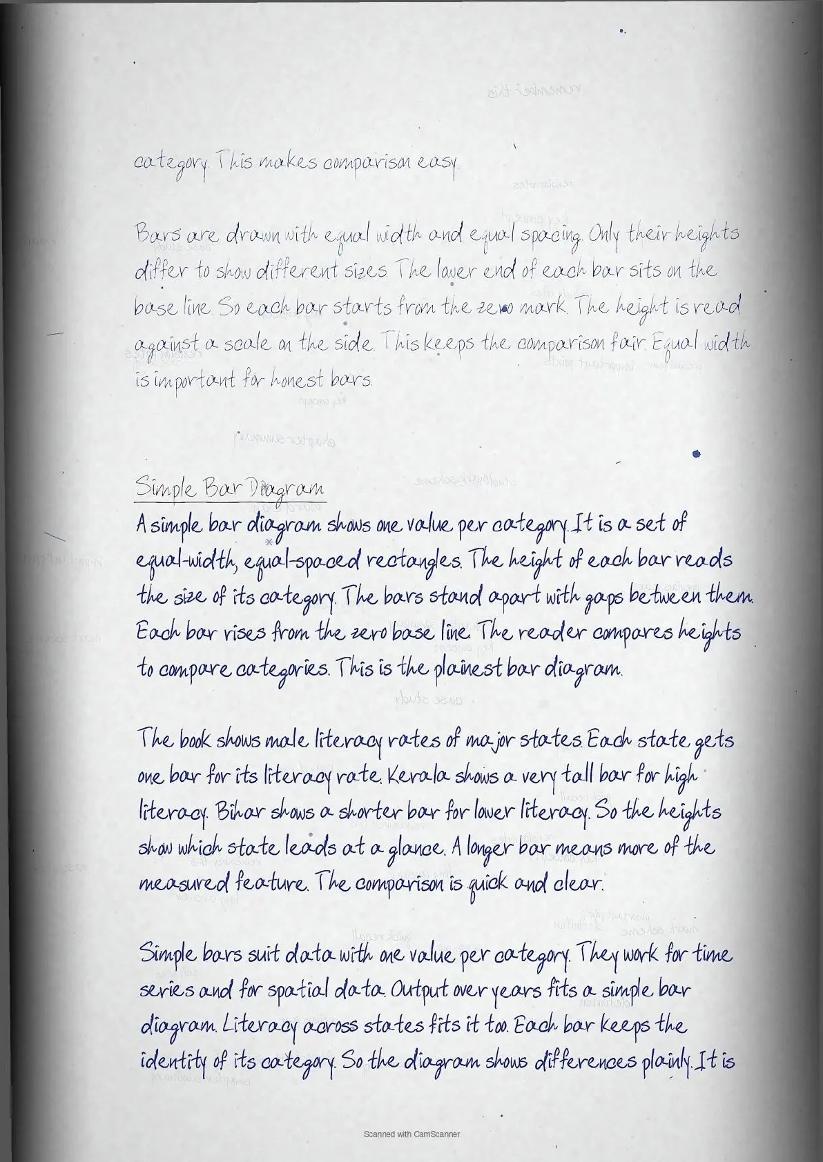
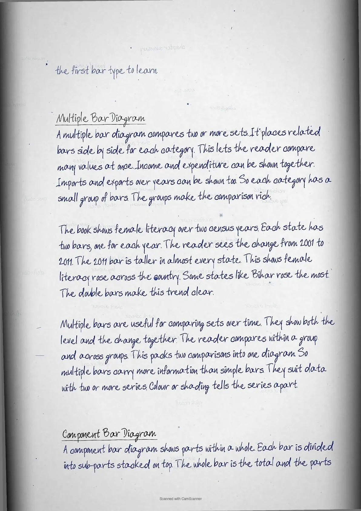
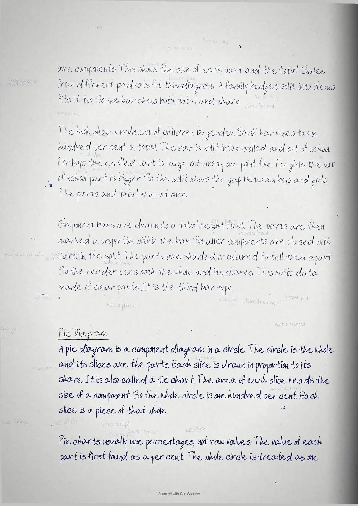
- Simple, multiple and component bar diagrams
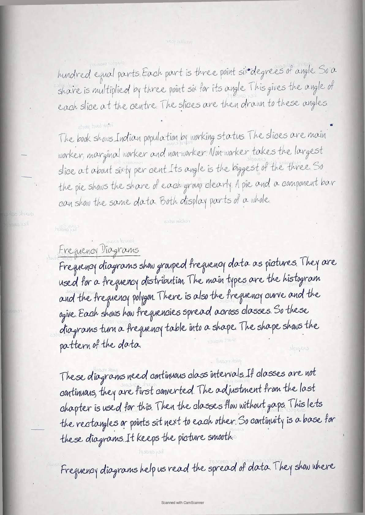
- Pie diagram of a whole
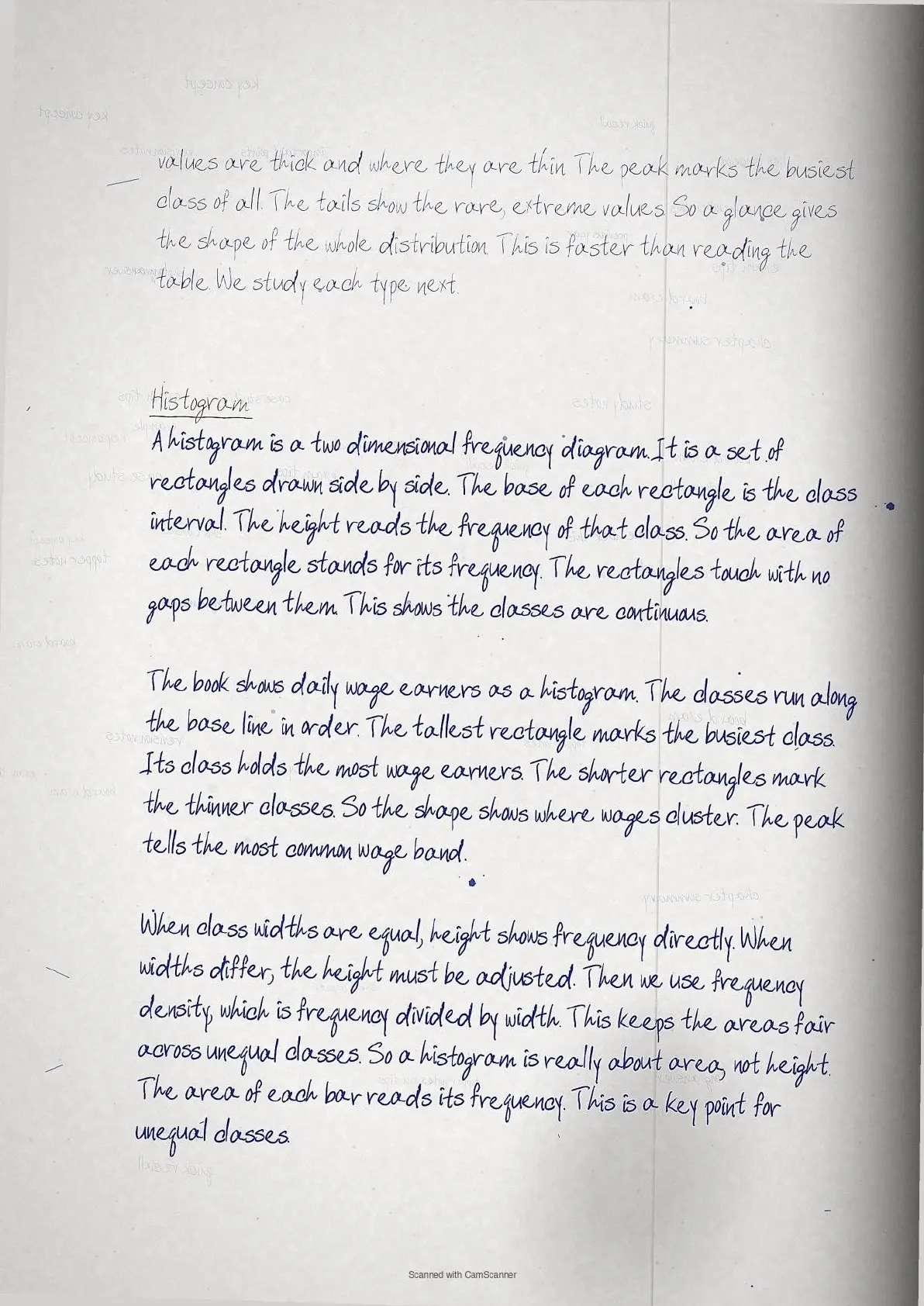
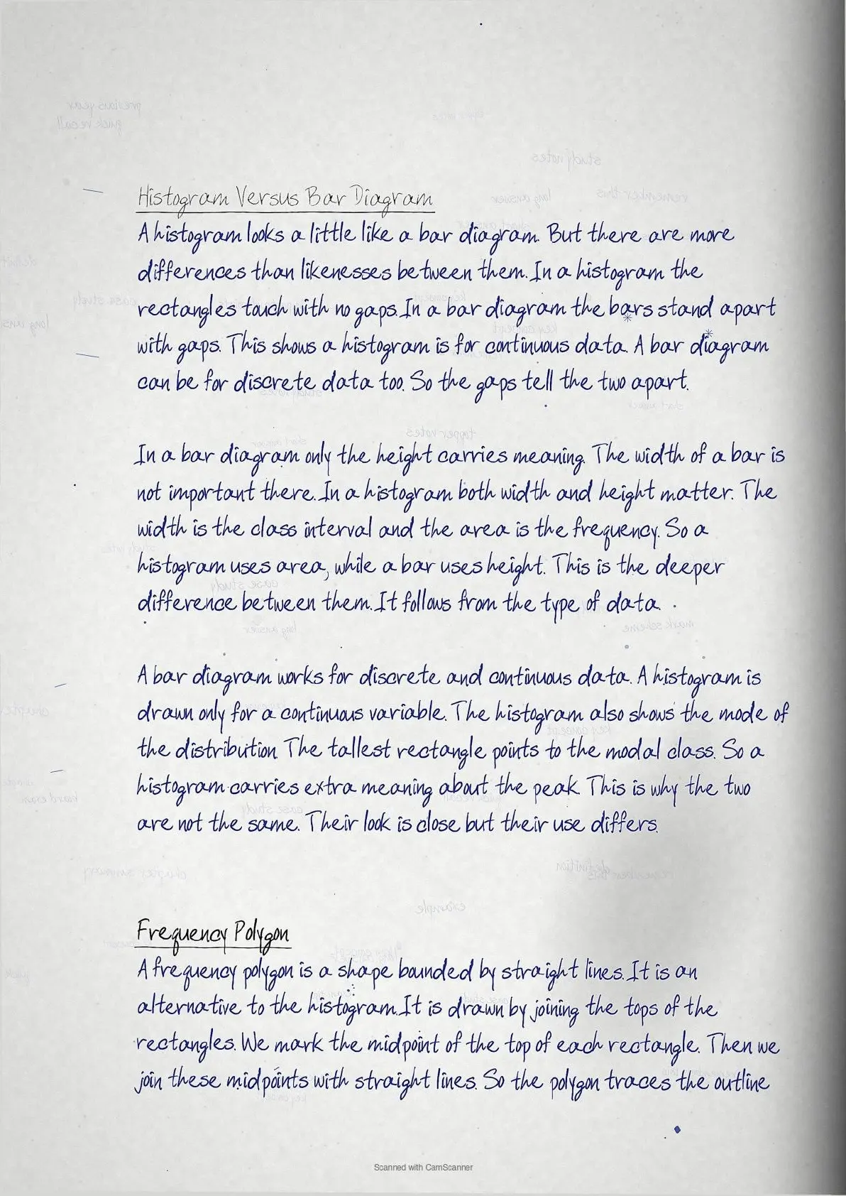
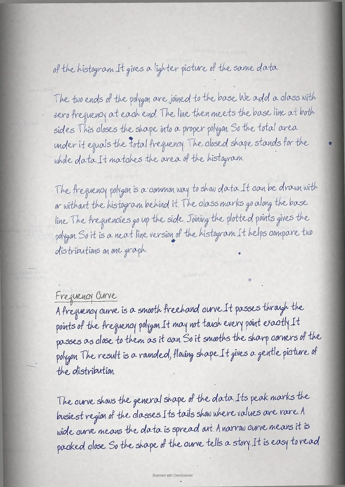
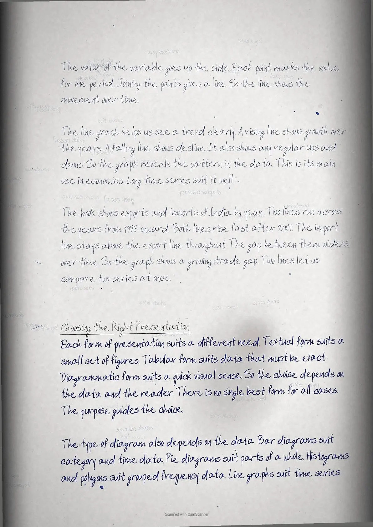
- Histogram, frequency polygon and frequency curve
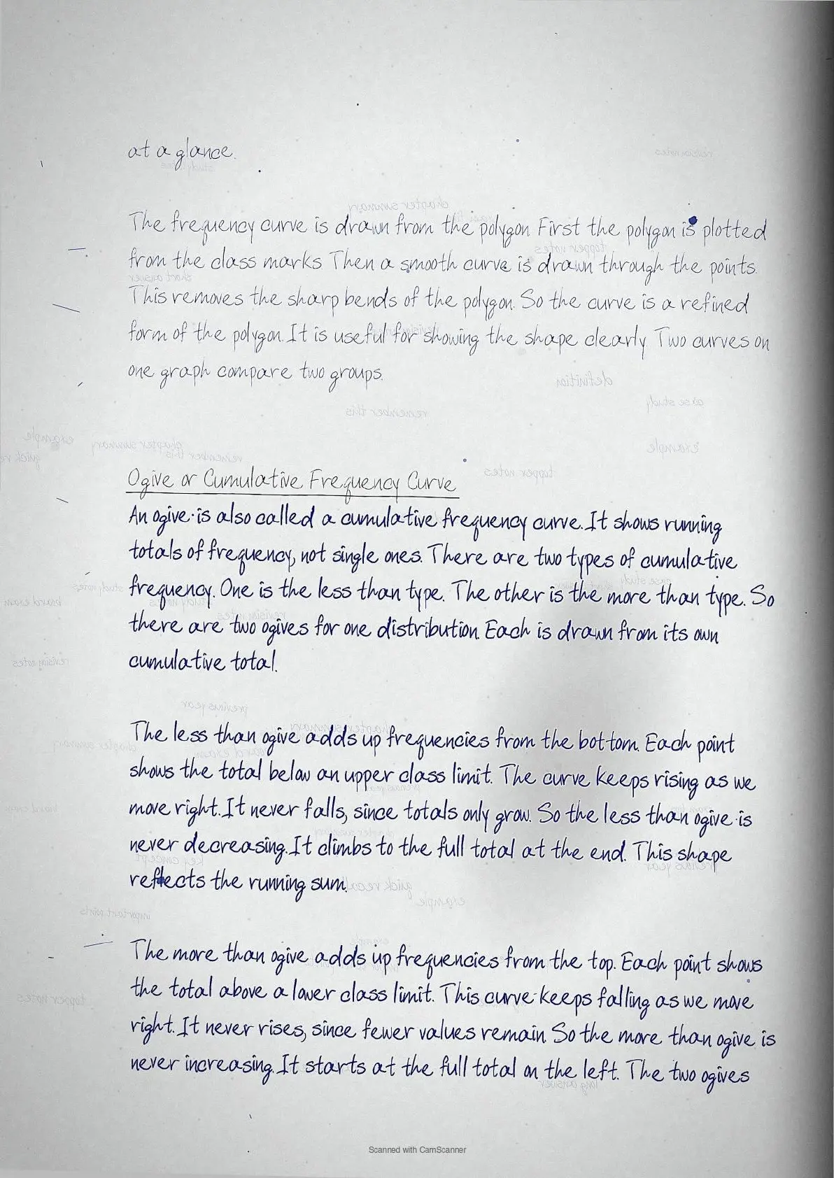
- Less than and more than ogives
- Arithmetic line graph for time series
Key Terms and Ideas in Presentation of Data
These are the terms and ideas the exam asks about most. Learn each one so you can define it and use it in your answers.
| Term / Idea | What it means |
|---|---|
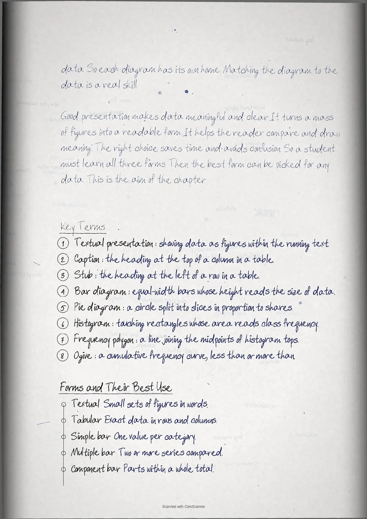
| Textual presentation | figures given within the running text |
| Tabular presentation | data shown in rows and columns |
| Caption | heading at the top of a column |
| Stub | heading at the left of a row |
| Simple bar diagram | one bar per category, height reads size |
| Component bar | a bar split into its parts and total |
| Histogram | touching rectangles whose area reads frequency |
| Ogive | cumulative frequency curve, less than or more than |
How Collegedunia's Handwritten Notes Help You Revise Presentation of Data
These notes are made for the night before the exam. They keep the facts short and easy to scan. Collegedunia maps every point to the 2026-27 NCERT.
- Clear handwriting: each topic is written in neat, easy-to-read handwriting.
- Boxed key terms: the main terms and definitions are boxed by hand for fast recall.
- Diagrams and tables: simple hand-drawn tables and charts make ideas clear.
- Colour-coded headings: new sub-topics stand out, so you find any section in seconds.
Presentation of Data Self-Assessment Quiz
Try these quick questions after you read the notes. Tap each question to check your answer. They cover the points CBSE asks most often.
The heading at the top of a column in a table is the
(a) stub (b) caption (c) body (d) source
Answer: (b) caption correct - stubs head rows and captions head columns.
A diagram whose bars touch with no gaps is a
(a) bar diagram (b) pie chart (c) histogram (d) line graph
Answer: (c) histogram correct - touching bars show the classes are continuous.
A pie chart shows shares by converting them into
(a) heights (b) angles (c) areas of bars (d) lines
Answer: (b) angles correct - each per cent is multiplied by 3.6 degrees.
To compare imports and exports over years we best use a
(a) pie chart (b) histogram (c) arithmetic line graph (d) stub
Answer: (c) arithmetic line graph correct - it shows two series changing over time.
The crossing point of the two ogives gives the
(a) mode (b) mean (c) median (d) range
Answer: (c) median correct - the less than and more than ogives cross at the median.
How to Use These Handwritten Notes for Class 11 Economics Revision
Use these class 11 economics handwritten notes in two passes. Read them slowly once for the full chapter. Then, near the exam, read only the boxes and key terms for a fast recall.
- Read the notes once with the NCERT chapter open beside you.
- Say each key term and idea in your own words.
- Practise one long-answer question from a past paper.
- On the last day, revise only the key terms and the boxes.
Class 11 Economics Handwritten Notes for All Chapters
The table below links the class 11 economics handwritten notes for every chapter. Use it to jump to any other chapter's notes.
Presentation of Data Class 11 Economics Handwritten Notes FAQs
Ques. Where can I download Presentation of Data Class 11 Economics Handwritten Notes PDF?
Ans. You can download the Presentation of Data Class 11 Economics Handwritten Notes PDF directly from this page. Both the Normal and HD versions are free.
Ques. Are these handwritten notes aligned with the 2026-27 NCERT?
Ans. Yes. These notes follow the current 2026-27 syllabus for Class 11 Economics. What is the difference between a histogram and a bar diagram?
Ques. How many pages is the Class 11 Economics Presentation of Data Handwritten Notes PDF?
Ans. The notes run about 22 pages. They cover the full chapter with key terms, hand-drawn boxes, and a short self-assessment quiz.
Ques. What is the main idea of the 11th standard Economics chapter Presentation of Data?
Ans. A histogram is for continuous data and its bars touch, with area reading the frequency. A bar diagram can show discrete data, its bars stand apart, and only the height carries meaning.
Ques. Are these Presentation of Data notes enough for the CBSE Class 11 exam?
Ans. Yes, for revision. The Collegedunia handwritten notes cover every key point and exam term. Read them with the NCERT chapter and practise past questions.



Comments