




These Class 12 Geography Chapter 3 Graphical Representation of Data notes cover every NCERT definition, the construction rules for all diagram types and the pie diagram angle formula, aligned to the 2026-27 syllabus. Built for a quick, full-chapter revision.
- Concept-first revision for the chapter: why representation matters, the three design rules, and when to use each diagram type.
- Every construction step for graphical representation of data class 12 Geography diagrams: line graph, polygraph, bar diagram, pie diagram and flow chart.
- Cross-pointers to the matching NCERT Solutions, Handwritten Notes and NCERT Book PDF.
These notes are written by Collegedunia geography subject experts, mapped to the 2026-27 NCERT Practical Work in Geography Part II textbook and checked against recent CBSE board papers.
Student Feedback
67% of Class 12 students said choosing the correct diagram type for a data set was the most-confused part of this chapter, and 3 out of 4 rated the pie diagram angle formula as the item most worth revising from a notes sheet. Most finished a full revision in about 30 minutes.
Source: 2026-27 Class 12 Geography student poll, 8,600 CBSE students.
Quick Concept Recap: Graphical Representation at a Glance
Chapter 3 teaches students to convert raw data tables into visual diagrams. This transformation through graphs, diagrams, maps and charts is called representation of data, and it communicates patterns faster than a table of numbers.
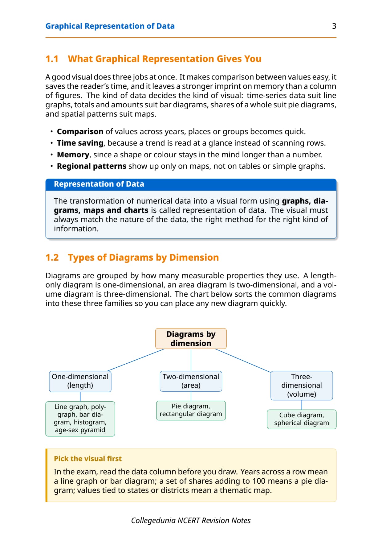
- Three diagram dimensions: one-dimensional (line graphs, bar diagrams), two-dimensional (pie diagrams) and three-dimensional (cube and spherical diagrams).
- Key diagram types to master: line graph, polygraph, simple/multiple/compound bar, pie diagram and flow chart, all common in CBSE practical questions.
- Pie diagram formula: Angle = (Value of component / Total value) multiplied by 360, or Percentage multiplied by 3.6.
Read these notes first, then use the matching NCERT Solutions for Class 12 Geography Chapter 3.
Source: TheGeoecologist GS on YouTube
Key Definitions for Graphical Representation of Data Class 12
Every short-answer question in this chapter starts with a definition, written below in the exact one-line form CBSE markers expect.
| Term | One-line definition | NCERT section pointer |
|---|---|---|
| Representation of Data | Transformation of data through visual methods like graphs, diagrams, maps and charts so that patterns can be understood and compared easily. | Introduction |
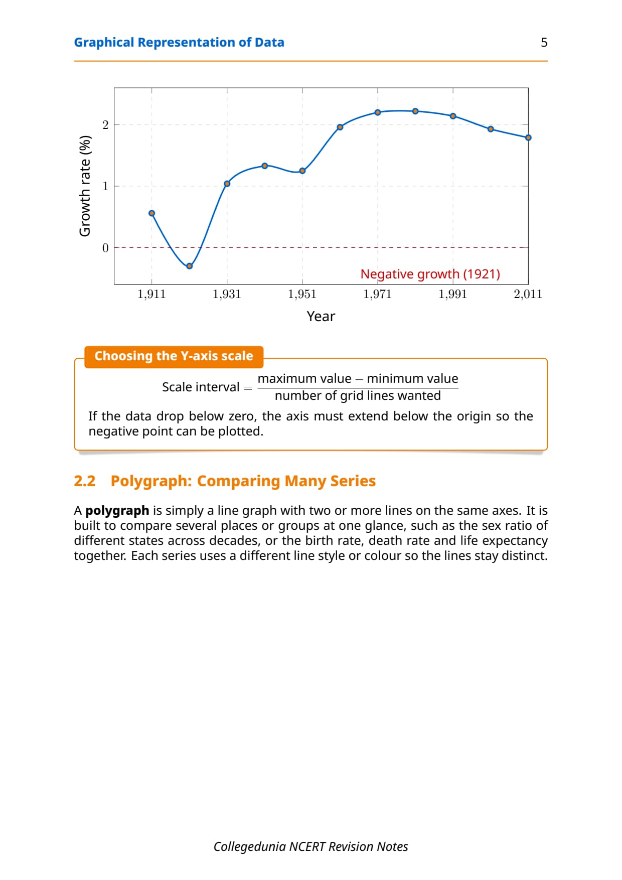
| Line Graph | A one-dimensional diagram drawn by plotting time-series data as dots on X-Y axes and joining them with a freehand line; best for showing temperature, rainfall and population growth trends. | Line Graphs section |
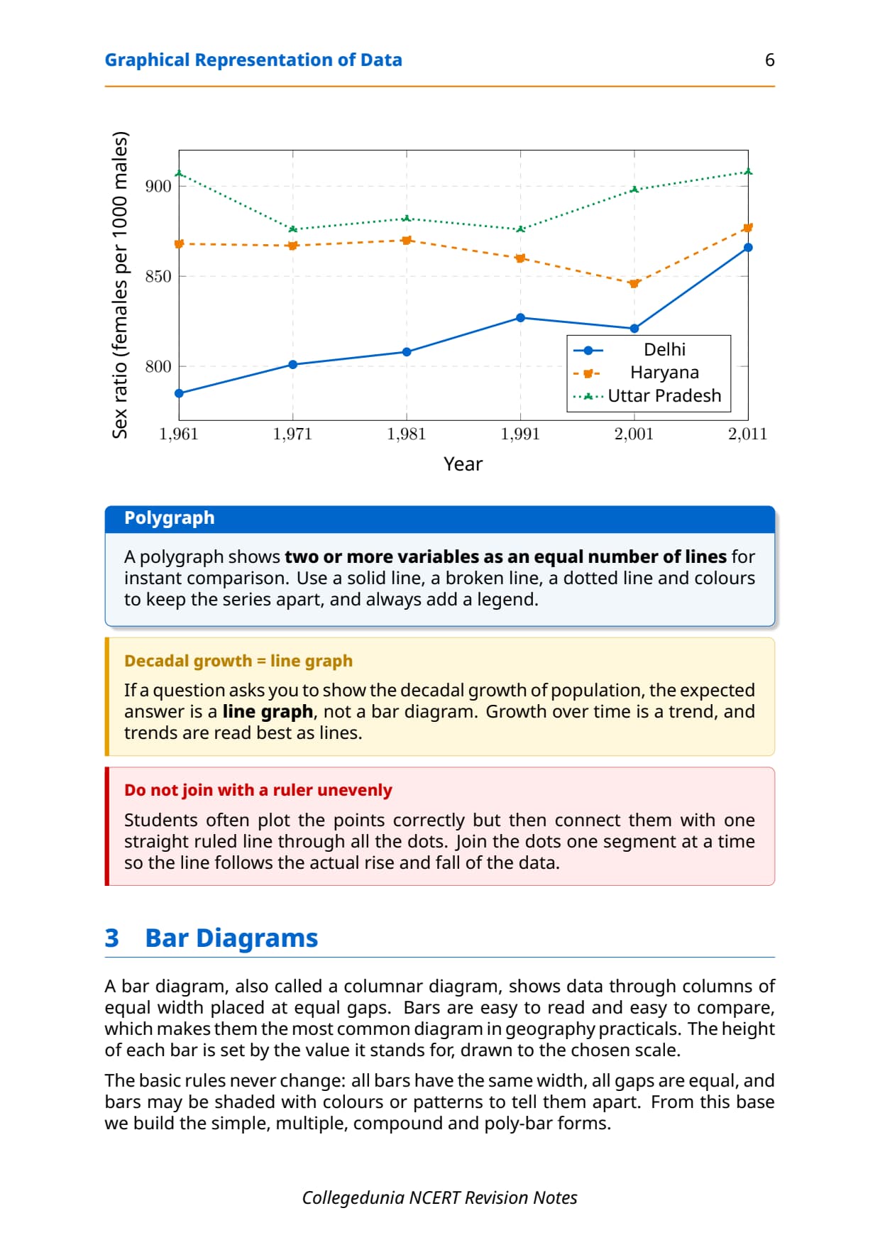
| Polygraph | A line graph in which two or more variables are shown by an equal number of lines on the same diagram for immediate comparison, distinguished by different line patterns or colours. | Polygraph section |
| Bar Diagram | A one-dimensional diagram drawn through columns of equal width on equal intervals; also called a columnar diagram; suited for comparing discrete categories. | Bar Diagram section |
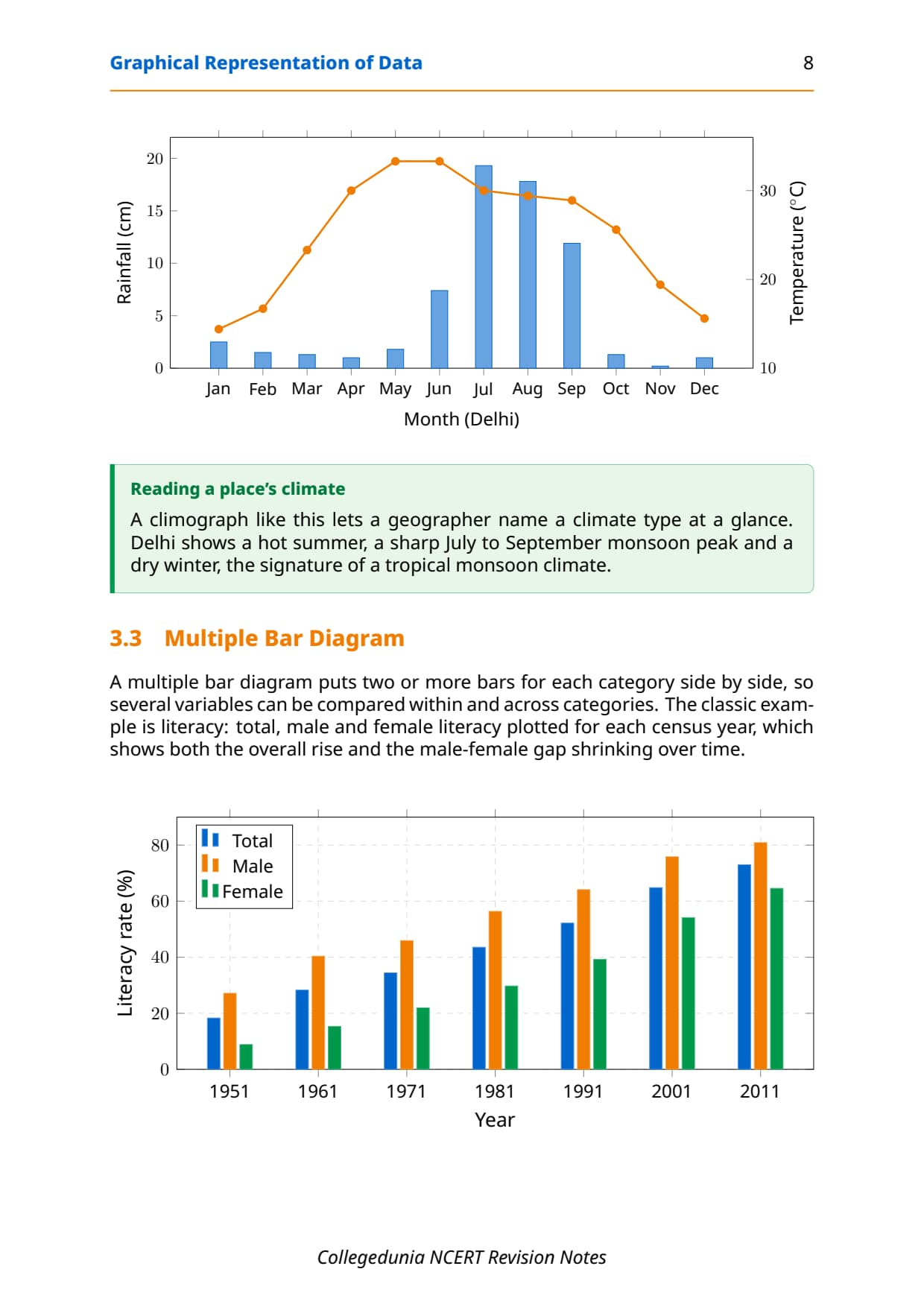
| Multiple Bar Diagram | A bar diagram in which two or more variables are represented side-by-side in a single set of bars for comparison, such as male and female literacy rates across years. | Multiple Bar section |
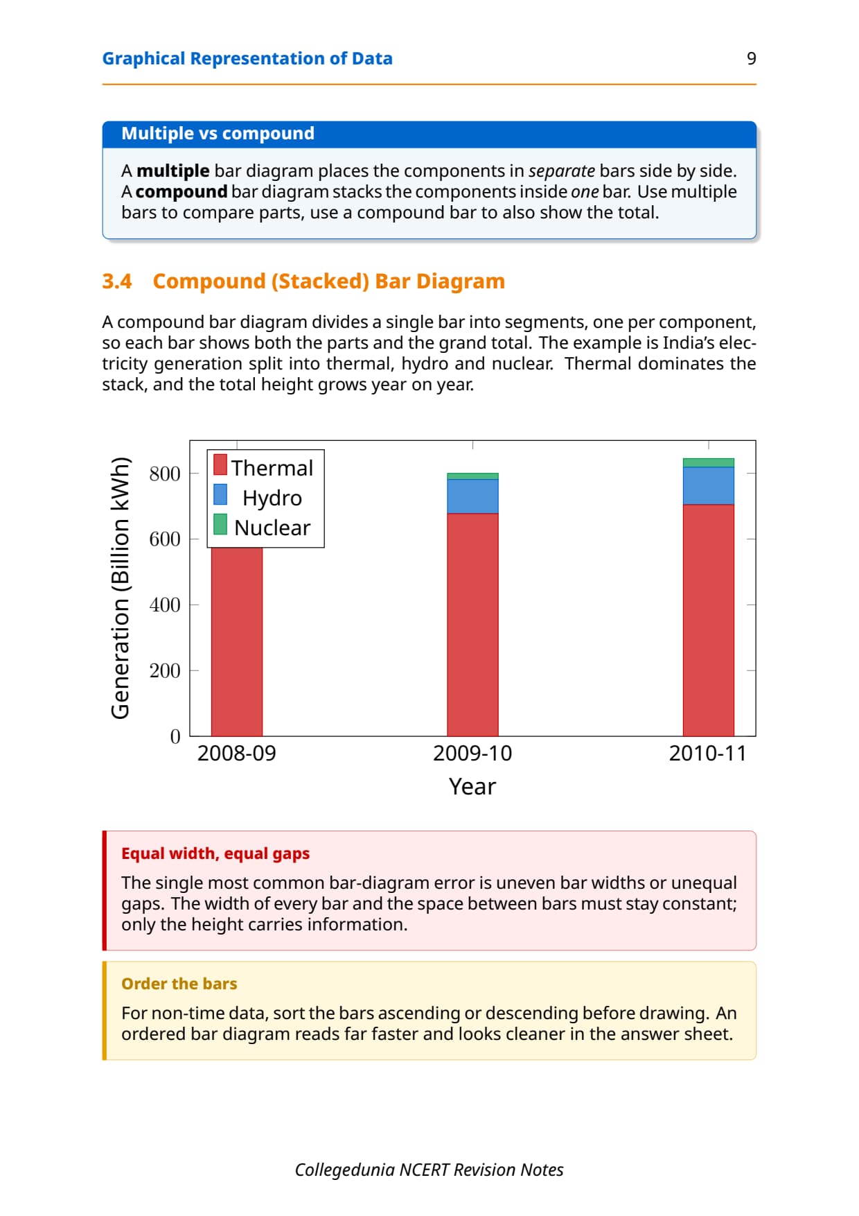
| Compound Bar Diagram | A diagram in which different components of a single total are stacked within one bar using different shades or colours, showing both the total and the part-whole relationship. | Compound Bar section |
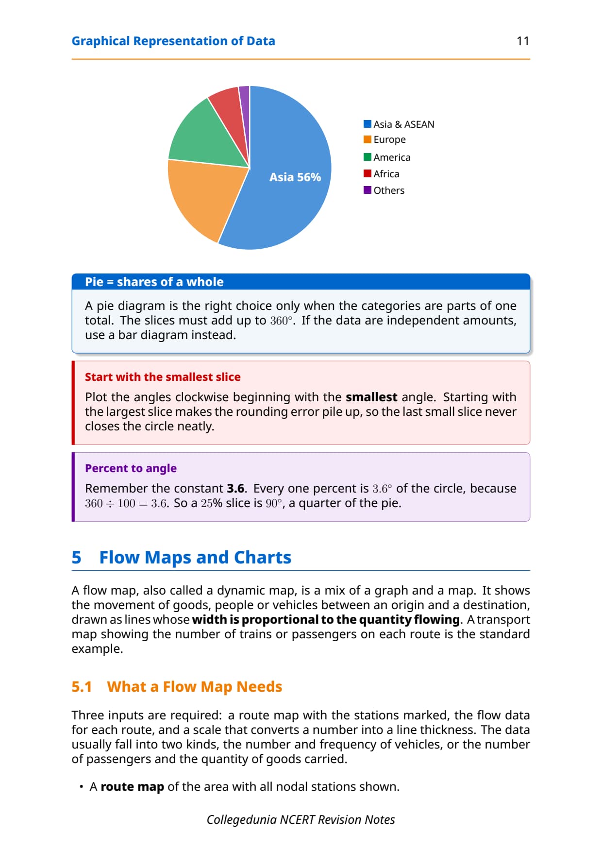
| Pie Diagram | A two-dimensional circular diagram in which a circle is divided into sectors proportional to the values of the components; also called a Divided Circle Diagram. | Pie Diagram section |
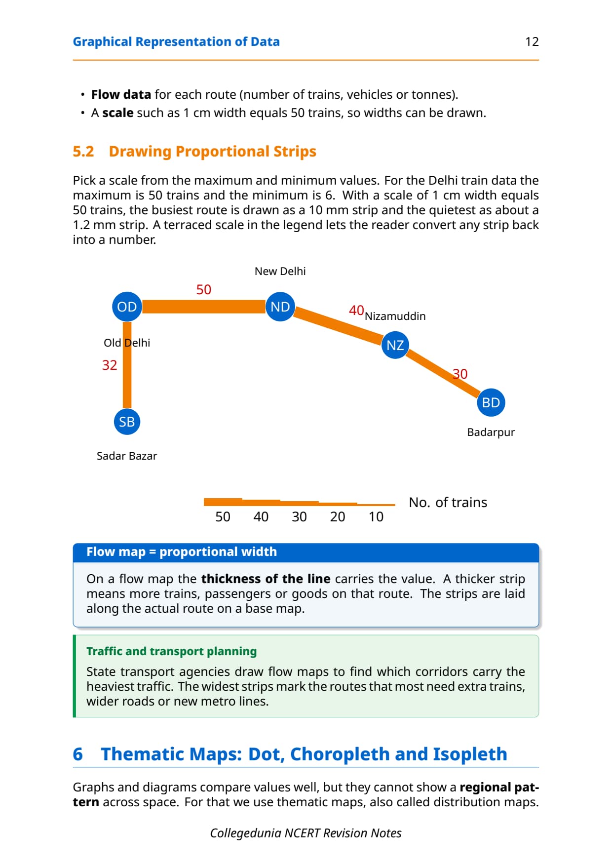
| Flow Chart / Flow Map | A combination of graph and map that shows the flow of commodities or people between places of origin and destination using lines of proportional width; also called a Dynamic Map. | Flow Maps section |
| Legend / Index | An important cartographic component of any diagram or map that explains the colours, shades, symbols and signs used, normally placed at the lower left or lower right of the map sheet. | Design section |
| Wind Rose Diagram | A star-shaped diagram used to show the direction and frequency of wind at a given location, with arms of proportional length radiating from a central point in compass directions. | Wind Rose section |
These cover roughly 8 of the 10 short-answer questions CBSE has asked since 2021.
General Rules for Drawing Graphs, Diagrams and Maps
NCERT sets out three decisions for every diagram, tested as 1 or 2-mark theory questions.
Rule 1: Selection of a Suitable Method
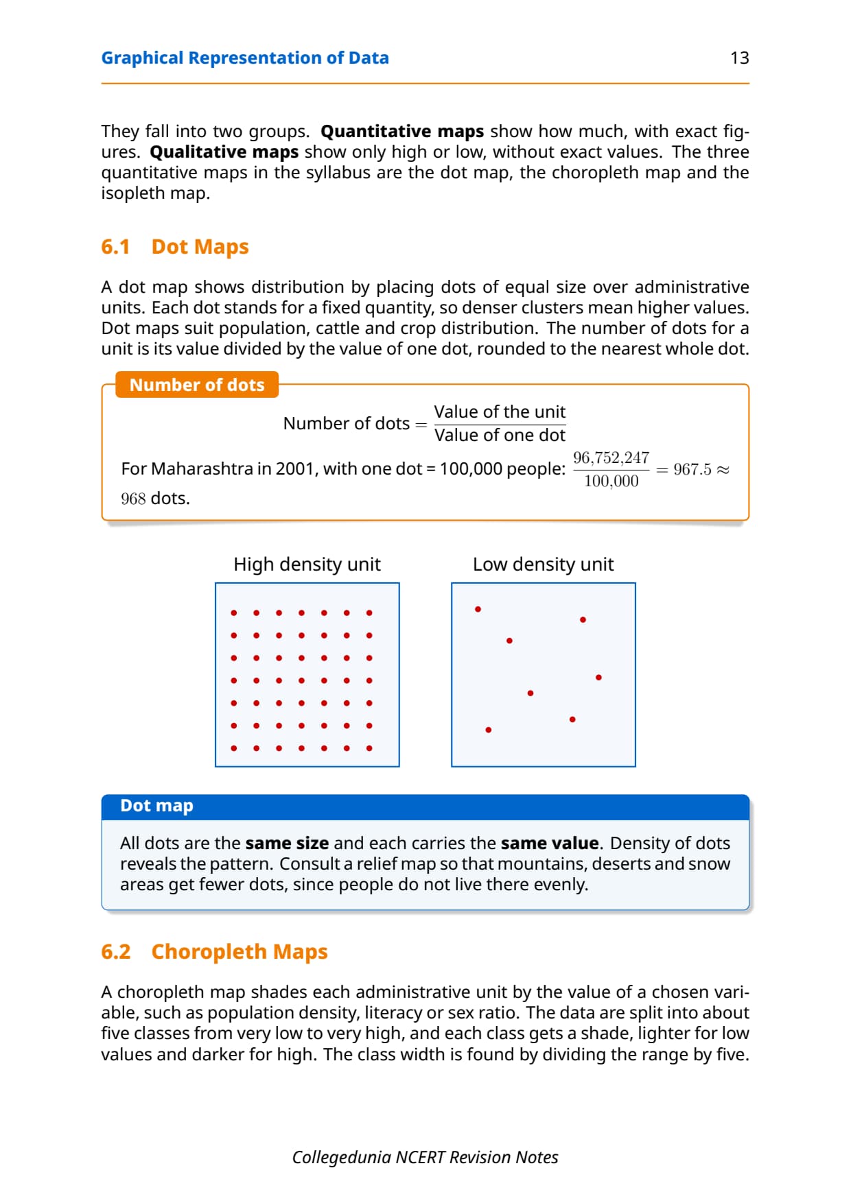
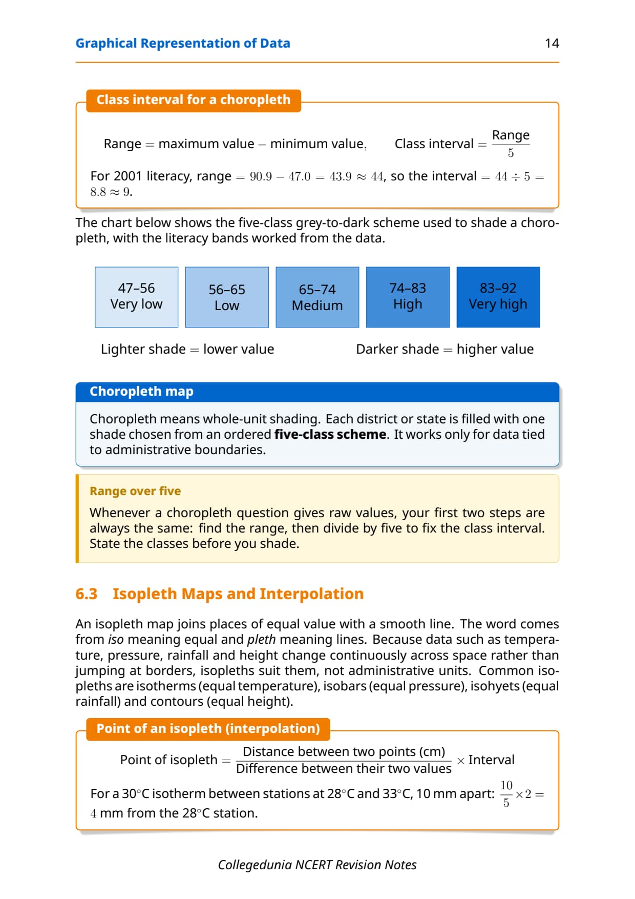
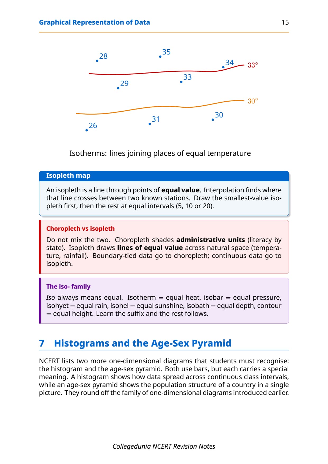
Temperature and growth trends use line graphs; rainfall and totals use bar diagrams; population distribution uses dot maps; density uses choropleth maps.
Rule 2: Selection of Suitable Scale
The scale must cover the entire data range, neither too large nor too small, and must always be stated on the diagram.
Rule 3: Design - Title, Legend and Direction
- Title: top-centre, naming the area, reference year and caption.
- Legend / Index: lower-left or lower-right, explaining every colour, shade and symbol used.
- Direction symbol: required on all maps (not pure graphs), North arrow properly placed.
Line Graph and Polygraph: Construction Steps
Constructing a Line Graph: Four Steps
- Step 1: Round the data to convenient numbers where needed.
- Step 2: Draw X and Y axes; put the time variable on X and the quantity on Y. Negative values go below the X-axis origin.
- Step 3: Choose a scale that fits all data values and label it.
- Step 4: Plot each value as a dot, join with a smooth freehand line, and add title, scale and legend.
NCERT example: Table 3.1, India's population growth rate 1901 (0.56%) to 2011 (1.79%), with a negative value in 1921 (-0.30%) caused by the 1918 influenza pandemic and partition-era disruptions.
Constructing a Polygraph
A polygraph plots two or more variables on one diagram, each on a different line: solid, broken, dotted. Table 3.2 uses sex ratio for Delhi, Haryana and Uttar Pradesh, 1961-2011. Rules: same axis scale, distinct patterns, a legend, and only when variables share one unit.
Bar Diagrams: Simple, Multiple and Compound
All four bar types share three rules: equal bar width, equal intervals, and distinct shading or colour.
Simple Bar Diagram
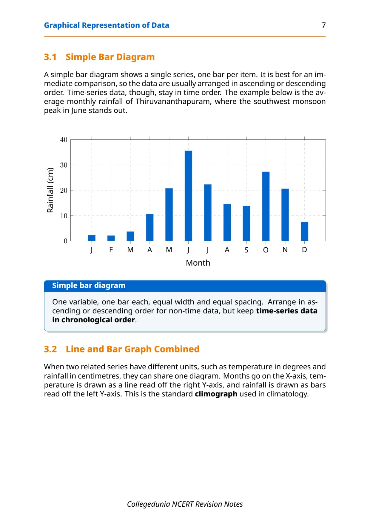
Compares one variable across categories or time (Table 3.3: monthly rainfall in Thiruvananthapuram).
Line and Bar Graph Combined
Bars show one variable (rainfall) on the left Y-axis, a line shows another (temperature) on the right Y-axis. Table 3.4 uses Delhi's data; also called a climograph.
Multiple Bar Diagram
Shows two or more variables side-by-side per group. Table 3.5 uses India's literacy rate 1951-2011 (total, male, female). Bars share the same width, distinct shades and a legend.
Compound Bar Diagram
Stacks components inside one bar as rectangles of proportional height, total height as the grand total. Table 3.6 shows India's electricity generation 2008-09 to 2010-11 by thermal, hydro and nuclear.
| Diagram Type | When to Use | NCERT Example |
|---|---|---|
| Simple Bar | One variable across categories or time | Monthly rainfall of Thiruvananthapuram |
| Line + Bar | Two related variables (one continuous, one discrete) on one diagram | Temperature and rainfall in Delhi |
| Multiple Bar | Two or more variables across the same time points for direct comparison | Literacy rate in India 1951-2011 (total, male, female) |
| Compound Bar | Parts that add to a whole, compared across time or categories | Electricity generation by source (thermal, hydro, nuclear) 2008-2011 |
Pie Diagram: Formula and Construction
The pie diagram shows parts of a whole as sectors of a circle, also called a Divided Circle Diagram. CBSE includes it as a 3 to 5-mark question almost every year.
The Angle Formula
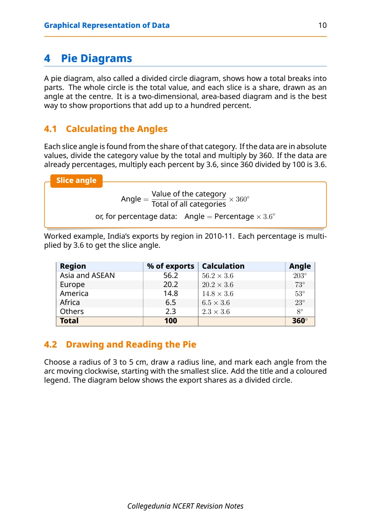
Absolute values: Angle = (Value of component / Total value) multiplied by 360. Percentages: Angle = Percentage multiplied by 3.6 (since 360/100 = 3.6).
Memory hook: all angles must sum to 360 degrees; if not, a rounding error has been made somewhere.
NCERT Worked Example: India's Exports 2010-11
Table 3.7 gives India's export share by region with the angle calculation for each:
| Region | % of Indian Exports | Calculation | Angle |
|---|---|---|---|
| Asia and ASEAN | 56.2% | 56.2 multiplied by 3.6 | 203 degrees |
| Europe | 20.2% | 20.2 multiplied by 3.6 | 73 degrees |
| America | 14.8% | 14.8 multiplied by 3.6 | 53 degrees |
| Africa | 6.5% | 6.5 multiplied by 3.6 | 23 degrees |
| Others | 2.3% | 2.3 multiplied by 3.6 | 8 degrees |
| Total | 100% | 360 degrees |
Construction Steps for Pie Diagram
- Draw a circle of suitable radius (3-5 cm) with a radius line from centre to arc as reference.
- Measure angles clockwise starting from the smallest, to avoid accumulated rounding error.
- Shade each sector distinctly and add title, legend and data labels.
Flow Charts and Wind Rose Diagrams
Flow Chart (Flow Map / Dynamic Map)
A flow chart combines a graph and a map to show movement of goods or people between places, using lines of proportional width: a thicker line means more flow. Table 3.8 shows train frequency on Delhi-area rail routes (Old Delhi-Shahdara with 51 trains gets a wider line than Old Delhi-Pusa Road with 22).
Wind Rose and Star Diagram
A wind rose shows wind direction and frequency at a station. Arms radiate from a centre in the eight compass directions, each arm's length proportional to the days wind blew that way, with a calm-day percentage at the centre.
Common Mistakes Students Make in This Chapter
- Wrong diagram type: time series needs a line/bar graph; parts of a whole need a pie diagram.
- Pie angle error: forgetting to multiply by 3.6, or angles not summing to 360.
- Starting pie from a large angle: always start with the smallest.
- Missing Y-axis scale label, unequal bar widths, or a missing legend/title/North arrow.
Previous Year Question Trends from Chapter 3 Geography
What CBSE has asked from this chapter over the last four years:
| Year | Question type asked | Marks | Notes section to revise |
|---|---|---|---|
| 2025 | Construct a pie diagram from given export data + define flow chart | 5 + 2 | Pie Diagram section + Key Definitions |
| 2024 | Construct a multiple bar diagram for literacy rates + state three rules for bar diagrams | 5 + 3 | Bar Diagrams section + General Rules |
| 2023 | Distinguish between simple bar and compound bar diagram + construct a line graph for given data | 3 + 5 | Bar Diagrams section + Line Graph section |
| 2022 | Define polygraph and give two uses + construct a pie diagram from percentage data | 3 + 5 | Key Definitions + Pie Diagram section |
The chapter carries 8 to 10 marks per year in the CBSE practical paper.
Other Resources for Class 12 Geography Chapter 3 Graphical Representation of Data
Pair these notes with the matching NCERT Solutions, handwritten notes and the official NCERT book chapter.
| Resource | What it covers | Open |
|---|---|---|
| Notes | Concept-first revision notes covering diagram types, construction rules, pie formula and common mistakes. | You are here |
| NCERT Solutions | Step-by-step answers to all five exercises with worked diagrams and expert solutions. | Class 12 Geography Chapter 3 NCERT Solutions |
| Handwritten Notes | Topper's handwritten revision pages for last-minute board exam practice. | Class 12 Geography Chapter 3 Handwritten Notes |
| NCERT Book PDF | Official NCERT Practical Work in Geography Chapter 3 textbook in PDF form. | Class 12 Geography Chapter 3 NCERT Book PDF |
| Subject Hub | All chapters of Class 12 Geography with every resource in one place. | Class 12 Geography Subject Hub |
All Chapters Notes for Class 12 Practical Work in Geography
Related Links: Notes for the other chapters of Class 12 Practical Work in Geography.
| Chapter | Topic | Notes link |
|---|---|---|
| Chapter 1 | Data: Its Source and Compilation | Class 12 Geography Data Its Source and Compilation Notes |
| Chapter 2 | Data Processing | Class 12 Geography Data Processing Notes |
| Chapter 3 | Graphical Representation of Data | You are here |
| Chapter 4 | Spatial Information Technology | Class 12 Geography Spatial Information Technology Notes |
NCERT Notes Class 12 Geography Chapter 3 Graphical Representation of Data FAQs
Ques. What is graphical representation of data in Class 12 Geography?
Ans. Graphical representation of data in Class 12 Geography refers to the transformation of numerical data through visual methods such as graphs, diagrams, maps and charts so that patterns, comparisons and trends can be understood at a glance. The NCERT textbook states that such representation enhances understanding, makes comparisons easy and creates an imprint on the mind for a longer time. Chapter 3 of Practical Work in Geography Part II teaches students to construct line graphs, polygraphs, bar diagrams, pie diagrams and flow charts from given data tables.
Ques. What is the formula for the pie diagram angle in Class 12 Geography?
Ans. When data is given as absolute values, the angle for each component is calculated as: (Value of the component divided by Total value of all components) multiplied by 360 degrees. When data is given in percentage form, the angle is simply: Percentage of the component multiplied by 3.6. The constant 3.6 comes from dividing 360 (total degrees in a circle) by 100 (total percentage). The sum of all angles must equal 360 degrees; if it does not, recheck the rounding in each step.
Ques. What is the difference between a simple bar diagram and a compound bar diagram?
Ans. A simple bar diagram uses one bar per category or time period to show the total value of a single variable, making it suitable for straightforward comparison across categories. A compound bar diagram divides each bar into coloured or shaded rectangles representing the components that make up the total, so that both the total and the part-whole relationship are visible in one diagram. For example, India's total electricity generation can be shown as a simple bar, while showing its thermal, hydro and nuclear breakdown requires a compound bar diagram.
Ques. What is a polygraph and when is it used?
Ans. A polygraph is a line graph in which two or more variables are plotted on the same diagram using different line patterns (solid, broken, dotted) or colours, allowing immediate visual comparison. It is used when the variables share the same unit of measurement and the same time scale. The NCERT textbook uses the example of sex ratio data for Delhi, Haryana and Uttar Pradesh from 1961 to 2011, with each state represented by a different line pattern. A polygraph is different from multiple line graphs drawn separately because all variables share one set of axes.
Ques. What is a flow chart in geography and how is it different from other diagrams?
Ans. A flow chart, also called a flow map or dynamic map, is a combination of a graph and a map that shows the movement of commodities, people or vehicles between places using lines of proportional width. The thicker the line, the greater the flow. This makes it fundamentally different from bar diagrams (which compare magnitudes at fixed points) or pie diagrams (which show parts of a whole at a single point in time). Flow charts are specifically geographic because the lines follow actual routes on a map base and their position carries locational meaning.
Ques. What are the three general rules for drawing diagrams in Class 12 Geography?
Ans. The NCERT textbook sets out three general rules that must be followed before constructing any diagram. First, select a suitable method that matches the nature of the data: time-series data uses line graphs, discrete comparisons use bar diagrams, part-whole data uses pie diagrams. Second, select a suitable scale that covers all data values in the set, neither too large nor too small. Third, ensure the diagram is properly designed with a title at the top-centre, a legend at the lower-left or lower-right, and a North arrow for all maps. Missing any of these design elements costs marks in board exams.
Ques. When should a multiple bar diagram be used instead of a simple bar diagram?
Ans. A multiple bar diagram is used when two or more variables need to be compared side-by-side for the same set of categories or time periods. For example, if a question asks students to compare male and female literacy rates across seven census years, a multiple bar diagram places male and female bars next to each other in each year group so the gender gap is immediately visible. A simple bar diagram, by contrast, shows only one variable and cannot make this simultaneous comparison. The NCERT textbook uses India's total, male and female literacy rates from 1951 to 2011 as the worked example for multiple bar diagrams.
Ques. Why must pie diagram construction start with the smallest angle?
Ans. The NCERT textbook explicitly warns that starting with a larger angle leads to accumulation of rounding error, which makes it impossible to accurately place the final small-angle sector. When angles are calculated by multiplying percentages by 3.6, rounding to whole degrees introduces a small error in each sector. If the large sectors are drawn first, these errors stack up by the time the last sector is reached, causing the final arc to either fall short of or overshoot the starting radius. Starting with the smallest angle first keeps the accumulated error in the largest sector, where it is least visible and least likely to cause a noticeable gap.
Ques. Is Chapter 3 of Practical Work in Geography important for CUET and UPSC?
Ans. Yes, for different reasons. CUET Geography includes NCERT-based questions and diagram-identification MCQs such as "which diagram shows part-whole relationships?" or "which map type shows movement between two places?" are directly from Chapter 3. For UPSC Preliminary, flow maps and thematic maps appear in the map-based questions section, and understanding how flow lines of proportional width are constructed helps students interpret maps correctly in the question paper. Students preparing for both CBSE boards and competitive exams should focus on the Key Definitions table and the diagram-type selector in these notes.
Ques. What is a wind rose diagram and how is it read?
Ans. A wind rose diagram is a star-shaped or spoke diagram used in climatology and geography to show the frequency and direction of wind at a given location over a reference period. Arms radiate from a central point in eight compass directions: N, NE, E, SE, S, SW, W and NW. The length of each arm is proportional to the number of days the wind blew from that direction. A circle or number at the centre shows the percentage of calm days. Students read a wind rose by identifying the longest arm, which represents the dominant or prevailing wind direction at that station. CBSE MCQs sometimes show a wind rose and ask students to name the diagram type.
Ques. How are these Class 12 Geography graphical representation notes aligned to the 2026-27 NCERT syllabus?
Ans. These graphical representation of data class 12 Geography notes are aligned to the 2026-27 reprint of the NCERT Practical Work in Geography Part II textbook, Chapter 3. Every diagram type, construction rule, worked example and exercise question in these notes is drawn directly from the 2026-27 NCERT text. The textbook content for this chapter has not been reduced in the current cycle. The Previous Year Question table above cross-references recent CBSE board papers to confirm that all topics covered in these notes remain examinable in the 2026-27 session.



Comments