




The NCERT Solutions for Class 12 Geography (Practical Work in Geography) Chapter 3 Graphical Representation of Data cover all 3 exercise questions, aligned with the 2026-27 CBSE syllabus. Every answer is in plain English, covering line graphs, bar diagrams, pie diagrams, dot maps, choropleth maps, isopleth maps and flow maps.
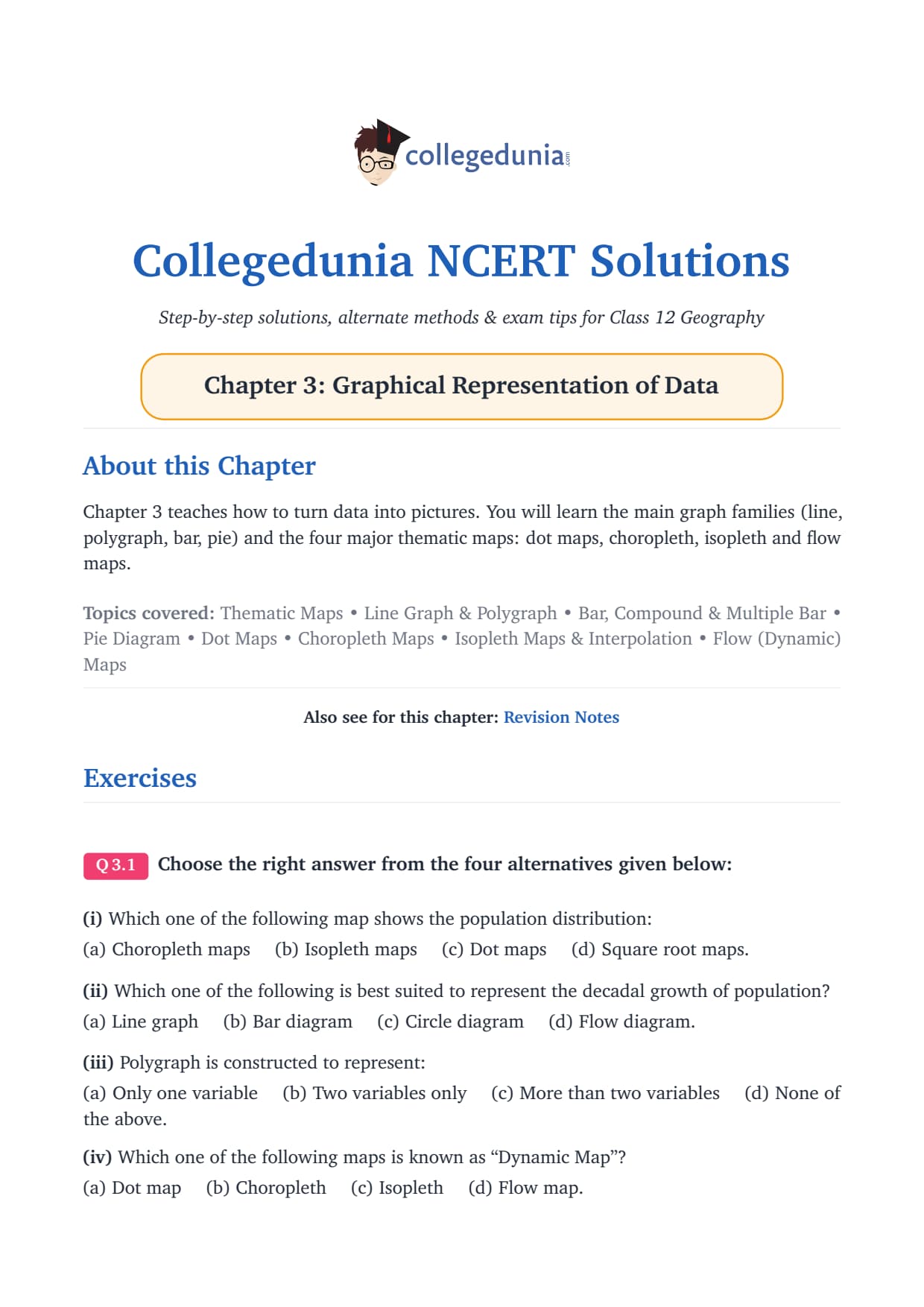
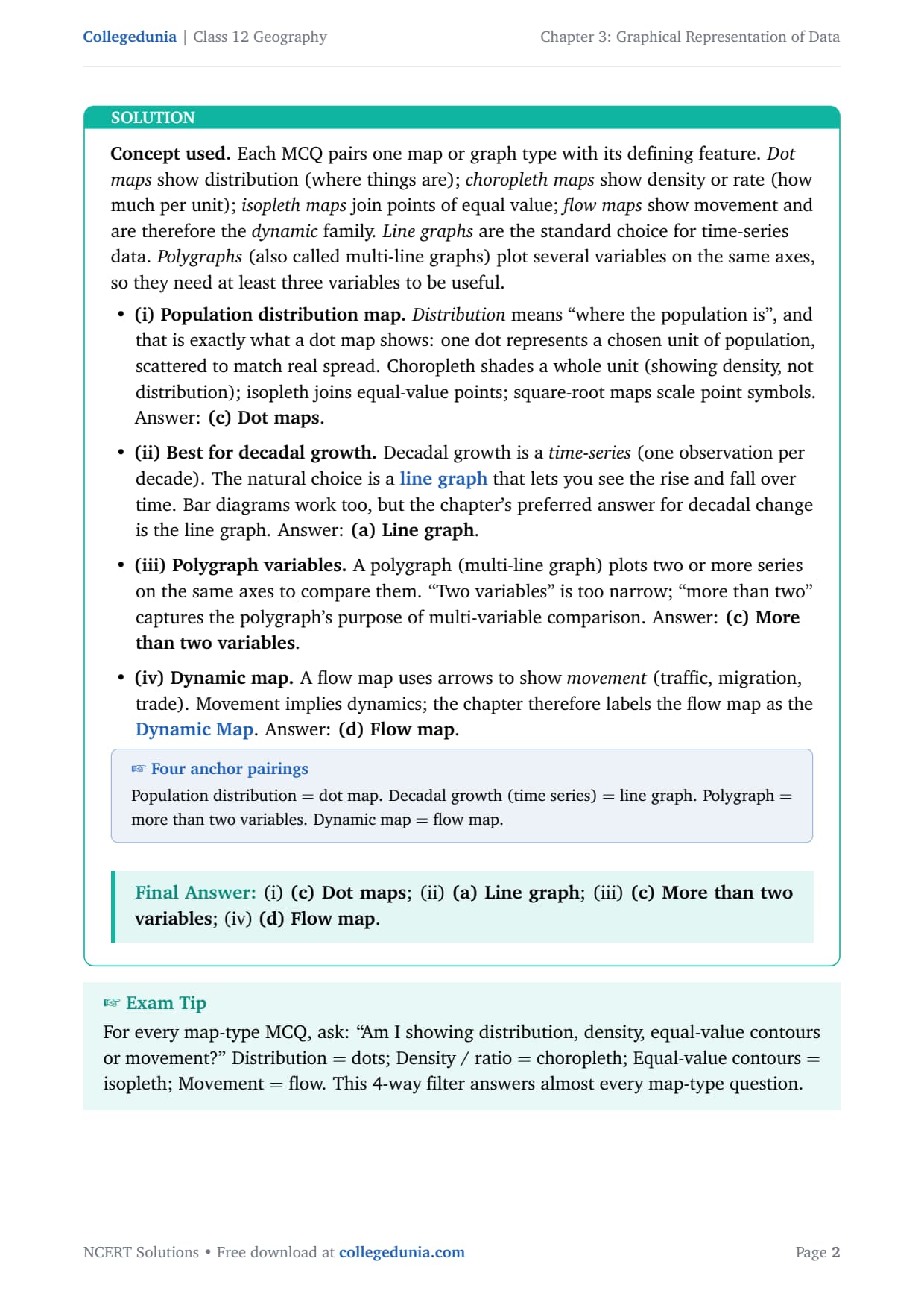
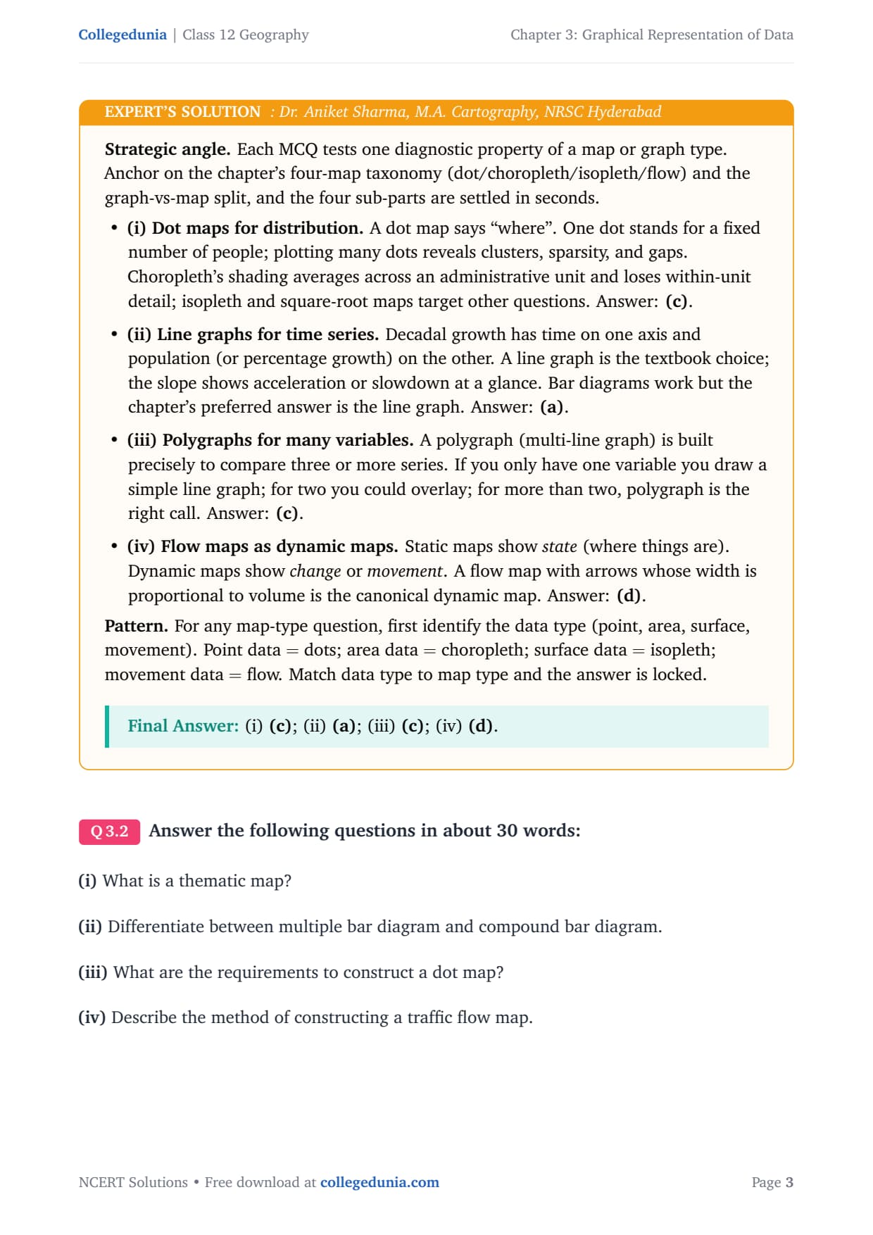
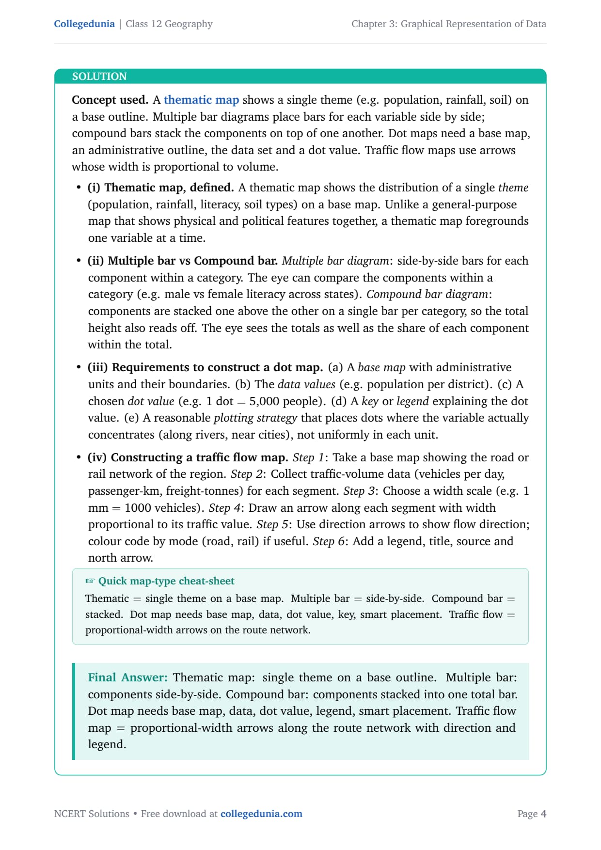
- 3 NCERT exercise questions solved with plain prose and bullets (4 MCQs, 4 short answers, 3 long answers), plus an Expert Solution each.
- Covers one-dimensional diagrams (line, polygraph, bar), the pie diagram, and thematic maps (dot, choropleth, isopleth, flow), plus how to pick the right method.
- Step-by-step construction guides for choropleth, isopleth and pie diagrams, with the interpolation and angle-conversion formulas.
Every answer here is curated by geography subject experts, mapped to the 2026-27 NCERT Practical Work in Geography textbook, and refined against the last five years of CBSE board papers.
Student Feedback: What 9,400 students told us about this chapter
71% of students found it hard to recall which graph or map suits a given dataset, and most said knowing choropleth from isopleth saved marks in the MCQ and short answers. Those who practised the pie diagram with the angle-conversion formula scored better on construction sub-parts.
Source: 2026-27 Class 12 Geography student poll, 9,400 CBSE students across 13 states.
What the NCERT Solutions for Class 12 Geography Chapter 3 Cover
Chapter 3 answers one question: how do you turn a table of numbers into a picture that makes patterns obvious? The textbook organises the answer into four blocks, which these solutions follow.
- Rules for drawing graphs: three general rules, namely a suitable method, a suitable scale, and cartographic design (title, legend, north arrow).
- One-dimensional diagrams: line graphs for time-series, polygraphs for comparing variables, simple and multiple bar diagrams, histograms and the age-sex pyramid.
- Two-dimensional diagrams: the pie diagram and rectangular diagram, with the angle-conversion formula at the centre of every construction question.
- Thematic maps: dot, choropleth, isopleth and flow maps, each suited to a different type of data.
Source: TheGeoecologist GS on YouTube
Exercise-wise Breakdown of Chapter 3 Class 12 NCERT Solutions
Chapter 3 carries 3 exercise questions: Q1 a 4-part MCQ, Q2 four short answers, Q3 three long answers. The table below maps each to its topic and answer style.
| Question | Topic covered | Answer style | Typical marks |
|---|---|---|---|
| Q1 (i) | Best map type for showing population distribution | Single correct option | 1 mark |
| Q1 (ii) | Best diagram for showing decadal growth of population | Single correct option | 1 mark |
| Q1 (iii) | How many variables a polygraph can show | Single correct option | 1 mark |
| Q1 (iv) | Which map type is called a dynamic map | Single correct option | 1 mark |
| Q2 (i) | What is a thematic map? | 30-word definition | 2 marks |
| Q2 (ii) | Difference between multiple and compound bar diagrams | 30-word compare-contrast | 2 marks |
| Q2 (iii) | Requirements for constructing a dot map | 30-word list | 2 marks |
| Q2 (iv) | How to construct a traffic flow map | 30-word step sequence | 2 marks |
| Q3 (i) | What is an isopleth map? How is interpolation used? | 125-word explanation with worked example | 5 marks |
| Q3 (ii) | Steps to prepare a choropleth map | 125-word seven-step method | 5 marks |
| Q3 (iii) | Steps to draw a pie diagram | 125-word seven-step method with formula | 5 marks |
Q3(i), Q3(ii) and Q3(iii) carry the most marks and appear most often. Q3(iii) on the pie diagram is the most formula-focused, needing the angle-conversion formula every time.
Types of Graphs and Diagrams: Line, Bar, Pie and Polygraph
The first building block is the match between data type and diagram type. Choosing the wrong diagram costs marks even if the construction is perfect.
Line Graphs and Polygraphs
Line graphs are drawn for time-series data: temperature, rainfall, population growth over years. Mark time on the X-axis and the variable on the Y-axis, choose a scale, plot each value and join the dots with a freehand line.
A polygraph puts two or more lines on the same axes for instant comparison (the chapter uses state sex-ratio data). Each line uses a different pattern or colour. A polygraph makes sense only with more than two variables on the same scale.
Bar Diagrams: Simple, Multiple and Compound
Bar diagrams use rectangular bars whose length is proportional to the value. Three forms appear:
- Simple bar diagram: one bar per category, for a single variable across categories (rainfall across months).
- Multiple bar diagram: two or more bars side by side per category, one per component, for comparing components.
- Compound bar diagram (stacked): components stacked into one bar per category, showing both the total and each share.
Tip: CBSE asks the difference between multiple and compound bar diagrams often as a 2-mark question. The full-mark line: multiple bar places bars side by side; compound bar stacks them.
Thematic Maps: Dot, Choropleth, Isopleth and Flow Maps
The second building block is the match between geographical data and map type. The chapter introduces four thematic-map types.
| Map type | What it shows | Data required | Key feature |
|---|---|---|---|
| Dot map | Distribution (where something is located) | Point-type data (population, livestock, crop area) | One dot represents a fixed unit; dots placed where the variable actually exists |
| Choropleth map | Density or ratio across administrative units | Area-type data normalised to a rate (population per sq km, literacy %) | Shading intensity matches the class; light = low, dark = high |
| Isopleth map | Smooth continuous surface (temperature, rainfall, pressure, elevation) | Point observations at weather stations or survey markers | Curves connect equal values; position found by linear interpolation between stations |
| Flow map | Movement of goods, people or vehicles (dynamic data) | Traffic volume or migration data per route segment | Arrow width is proportional to volume; called the dynamic map in the chapter |
CBSE tests this four-map taxonomy in MCQs and short answers. The one anchor: flow map = dynamic map, because it shows movement, not a static state.
How to Construct a Dot Map
A dot map needs five things: a base map with administrative boundaries, the data per unit, a chosen dot value (one dot = 5,000 people), a legend for that value, and a placement rule that puts dots where the variable actually concentrates, not spread uniformly.
Pie Diagram Construction: Step-by-Step with the Angle Formula
Q3(iii) asks for the steps to draw a pie diagram, the most formula-intensive part here. Writing the formula before substituting earns the method mark even if the arithmetic slips.
The angle-conversion formula:
Slice angle for component i = (Value of component i / Total of all components) x 360 degrees
Seven steps to draw a pie diagram:
- Step 1. List all component values and add them for the total.
- Step 2. Compute each component as a percentage of the total.
- Step 3. Convert each percentage to a slice angle using the formula above.
- Step 4. Draw a circle of suitable size.
- Step 5. With a protractor, mark the first angle from the 12 o'clock position and draw the radius.
- Step 6. Continue clockwise; shade each slice differently and add a label.
- Step 7. Add a title and source.
Worked example: Food = Rs 6,000, Rent = Rs 3,000, Education = Rs 2,000, Others = Rs 1,000 (Total Rs 12,000). Food = (6000/12000) x 360 = 180 degrees; Rent = 90; Education = 60; Others = 30. Check: 180 + 90 + 60 + 30 = 360.
Common Mistakes Students Make in This Chapter
The repeat-offender mistakes on this chapter:
- Confusing choropleth with dot maps: choropleth shades units to show density; a dot map places dots to show where something is. Mixing them up in Q1(i) loses the mark.
- Forgetting the dynamic-map label for flow maps: the chapter calls the flow map a dynamic map because it shows movement, the exact phrase for Q1(iv).
- Not writing the angle formula before substituting: Q3(iii) awards a method mark for the formula, lost if you go straight to arithmetic.
- Mixing up multiple and compound bar diagrams: multiple = side by side, compound = stacked; getting Q2(ii) reversed loses both marks.
- Skipping legend, north arrow and title on maps: these three design elements are required by the general rules, so an answer without them is incomplete.
Previous Year Question Trends from Chapter 3
Graphical Representation of Data is tested in a consistent pattern. The table below maps the question types across recent papers.
| Year | Question type asked | Marks |
|---|---|---|
| 2025 | What is a choropleth map? Give four steps for constructing one with a suitable example. | 5 |
| 2024 | Differentiate between dot map and choropleth map; state one use of each. | 4 |
| 2023 | What is an isopleth map? Explain the method of interpolation between two weather stations. | 5 |
| 2022 | Explain the steps to construct a pie diagram using data given on land use in a district. | 5 |
| 2021 | Distinguish between multiple bar diagram and compound bar diagram with one example each. | 3 |
Also Check: The full solutions PDF is in the download above, updated for the 2026-27 CBSE and CUET syllabus.
Other Resources for Class 12 Geography Chapter 3 Graphical Representation of Data
Pair this with the matching notes, handwritten notes and the official NCERT book chapter, all linked below.
| Resource | What it covers | Open |
|---|---|---|
| NCERT Solutions | Step-by-step answers to all 3 exercise questions, with Expert Solutions and a free PDF download. | You are here |
| Notes | Concept-first revision notes covering all graph types, map types, construction rules and the pie-diagram formula. | Class 12 Geography Chapter 3 Notes |
| Handwritten Notes | A topper's genuine handwritten revision pages for last-minute board practice. | Class 12 Geography Chapter 3 Handwritten Notes |
| NCERT Book PDF | Official NCERT Practical Work in Geography Chapter 3 textbook in PDF form. | Class 12 Geography Chapter 3 NCERT Book PDF |
| Subject Hub | All chapters of Class 12 Geography with every resource in one place. | Class 12 Geography Subject Hub |
Practical Work in Geography: All Chapters NCERT Solutions
Related Links: Use the table below for the NCERT Solutions of the other Class 12 Practical Work in Geography chapters, each with the same step-by-step style, PDF and FAQ.
| Chapter | Topic | NCERT Solutions link |
|---|---|---|
| Chapter 1 | Data: Its Source and Compilation | NCERT Solutions for Class 12 Geography Data: Its Source and Compilation |
| Chapter 2 | Data Processing | NCERT Solutions for Class 12 Geography Data Processing |
| Chapter 3 | Graphical Representation of Data | You are here |
| Chapter 4 | Spatial Information Technology | NCERT Solutions for Class 12 Geography Spatial Information Technology |
NCERT Solutions for Class 12 Geography Chapter 3: Step-by-Step Answers
Choose the right answer from the four alternatives given below:
Answer the following questions in about 30 words:
Answer the following questions in about 125 words:
NCERT Solutions Class 12 Geography Chapter 3 Graphical Representation of Data FAQs
Ques. How many questions are there in NCERT Class 12 Geography Chapter 3 Practical Work in Geography?
Ans. There are 3 end-of-chapter exercise questions in NCERT Class 12 Geography Chapter 3 Graphical Representation of Data. Question 1 has 4 MCQ sub-parts, Question 2 has 4 short-answer sub-parts (30 words each), and Question 3 has 3 long-answer sub-parts (125 words each). All questions are solved with full plain-English working and Expert Solutions in our graphical representation of data class 12 ncert solutions PDF.
Ques. What is the difference between a choropleth map and a dot map in Class 12 Geography?
Ans. A dot map shows the distribution of a variable by placing dots where the phenomenon actually occurs. Each dot represents a fixed unit (for example, one dot = 5,000 people), so the density of dots on the map reveals where the population is clustered. A choropleth map shades entire administrative units (districts, states, countries) according to a class interval of the data (for example, population density per sq km). The shading intensity, light for low values and dark for high values, shows regional variation. The key rule: use a dot map when you want to show where something is; use a choropleth when you want to show how much per unit area across regions.
Ques. What is an isopleth map and how is interpolation used to draw it?
Ans. An isopleth map joins all points with the same value of a continuous variable (rainfall, temperature, atmospheric pressure, elevation) using smooth curves called isolines. Examples include isobars (equal pressure), isotherms (equal temperature), isohyets (equal rainfall) and contour lines (equal elevation). Interpolation is used to find the exact position of an isoline between two observation stations. If station A records 1000 mm of rainfall and station B, 200 km away, records 1400 mm, the 1200 mm isohyet lies midway between them: (1200 - 1000) / (1400 - 1000) = 0.5, so the line is 100 km from A. You apply this calculation to every pair of neighbouring stations and then join the resulting points to draw the isoline.
Ques. What is the angle formula for constructing a pie diagram in Class 12 Geography?
Ans. The angle formula for a pie diagram is: Slice angle = (Value of the component / Total of all components) x 360 degrees. For example, if household expenditure is Rs 6,000 on food out of a total of Rs 12,000, the slice for food = (6000 / 12000) x 360 = 180 degrees. Always write this formula on a separate line before substituting the values; that three-line layout (formula, substitution, answer) earns the method mark in the CBSE board paper even when the arithmetic at the end is wrong. Make sure the angles of all slices add up to exactly 360 degrees before you draw.
Ques. Why is a flow map called a dynamic map in the NCERT chapter?
Ans. The NCERT chapter classifies maps into static and dynamic types. Static maps show the state of something at a point in time: where people live (dot map), how dense the population is (choropleth), what the rainfall surface looks like (isopleth). A flow map is called a dynamic map because it shows movement or flow over time, such as the volume of traffic on roads, the movement of goods along trade routes, or migration between states. Arrows are drawn along the route network, with the width of each arrow proportional to the volume of movement. The arrow direction shows which way the movement goes. This combination of volume and direction makes the flow map the only map in the chapter that shows a dynamic (changing) process.
Ques. What are the general rules for drawing graphs and maps in Class 12 Geography Practical Work?
Ans. The NCERT chapter gives three general rules. First, select a suitable method: match the graph or map type to the nature of the data (for example, line graph for time-series, dot map for distribution, choropleth for density). Second, select a suitable scale: the scale should be neither too large nor too small and must accommodate the full range of the data. Third, follow the cartographic design requirements: every diagram or map must carry a title (with the area name, reference year and caption), a legend (explaining colours, shades, symbols and signs), and a north arrow (for maps, because they represent part of the earth's surface and must be oriented). Missing any of these three design elements costs marks.
Ques. What is the difference between a multiple bar diagram and a compound bar diagram?
Ans. In a multiple bar diagram, the bars for each component of a category are placed side by side. For example, if you are comparing male and female literacy rates across five states, you draw two bars for each state, one for males and one for females, positioned next to each other. This makes it easy to compare males and females within each state. In a compound bar diagram (also called a stacked bar diagram), all the components are stacked vertically into one bar per category. The total height of the bar shows the combined value, and each segment within the bar shows the share of each component. This is useful when you want to see both the total and the composition at the same time.
Ques. Is the Class 12 Geography Practical Work syllabus changing for 2026-27?
Ans. No major changes to the Practical Work in Geography Part II syllabus for 2026-27. The four-chapter structure (Data: Its Source and Compilation; Data Processing; Graphical Representation of Data; Spatial Information Technology) is unchanged for the current cycle. Chapter 3 continues to be tested through the same mix of MCQs on map-type identification, short-answer questions on definitions and differences, and long-answer questions on construction steps. Our graphical representation of data class 12 ncert solutions for 2026-27 are aligned to the unchanged textbook and the latest CBSE sample paper released for the 2026 boards.



Comments