



Education Journalist | Study Abroad Lead
Pareto Chart is one of the various types of charts used in data handling. It is also sometimes called Pareto analysis or Pareto diagram. It is somewhat similar to a bar graph, where the length of the bar denotes time, money, cost, quantity and frequency. The name ‘Pareto’ comes from the name of an Italian economist named “ Vilfredo Pareto ” who derived the Pareto Principle. Pareto Principle states that 80% of the outcomes come from 20% of the conditions for most of the events. This principle is an integral part of Probability and Statistics.
| Table of Contents |
Key Takeaways: Pareto Chart, Bar Graph, Pareto Chart Analysis, Pareto Principle, Data Representation, Data Handling, Frequency, Graphs, Probability, Statistics
What is a Pareto Chart?
[Click Here for Sample Questions]
A Pareto chart is a combination of bar graphs and line graphs. It is a modified bar graph where all the longest bars come in the first and the shortest ones later. The purpose of using Pareto charts is the same as the use of bar graphs, which is representing data in a graphical format.
Excel sheets are also used to create these graphs. The chart is very effective in depicting important situations visually and is often used as cause analysis equipment. This graph can visually pinpoint the occurrence of defects along with their impact on the results.
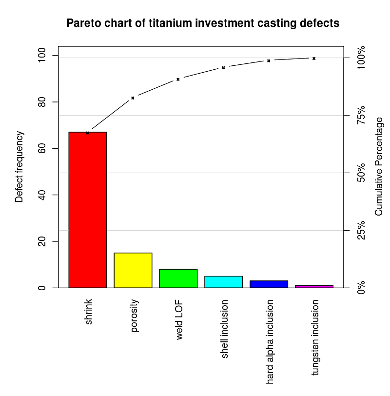
Pareto Chart
Also Read:
Pareto Chart Analysis and Interpretation
[Click Here for Sample Questions]
Pareto chart analysis is the method of interpreting the Pareto graph for varied applications. The process is:
- The first step is to choose the different classifications that will be used for arranging items in the graph.
- Next thing is to choose the right measurement like time, quantity, cost, frequency, etc.
- The next step is deciding a period of time for the Pareto chart so that accordingly the bar graph will be made. The period could be a week, a month or a year.
- Collect new data along with the existing data with time and category.
- Find out the total of measurements for different categories.
- A proper scale should be chosen in order to make an even graph. The total value which is calculated in the above step will be the maximum value.
- Now for each category, raise the bars along with the labelling. The longest bar should be placed at the leftmost place and the shortest at the rightmost.
Read More: Graphical Representation of Data
Applications of Pareto Chart
[Click Here for Sample Questions]
Pareto charts are found to be the perfect chart for analysis of the bulk of data. These charts are very popular among the business and startup industries.
- It is used for the analysis of growth in revenue of an organisation with respect to time.
- To represent the data in a visually understandable way.
- To check for problems in an organisation and resolve them.
- To get the major complaints from the public and get them solved.
- For the analysis of population growth in a city or a country all over the world.
- For explaining the data sets to other individuals in an easy manner.
Read More: Frequency Distribution Table
Example of Pareto Chart
[Click Here for Sample Questions]
Pareto charts are used by quality analysts to identify the most common defects with a product so that they can target their quality improvement efforts on the most frequently occurring defects first. A Pareto chart is produced once a random sample of data is collected, categorizing the types of defects, and recording their frequencies.
For example, a company has collected random data for a product and has received the given defects/related defects in the product
- Dent
- Paint
- Abrasion
- Tear
- Brittle
- Lable
- Stitching
- Burr
The first two bars are the tallest and comprise a large percentage of all outcomes. The cumulative curve rises steeply at first and then levels out, indicative of the Pareto principle in action. The chart shows that dents and paint defects are the two most common types of defects and needs to be worked upon first.
Read More: Graphical Representation of Data and Central Tendency
Things to Remember
- The name ‘Pareto’ comes from the name of an Italian economist named “ Vilfredo Pareto ” who derived the Pareto Principle.
- Pareto Principle states that 80% of the outcomes come from 20% of the conditions for most of the events.
- A Pareto chart is a blend of bar graphs and line graphs.
- Pareto graphs can visually pinpoint the occurrence of defects along with their impact on the results.
- It is a modified bar graph where all the longest bars come in the first and the shortest ones later
- Pareto chart is used to measure population growth in a city or country.
- Pareto chart is used for the analysis of growth in revenue of an organisation with respect to time.
Sample Questions
Ques. What is the Pareto chart used for? (3 Marks)
Ans. A Pareto chart is a tool in statistics that helps us in identifying the most serious defects, complaints or any other issue which is to be pointed out. It is mostly used by big businesses and startups to check the revenue growth of the company with passing time. It is also used to measure population growth in a city or country.
Ques. What is the Pareto rule? (3 Marks)
Ans. Pareto chart is a very important tool used in data representation and analysis. It is a kind of bar graph where the length of bars defines different quantities like cost, time, height, etc. These graphs follow a rule which is called the Pareto rule. It states that roughly 80% of the outcomes come from 20% of the conditions for most of the events.
Ques. How does a Pareto chart work? (3 Marks)
Ans. The main objective of the Pareto chart is to highlight the most frequent issues or problems occurring in an event. In General, it depicts the most important factors which are responsible for some activities. It is used to find the most serious causes of defects or complaints from customers so that they can be fixed by the organisation.
Ques. What are the common limitations to the Pareto principle? (3 Marks)
Ans. The Pareto principle states that roughly 80% of the outcomes come from 20% of the conditions for most of the events. Pareto principle mostly measures the occurrence of defects rather than finding the severity of defects. Also if a severe defect is coming under the 20% of the defect category then there is a chance that it might be skipped.
Ques. How to make a Pareto chart? (5 Marks)
Ans. Here are the steps to make a Pareto Chart:
- At first, it is required to make a list of items, problems, causes that are to be analysed.
- Developing standard measures is required to compare the issues or causes. Calculating the frequency of the problems.
- Finding the percentage of all the entries by checking how often an event occurred or the total amount of time it took.
- Creating a chart with the vertical bars in decreasing order.
- Finally, analyse the chart and derive necessary conclusions from the graph.
Ques. What mistakes should be avoided while drawing the Pareto chart? (3 Marks)
Ans. While trying to draw a Pareto chart the given mistakes should be avoided-
- The first mistake is wrongly summarising the data. Pareto chart makers face difficulty in summarising the data in a way so that it can quickly become a good Pareto chart. The best thing to do is to use a pivot table for synthesising data or using some tools to draw a Pareto chart.
- Another mistake that is frequently happening during writing categories is the other category. Some people categorise defects as ‘other’ categories instead of researching the defects, so as to give the right label to them. It is good practice to avoid the ‘other’ category.
Ques. In what cases is a Pareto Chart used? (3 Marks)
Ans. The various situations in which a Pareto Chart comes into use are:
- When you need to analyze data about the frequency of problems or causes in a process
- When there are too many problems or causes and one needs to focus on the most significant one
- When you need to analyze broad causes by having a look at their specific components
- When you need to communicate with others about the data
For Latest Updates on Upcoming Board Exams, Click Here: https://t.me/class_10_12_board_updates
Check-Out:



Comments