



Education Journalist | Study Abroad Lead
A pie chart is a pictorial representation of data. It explains numerical problems by dividing a circular statistical graph into slices or sectors. Here, the term "pie" corresponds to the word whole, and sector or slice represents a part of the whole. Pie charts are used to find the composition of something. A pie chart can also be called a circular chart cut by radii into segments. If too much data is used, the pie chart becomes less effective. Pie charts fall into two main types based on the dimensions of the charts: 2D pie chart and 3D pie chart.The best example of a pie chart is pizza.
| Table of Contents |
Keywords: Pie chart,pictorial,data,numerical,pie,circular,sector, segment,whole,percent,degree.
Pie Chart Formula
[Click Here for Sample Questions]
Pie charts are an important way to represent data. It contains different segments and sectors, and each part and sector of the pie chart forms a specific percentage of the total. The total sum of all data in the pie chart is 360 °, and the total value of the pie is 100 percent.
Pie chart formula
How to calculate or use the formula in a Pie chart?
These are the following steps for calculation of formula of pie chart:
- Classify, categorize or segregate the data provided.
- Calculate the total split categories and then convert to percentage.
- Then calculate the degree.
Formula for the pie chart (Given Data/Total Value of Data) x 360 degree
If one needs to calculate the total number of sectors on a pie chart, then they need to multiply the section’s percentage in the pie chart by the total value of the data. After the calculation, divide it by 100.
Read More: NCERT Solutions for Class 8 Maths Chapter 5 Data Handling
When is Pie chart used?
[Click Here for Sample Questions]
Pie charts are commonly used in business. Pie charts show the percentage of customer types, percentage of revenue, Sales from different products, and profits from various sectors. Pie charts are helpful in showing the relationship between parts and the whole when the number of levels is negligible or small.
How to Create a Pie Chart?
[Click Here for Sample Questions]
Let us imagine there is a class in which the students are members of different sports:
| Football | Hockey | Cricket | Basketball | Badminton |
|---|---|---|---|---|
| 10 | 5 | 10 | 5 | 10 |
Step 1: Tabulate the data.
Step 2: Add all the values to get a total.
Total = 10 + 5 + 10 + 5 + 10 = 40 students.
Step 3: Now, divide every value by the total value and then multiply it by 100 to get a percent:
| Football | Hockey | Cricket | Basketball | Badminton |
|---|---|---|---|---|
| (10/40) × 100 =25% | (5/40) × 100 =12.5% | (10/40) ×100 =25% | (5/40) ×100 =12.5% | (10/40)× 100 =25% |
Step 4: We take a full circle of 360° for pie chart and follow the calculations as below:
The central angle of each component = (Value of every component/sum of values of all the components) x 360°
| Football | Hockey | Cricket | Basketball | Badminton |
|---|---|---|---|---|
| (10/40)× 360° =90° | (5/40) × 360° =45° | (10/40)× 360° =90° | (5/40) × 360° =45° | (10/40) × 360° =90° |
Now you can draw a pie chart.
Step 5: Draw a circle and measure the degree of each sector using a protactor.

Read More: Data Handling MCQs
What are the Advantages and Disadvantages of a Pie chart?
[Click Here for Sample Questions]
The advantages of using a pie charts are as follows:
- The pie chart data is visually represented, and hence it is simple and easy to understand.
- Data can be shown as part of the whole.
- It provides viewers data comparisons for instant analysis or quick understanding of information.
- The reader does not have to look at or measure the underlying numbers themselves.
- One can manipulate/change the pie chart data to highlight some points that they want to emphasize
The disadvantages of the using a pie chart are as follows:
- The pie chart will be less effective if one uses too much data.
- If there is too much data, adding data labels won't help, as the data becomes crowded and difficult to read.
What are the different data types in the pie chart?
[Click Here for Sample Questions]
The different data types in the pie chart are as follows.
- Category data or nominal data: It is suitable for pie charts.Pie charts are useful for showing the relationship between parts of categorical or nominal data and totals. Pie chart slices usually represent a percentage of the total.
The samples are often divided into groups in categorical data, and the responses have a defined order.
For example, in a survey that asks you to express your opinion on a scale from "strongly disagree" to "strongly agree," your answer is categorical. The nominal data is divided into groups, but there are certain orders.
- Continuous data: Normally, pie charts do not make sense for continuous data. Since continuous data is measured on a scale with many possible values, it does not make sense to represent the parts to whole relationship. The following are examples of continuous data.
- Age
- Temperature
- Weight
- Speed
- Blood pressure
Things to remember
- Pie charts contain different segments and sectors, and each part and sector of the pie chart forms a specific percentage of the total
- The pie chart is a circle divided into sectors. The size of each sector is proportional to the activity or information it represents.
- A pictorial representation of data is a pie chart.
- The total sum of all data in the pie chart is 360°, and the total percentage is 100 percent.
- To convert the data into degrees we use the formula (Given Data/Total Value of Data) x 360 degree.
- A pie chart divides a circular statistical graph into sectors or sections to explain numerical problems.
Also Read:
Sample Questions
Ques: Riya has a monthly budget in which she lists down her monthly expenditure. Represent this data in a pie chart. (3 marks)

Ans:

Ques: The following data shows the favorite movie data of Priya.Represent the data in pie chart Favorite Type of Movie. (3 marks)

Ans:

Ques: The subject liking of each student in a class. Answer the following question. (3 marks)
a. If 20 students's subject of interest is history, how many total students were surveyed?
b. Which subject is liked the most?
c. Which subject is disliked the most?
Ans: According to the given question, 8% of the total number of students is 20.
therefore (8/100) x Total = 20
Therefore, Total = 20 x (100/8) = 250
Hence 250 students were surveyed.
- Science is liked the most, according to the given pie-chart.
- History is disliked the most, according to the given pie-chart.
Ques: For a science camp, students from different states have enrolled. (3 marks)

Ans: The sum of all data = (10 + 5 + 5 + 10 + 10) = 40
Now, divide each sector value by the sum or total and then multiply it by 100.
West Bengal = (10/40) x 100 = 25%
Assam = (5/40) x 100 = 12.5%
Tamil Nadu = (5/40) x 100 = 12.5%
Gujarat = (10/40) x 100 = 25%
Karnataka = (10/40) x 100 = 25%
Calculate the degrees corresponding to each slice.
West Bengal
(10/40) x 360 = 90
Assam
(5/40) x 360 = 45
Tamil Nadu
(5/40) x 360 = 45
Gujarat
(10/40) x 360 = 90
Karnataka
(10/40) x 360 = 90
Ques: Brian asks 60 people what their favorite color is and separates the answers into 5 categories. His results are shown in the table below. Draw a pie chart to display Brian’s results. (3 marks)
Ans:

To draw the pie chart, we need to calculate the size of the angle needed for each category using the formula.
Red angle = 10/60 x 360 = 60 degree
Blue angle = 13/60 x 360 = 78 degree
Green angle = 24/60 x 360 = 144 degree
Yellow angle = 5/60 x 360 = 30 degree
Other angle = 8/60 x 360 = 48 degree
Now we have all the angles, we can draw the chart.

Ques: The whole pie represents a value of 100. It is divided into 10 slices or sectors. The various colours represent the ingredients used to prepare the cake. What would be the exact quantity of each of the ingredients represented in specific colors in the following pie chart? (3 marks)
Ans:
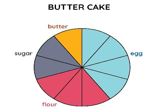
As we can see, the pie is divided into 10 slices or sectors. To calculate the exact amount of ingredients that are added to the cake, we divide the whole sector's value, i.e., 100 by the number of sectors. So, 100 ÷ 10 = 10. Hence, looking at the color divisions made in the pie chart we can conclude that:
| Quantity of Flour | 30 |
| Quantity of Sugar | 20 |
| Quantity of Egg | 40 |
| Quantity of Butter | 10 |
Ques: Observe the following pie chart that recommends a low-carb diet on a day. (3 marks)

We measure the angles of each slice. We get that Protein measures 180°, Carb measures 108°, and Fats measures 72°. Find the percentage.
Ans: To find the percentage, we divide each angle by 360 and multiply it by 100.
Protein = (180/360) × 100 = 50%
Carb = (108/360) × 100 = 30%
Fats = (72/360) × 100 = 20%
For Latest Updates on Upcoming Board Exams, Click Here: https://t.me/class_10_12_board_updates
Check-Out:



Comments