



Education Content Expert
Line Graph is a special type of graph commonly used in Statistics. It shows changes in one quantity in relation to another quantity.
- A graph is said to be linear if it can represent the relationship between two values by a straight line.
- A line graph is often called a Linear Graph.
- A graph consists of a horizontal line called X-axis and a vertical line called Y-axis.
- The data is plotted on the graph in form of coordinates depending on how far away from the X- and Y-axes.
| Table of Content |
Key Terms: Line Graph, Straight Line Graph, Abscissa, Ordinate, Coordinates, Statistics, Double Line Graph
What is Line Graph?
[Click Here for Sample Questions]
Line Graph is a kind of graph which shows changes in one quantity relation to other.
- Graphs show a line connecting many points or a line illustrating the relationship between the points.
- Set of two variables are plotted in a vertical and horizontal axis on a linear graph.
- X-axis is the horizontal line while y-axis is the vertical line in a two-dimensional XY plane.
- Abscissa is referred to as the x-coordinate while Ordinate is the y-coordinate.
- Line graphs are a versatile and informative tool for visualising data.
Types of Line Graph
[Click Here for Sample Questions]
Line Graphs are commonly used to visualise data over time and can display multiple sets of data in an easy to understand format. They are useful in comparing trends, patterns, and changes in data sets. There are three main types of line graphs:
- Simple Line Graphs
- Multiple Line Graphs
- Compound Line Graphs
Simple Line Graph
- A Simple Line Graph is when only one line is plotted on the graph.
- This type of line graph is ideal for displaying a single set of data that changes over time.
- It provides a clear and straightforward representation of the data, making it easy to identify trends and patterns.
Multiple Line Graphs
- They are used when more than one line is plotted on the same set of axes.
- This type of line graph is particularly useful for comparing similar items over the same period of time.
- For example, a multiple line graph could be used to compare the sales of two different products over the course of a year.
- By having both lines plotted on the same graph, it is easy to compare the sales of each product and identify any similarities or differences in their performance.
Compound Line Graph
- It is used when information can be divided into two or more types of data. In this type of line graph, lines are drawn to show the component parts of a total.
- The top line displays the total, while the lines below show parts of the total.
- The distance between each line shows the size of each part, making it easy to see the relationship between the parts and the whole.
- This type of line graph is useful for displaying data sets that can be broken down into multiple components, such as the expenses of a business.
Read More:
Vertical Line Graph
[Click Here for Sample Questions]
A vertical line runs from each data point down to the horizontal axis in a vertical line graph. Column graph is another name for a vertical line graph. A vertical line is a line that is perpendicular to the y-axis.

Vertical Line Graph
Horizontal Line Graph
[Click Here for Sample Questions]
A horizontal line that is parallel to the earth stretches from each data point in a horizontal line graph. Row graph is another name for a horizontal line graph. A vertical line is a line that is perpendicular to the x-axis.

Horizontal Line Graph
Straight Line Graph
[Click Here for Sample Questions]
A line graph is a type of graph where the plotted points that reflect the given data are connected by segments of straight lines.
- The line graph is frequently used to resolve varying situations over a predetermined period of time. Y = mx + c, where m and c are constants, is the formula for a general linear function.
- The essential tenet of drawing a linear graph is that a straight line may be drawn from just two points.

Straight Line Graph
Parts of Line Graph
[Click Here for Sample Questions]
Parts of a Line Graph include:
- Title: The title indicates the type of graph that will be plotted.
- Scale: The units used on the linear graph are described by a scale, which is a set of numbers.
- Labels: The linear graph has labels on both the side and the bottom that describe the type of data it is displaying. The y-axis displays the numerical value for each data point on the line, and the x-axis describes the data points on the line.
- Bars:The data number is measured by the bars.
- Data Values: The actual numbers for each data point are the data values.
How to Make a Line Graph?
[Click Here for Sample Questions]
Line Graphs are created using the data tables provided. They are plotted as a series of points, which are then joined with straight lines to depict the information. The steps to make a line graph are as follows:
- Refer to the data from the data-table to choose a suitable scale.
- Next, draw and label the scale on the y-axis and x-axis.
- Plot the points on the graph.
- Lastly, join the points with line segments.
Double-Line Graph
[Click Here for Sample Questions]
A line graph with two lines is called a double-line graph. a chart that shows two different issues. A double-line expresses things that alter over time. A single chart has two line graphs in the double line graph. They are used to compare trends and patterns between two subjects.
Steps to Make a Double Line Graph
- Refer to the data from the data table to choose an appropriate scale.
- Now, label the scale on the x and y axes.
- Plot the points for both the graphs.
- Join the points with line segments separately of both the lines.
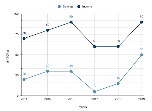
Double-Line Graph
Uses of Line Graph
[Click Here for Sample Questions]
The uses of Line Graph are as follows:
- Tracking changes over both short and long time periods is an important application of line graphs.
- Additionally, it is used to compare changes over the same time period.
- These graphs are used by scientists and engineers to interpret and make sense of massive amounts of data.
- They are used by salespeople and businesspeople to enhance and validate their presentations.
- A line graph can be used to compare the sales of two or more products over the same time period.
- It helps statisticians and mathematicians prove and resolve their theorems and hypotheses.
- It is used by both public and private organisations to highlight patterns in a variety of areas, such as annual population increase, regional rainfall trends, etc.
Properties of Line Graph
[Click Here for Sample Questions]
The properties of Line Graph are as follows:
- It is depicted by connecting locations with straight line segments. We obtain a line by connecting all the points, which may either be a straight line or a curve.
- There are two variables in it, one of which is independent, and the other of which depends on the first independent variable.
- The dependent variable should be displayed on the vertical axis, while the independent variable should be displayed on the horizontal axis.
- It has the ability to display variables, which are variations of one quantity with another.
Advantages and Disadvantages of Line Graph
[Click Here for Sample Questions]
The advantages of using Line Graph are as follows:
- Small adjustments that would become difficult to see in other graphs are shown, which is helpful.
- It aids in displaying trends over time.
- They are simple to comprehend.
- Multiple lines can be plotted on the same axis to compare data.
The disadvantages of using Line Graph are as follows:
- The graph can appear cluttered and difficult to read if too many lines are plotted on it at once.
- Applications are restricted to data sets with full and numeric values.
- Plotting data sets with fractional or decimal values is challenging.
Check More:
Things to Remember
- Line Graphs are a unique kind of graph used in Statistics.
- They are used to visualise data over time using lines.
- There are three types of Line Graphs namely Simple Line Graphs, Multiple Line Graphs, and Compound Line Graphs.
- Values on both the horizontal and vertical axes can be represented by a graph.
- If a straight line can be used to depict the relationship b/w two numbers on a graph, it is referred to as Linear Graph.
Sample Questions
Ques. What is Line Graph ? (3 Marks)
Ans. Line Graph is a particular kind of graph in the field of Statistics. It demonstrates how changes relate to one another.
- If a straight line can be used to depict the relation b/w two values on a graph, it is said to be linear.
- As a result, a line graph is frequently referred to as a linear graph.
Ques.What is the purpose of a Line Graph? (5 Marks)
Ans. A line graph, also known as a line plot or line chart, is a graphical representation of data that displays information as a series of data points connected by straight lines.
- The purpose of a line graph is to display changes in data over a period of time or across different categories.
- Line graphs are commonly used to visualise trends in data, such as changes in stock prices, population growth, or weather patterns.
- Line graphs can also be used to compare the relative magnitudes of different data sets, such as the number of products sold by different companies.
- Line graphs are useful for identifying patterns, trends, and outliers in data, which can help inform decisions and draw conclusions.
- By using line graphs, users can easily compare different data sets and make data-driven decisions.
Ques. By what percentage did production fall between 1993 and 1994? ( 5 Marks)
Ans.
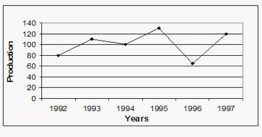
Here, one first looks up the production values for the previous two years. On the X axis, which represents years, place 1993.
- The value of production in 1993 is 110 when moving vertically up along the Y axis direction.
- The value of production in 1994 is obtained in the same way as 100.
In determining percent increases and decreases:
- It is crucial to keep in mind that the reference year in this instance, 1993, is the original year.
- The absolute drop is first calculated, coming out at 110 - 100 = 10.
- Now, one must translate 10 into a percentage of the 1993 production, which is 110.
Thus, the necessary response is 100 10/110 = 9.09%.
Ques. How is a Line Graph created? (5 Marks)
Ans. A line graph is created by plotting data points on a two-dimensional axis, typically with the x-axis representing the independent variable and the y-axis representing the dependent variable.
- The data points are connected by straight lines to form the graph.
- To create a line graph, you first need to gather and organise data. This data should be in the form of pairs of x and y values, where x represents the independent variable and y represents the dependent variable.
- Once you have your data organised, you can plot the data points on a graph by locating the x-value on the x-axis and the y-value on the y-axis.
- The data points are then connected by straight lines to form the line graph.
- The x-axis and y-axis should be labelled and scaled appropriately to accurately represent the data.
- The line graph can also be customised with different colours, line styles, and other features to make it visually appealing and easy to understand.
Ques.What are the components of a Line Graph ? (5 Marks)
Ans.A line graph has several components that work together to display data and communicate information effectively:
- X-axis: Represents the independent variable, and is typically located at the bottom of the graph. The x-axis is labelled with units or categories, and is scaled appropriately to accurately represent the data.
- Y-axis: Represents the dependent variable, and is typically located on the left side of the graph. The y-axis is labelled with units, and is scaled appropriately to accurately represent the data.
- Data Points: Represent the individual data values, and are plotted on the graph by locating the x-value on the x-axis and the y-value on the y-axis.
- Connecting Lines: Connect the data points to form the line graph. These lines can be straight, curved, or a combination of both, depending on the nature of the data.
- Gridlines: Horizontal and vertical lines that help to visually divide the graph into sections and make it easier to read.
- Title: A descriptive label that clearly identifies what the graph represents.
- Legends or Key: Used to identify different data sets or line styles on the graph, if applicable.
- Data Markers: Small symbols or dots placed at the data points to help emphasise the data and make it easier to read.
Ques. List some of the uses of Line Graph ? (3 Marks)
Ans.Some of the uses of line graph are:
- Scientists and engineers use these graphs to interpret and make sense of enormous volumes of data.
- Salespeople and businesspeople utilise them to strengthen and validate their presentations. To compare the sales of two or more products over a certain time period, a line graph can be utilised.
- It supports the theorems and hypotheses that statisticians and mathematicians seek to prove and settle.
- Public and corporate organisations utilise it to draw attention to trends in a range of sectors, such as annual population growth, regional rainfall trends, etc.
Ques.What is the process of drawing a Line Graph? (5 Marks)
Ans. By examining the steepness of the line on a graph sheet, a line graph aids in understanding the performance or comparisons across time. The process of drawing a line graph involves several steps:
- First, gather and organise the data to be plotted. The data should be in the form of pairs of x and y values, where x represents the independent variable and y represents the dependent variable.
- Next, determine the range and scale of both the x-axis and the y-axis to accurately represent the data.
- Plot the data points by locating the x-value on the x-axis and the y-value on the y-axis.
- Connect the data points with straight lines to form the line graph.
- Label the x-axis and y-axis with appropriate units and/or categories, and add a title to the graph to clearly identify what it represents.
- Customise the appearance of the line graph as desired, such as by adding gridlines, changing line colours or styles, or adding data markers.
- Finally, carefully review the graph to ensure that it accurately represents the data and clearly communicates the intended message.
Ques. What are the must elements of a Line Graphs? (2 Marks)
Ans.It is crucial to understand that every line graph needs to include a title section. A line graph has two axes, called the x and y axes.
- On the x-axis of a line graph, the events and categories that need to be compared for a particular time should be taken.
- The scale, which expresses the data and is set up into predictable intervals, is described by the y-axis.
Ques. What would be the ratio of Company B's 1996 revenue to that of Company A's 1993 revenue? (2 Marks)
Ans.
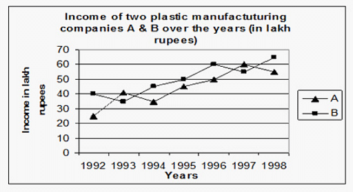
The 1996 income of Company B was 60 lakh. A company's 1993 revenue was 40 lakh. The necessary ratio is 60:40, or 3:1.
Ques. Company B generated Rs. 1239 lakhs in revenue in 2000. What was Company B's investment in that year, expressed in lakhs of rupees? (2 Marks)
Ans.

Company A's investment in 2000 was equal to 1239 x 100/177, or Rs. 700 lakh.
Check-Out:



Comments